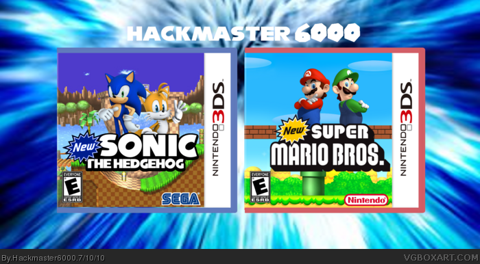
[ Box updated on July 10th, 2010 ] [ original ]
 New Mario And Sonic 3D Twin Pack Box Cover Comments
Comment on Hackmaster6000's New Mario And Sonic 3D Twin Pack Box Art / Cover.
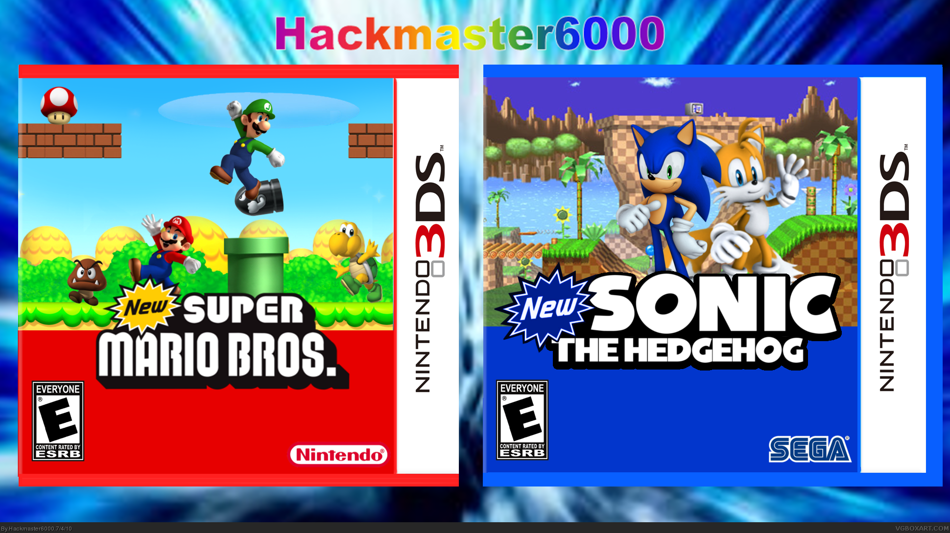
[ Box updated on July 10th, 2010 ] [ original ]
Comment on Hackmaster6000's New Mario And Sonic 3D Twin Pack Box Art / Cover.
This is my latest box enjoy :)
Mario renders - Delfino Plaza
Sonic renders - sonic research
Template - beardedwalrus
nintendo logo - google
sega logo - cerium
Both Backgrounds - google
Mushroom render - google
Favs and comments are welcome....
Edited at 1 decade ago
[ Reply ]
The bottom of the two boxes are a bit plain and boring. Fix that and i'll fav it :D
[ Reply ]
@2 does this help any
[ Reply ]
Well, it is better. But use a not-so-boring font, Lol. Anyway, fav'd! I like the box!
[ Reply ]
Thanks dude!
[ Reply ]
There should be another icon beside Sonic's to indicate 2 players, and do the same on the Mario cover, but swap the mushroom with Mario and Luigi's official icons from the New Super Mario Bros. Wii cover.
The Sonic cover looks alright, but that Mario cover looks extremely generic, and unorganized. It looks like you just placed random character renders in random places. That bullet bill's position makes no sence at all. It's right under Luigi's foot, and unrealisticly at that. I would do what you did with the Sonic cover; The main characters are the only point of focus. Mario's enemies don't need to be there.
Overall this is pretty decent, but it could use a little more work.
Edit: I just noticed that the plastic on the right side of the Mario box is cut off.
Edited at 1 decade ago
[ Reply ]
Okay will be able to fix in about 4-5 days going on a trip but yeah i'll get to it.
[ Reply ]
I honestly don't think you did good on this at all. Just looks like rendom renders on low-res backgrounds to me. One quality box > Two shitty boxes. If it makes you feel better, you did a very good job of messing up my template.
[ Reply ]
#8, Great job being an ass. That comment wasn't helpful at all. The point of comments are to give constructive criticism, not to come in and say "These boxes are shitty!" and "You messed up my template!". If you don't bother making an effort to be constructive, then don't bother posting at all.
[ Reply ]
#9 You tell 'em! You seriously took the words out of my mouth.
And Ill fav cause the sonic box rules, the Mario not so much...
[ Reply ]
#8 why don't you tell me whats wrong with them cause i'm gonna fix them.
Edited at 1 decade ago
[ Reply ]
#11, I would put the templates back the way they were. If you want, I can pm you a red temp and a blue temp. Ill just color the plastic a little better. For the boxes themselves, I would do something different for the colored space in the bottom half. I don't know what you could put there, but it looks kinda cheap. For the mario box, I would try to find some different renders. Those renders have been used a million times. Try to find some similar renders but not the same ones. Sorry for acting like such a jerk in my last post. PM me if you want the templates
[ Reply ]
This is what it its so far will add some more stuff to it.
Update!
[ Reply ]
Mario and Luigi faces on the bottom are blurry. About the boxes:
You should add something ti the background on New Mario's box.
On the New Sonic one, I think it's way better than Mario's.
[ Reply ]
Anyone have the hi-res Mario and Luigi faces i got those off the original box? What could i add to it, maybe enemies in the background.
[ Reply ]
#15, Try these: link
[ Reply ]
Not bad at all.
[ Reply ]
@16 & @17 thanks!
EDIT: Updated, thanks beardedwalrus for the templates. I also think this on looks better.
Edited at 1 decade ago
[ Reply ]
It does look better, but I thought it was fine as it was
[ Reply ]
You should center the mario logo and characters. Other than that, much better.
[ Reply ]
You know, You could have variated a bit. I can see both side-kicks on top of the logo, side by side, with a stage in the background, on both box-arts. Also, The ''new'' sign.
[ Reply ]