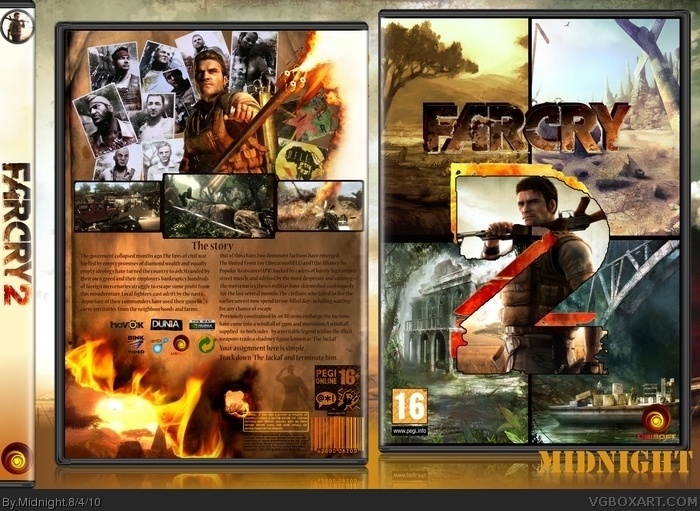
Credit to SilentOblivion fot the template and google for the rest.
This one took me a lot of time cause there are so any farcry 2 boxes.
So i wanted to make something out of the ordinary.Much time was spent to bend all the resouces together.Hope i did fine.Comments are welcome as usual.
This does have potential. I would try blending the images on the front together and give the logo a shadow. For the back, I would suggest moving the screenshots up and making the text a bit larger.
Still very nice though. You are coming along great.
Very nice job for a first, I agree with Stevencho about blending the front images. I like the back a lot, but the text looks a little too small. Still, it's a really good box.
 FarCry 2 Box Cover Comments
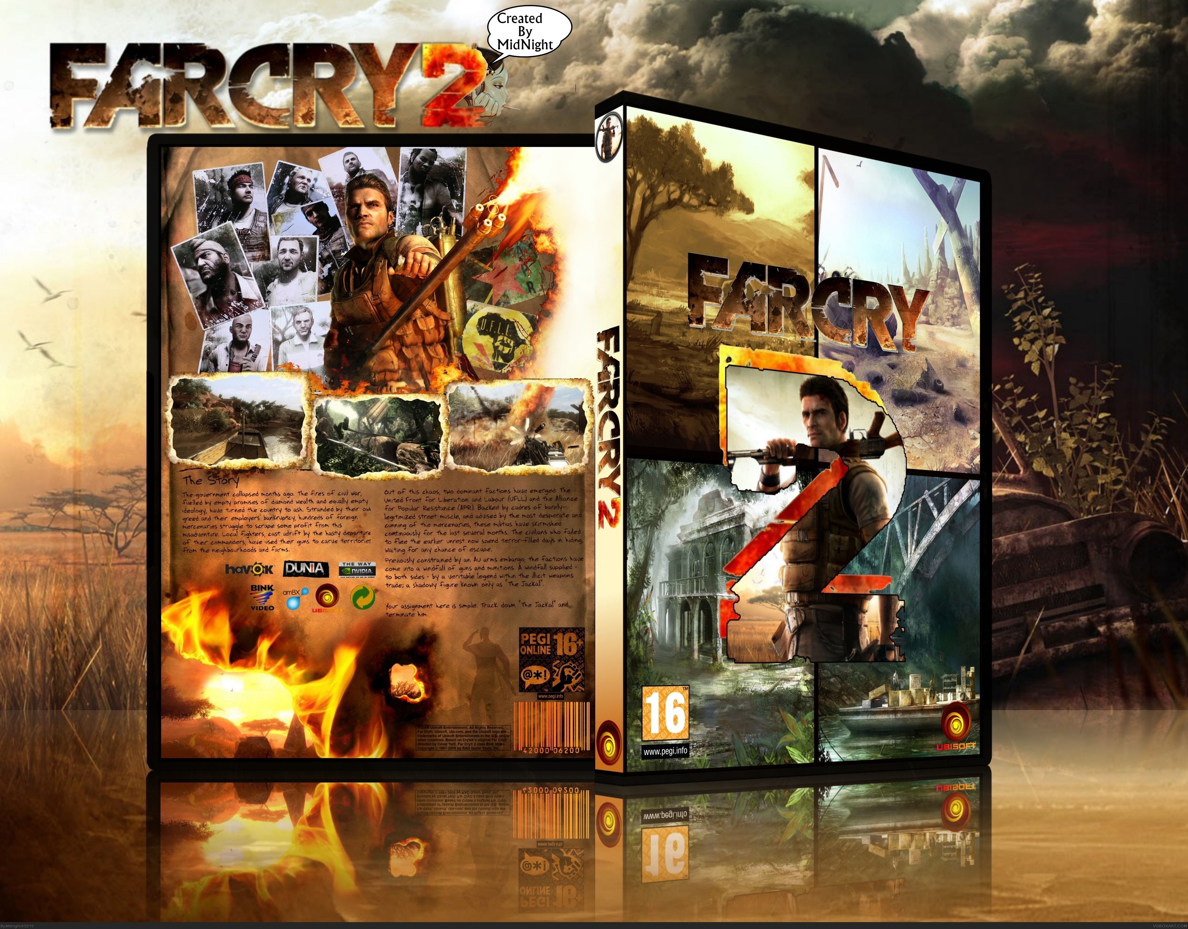
Credit to SilentOblivion fot the template and google for the rest.
This one took me a lot of time cause there are so any farcry 2 boxes.
So i wanted to make something out of the ordinary.Much time was spent to bend all the resouces together.Hope i did fine.Comments are welcome as usual.
[ Reply ]
I quite like it. Nice job for a beginner.
[ Reply ]
This does have potential. I would try blending the images on the front together and give the logo a shadow. For the back, I would suggest moving the screenshots up and making the text a bit larger.
Still very nice though. You are coming along great.
Edited at 1 decade ago
[ Reply ]
#2 thx and #3 Will try when i will have time
[ Reply ]
Very nice job for a first, I agree with Stevencho about blending the front images. I like the back a lot, but the text looks a little too small. Still, it's a really good box.
[ Reply ]
#3 #5 Thanks for the suggestions.Really appreciate it.
[ Reply ]
Agree with stevencho about the front but in the end nice job!!Next top Box Designer :P
[ Reply ]