[ Buy Devil May Cry 4 at Amazon ] » 2014 Hall of Fame Winner! By jevangod 50 on June 12th, 2010 Download Printable Devil May Cry 4 Box Cover Comments Comment on jevangod's Devil May Cry 4 Box Art / Cover. Cancel Reply Masloff 44 [ 1 decade ago ] very nice indeed sleek and awesome! front background is really cool btw Edited at 1 decade ago [ Reply ] jevangod 50 [ 1 decade ago ] #1, Thanks For this I wanted to do something really different with the front from all the other boxes out there. The back.... I just wanted it to be generic. [ Reply ] sd1833 48 [ 1 decade ago ] Front composition is perfect. [ Reply ] Dark Failure 34 [ 1 decade ago ] I need an 'automatic fav' button for your boxes! Edited at 1 decade ago [ Reply ] Gunslinger 42 [ 1 decade ago ] I really like your composition on the front but feel that the colors are a bit too over saturated. [ Reply ] Dark Failure 34 [ 1 decade ago ] #5 I felt the same when I saw this box on my 22" HD screen. But it looks 'normal' on my laptop screen. [ Reply ] jevangod 50 [ 1 decade ago ] #6, Yea. Same on my HD screen at home. On there it looks saturated, but I made this on my laptop so thats why it probably looks like that. [ Reply ] tleeart 45 [ 1 decade ago ] It does seem like it would be a little oversaturated, but ya know, I like it that way. I absolutely love the composition of the front. The back is nice...and generic. It's all good. The back doesn't always have to be earth-shattering awesome. [ Reply ] Hackmaster6000 20 [ 1 decade ago ] the saturation on the front burns my eyes but, its still good +fav Edited at 1 decade ago [ Reply ] Insomnium X 27 [ 1 decade ago ] Great cover. If you plan to edit, you have some typos(renowned,deepest) [ Reply ] jevangod 50 [ 1 decade ago ] #9, Really? I have the brightness on my screens turned up all the way and it doesnt even seem that bad. [ Reply ] Hackmaster6000 20 [ 1 decade ago ] Sorry forgot to turn down the brightness on my screens to normal Edited at 1 decade ago [ Reply ] Leegion 45 [ 1 decade ago ] Nice, great work as always. [ Reply ] gameninja 31 [ 1 decade ago ] Holy. Crap. On. A. Stick. [ Reply ] Joeseye 47 [ 1 decade ago ] Nice, the top half of the box looks like it's embering XD - a favourite from me. By the way, you should have waited a day before you uploaded this, chances are it's gonna be shifted off the front page in no time. [ Reply ] jevangod 50 [ 1 decade ago ] #15, LOL. Yea I noticed that. But I finished up my Soul Calibur Broken Destiny box since we had to wait for Reed to fix up the error so im quite eager to post that. So I dont mind if this gets bumped cause ill have another box up tomorrow. [ Reply ] LooseJuice 29 [ 1 decade ago ] I agree with the fact that it's over-saturated but once again your texture and brush work is incredible. [ Reply ] jevangod 50 [ 1 decade ago ] #17, Thanks [ Reply ] jevangod 50 [ 1 decade ago ] Printable added. [ Reply ] AgentLampshade 46 [ 9 years ago ] This is only just getting the hall? Pfft. You people. [ Reply ] jevangod 50 [ 9 years ago ] lol. I actually thought it was already in the hall. [ Reply ] ManuMIAS 1 [ 8 years ago ] PS3 please! [ Reply ]
 Devil May Cry 4 Box Cover Comments
very nice indeed
sleek and awesome! front background is really cool btw
Edited at 1 decade ago
[ Reply ]
#1, Thanks
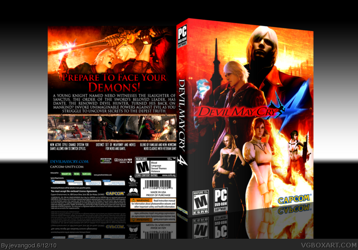
For this I wanted to do something really different with the front from all the other boxes out there.
The back.... I just wanted it to be generic.
[ Reply ]
Front composition is perfect.
[ Reply ]
I need an 'automatic fav' button for your boxes!
Edited at 1 decade ago
[ Reply ]
I really like your composition on the front but feel that the colors are a bit too over saturated.
[ Reply ]
#5 I felt the same when I saw this box on my 22" HD screen. But it looks 'normal' on my laptop screen.
[ Reply ]
#6, Yea. Same on my HD screen at home. On there it looks saturated, but I made this on my laptop so thats why it probably looks like that.
[ Reply ]
It does seem like it would be a little oversaturated, but ya know, I like it that way.
I absolutely love the composition of the front. The back is nice...and generic.
It's all good. The back doesn't always have to be earth-shattering awesome.
[ Reply ]
the saturation on the front burns my eyes but, its still good +fav
Edited at 1 decade ago
[ Reply ]
Great cover. If you plan to edit, you have some typos(renowned,deepest)
[ Reply ]
#9, Really? I have the brightness on my screens turned up all the way and it doesnt even seem that bad.
[ Reply ]
Sorry forgot to turn down the brightness on my screens to normal
Edited at 1 decade ago
[ Reply ]
Nice, great work as always.
[ Reply ]
Holy. Crap. On. A. Stick.
[ Reply ]
Nice, the top half of the box looks like it's embering XD - a favourite from me.
By the way, you should have waited a day before you uploaded this, chances are it's gonna be shifted off the front page in no time.
[ Reply ]
#15, LOL.
Yea I noticed that. But I finished up my Soul Calibur Broken Destiny box since we had to wait for Reed to fix up the error so im quite eager to post that. So I dont mind if this gets bumped cause ill have another box up tomorrow.
[ Reply ]
I agree with the fact that it's over-saturated but once again your texture and brush work is incredible.
[ Reply ]
#17, Thanks
[ Reply ]
Printable added.
[ Reply ]
This is only just getting the hall? Pfft. You people.
[ Reply ]
lol. I actually thought it was already in the hall.
[ Reply ]
PS3 please!
[ Reply ]