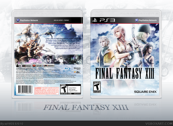
Finally finished this, after several attempts. Wanted to make something a little different from other FF cases, I wanted it to be really bright, and colorful and I think I was able to achieve that. I also used as many different renders as I could and even a attempted a more unique tagline. If you guys could think of a better one though, I'd change it if possible. I just didn't want to use the same old “Fight for the Land You Live For” or whatever it is.
Also, currently listening to this game's soundtrack, some really awesome stuff. Hamauzu's my freakin' hero right now. :P
Cred goes to Scorpion Soldier and Sens for the temp.
Back is looking a tad choppy, but whooooooooo, this is amazing. Composition on the front is absolutely top-notch, you're headed straight for the top, my friend!
#11, Yeah it's alright. I see what you mean about it being choppy, mainly in the synopsis and characters. Funny I didn't really see it before I uploaded the case. Thanks man. =)
#15, Well I put it there because parts of the logo were tough to see without something bright behind it. I would try again without it, but I'm retarded and saved over the original file with the final flattened one, so I can't change it...
Good, nice choice of renders, I think the cover overall is a bit too bright, but I like how you actually put the correct legal info, because not every PS3 game has, Multiplayer, Voice, In-game Chat, etc. It looks kinda of stupid when people leave that stuff up there, nice work taking that shit out. :O
#18, Yeah the legal info/features always bugged me when they aren't changed. I mean, it's pretty obvious FF13 doesn't have online multiplayer or leaderboards, haha.
#19, Always great to hear stuff like that from one of my fav artists. Thanks alot!
On the front, Snow looks soo big. The tagline and synopsis looks a bit hard to read in some places. I'm also not a big fan of cloudy background, really.
#22, I made Snow larger, since I think varying the character sizes can result in an effective design. Similar to this: link And I'm sorry you're not feeling the cloudy background, thanks for the honest comment. =)
#25, Maybe it's just my monitor or something, I really don't have any trouble reading the text. Guess you can't please everyone, so thanks for letting me know what you think of it.
#27, Yeah I guess it really depends on the screen you're looking at. The text is perfectly readable on my desktop monitor, but when I look at it on my laptop it's ridiculously bright and I can't read any of it. :/
#32, Unfortunately the only one I still have somewhere on my PC is the Lightning render on the front. I could send that one, or upload it to the resources I guess. My hair rendering skills are still pretty shaky, they honestly looked pretty shit up close. :P
You are my Hero. This is the best FFXIII Boxart out there. Now i can finally throw away the crappy standard Cover (Platinum too *gross*) and replace it with this beautiful one. Thank you for the Printable very very much.
 Final Fantasy XIII Box Cover Comments
Finally finished this, after several attempts. Wanted to make something a little different from other FF cases, I wanted it to be really bright, and colorful and I think I was able to achieve that. I also used as many different renders as I could and even a attempted a more unique tagline. If you guys could think of a better one though, I'd change it if possible. I just didn't want to use the same old “Fight for the Land You Live For” or whatever it is.
Also, currently listening to this game's soundtrack, some really awesome stuff. Hamauzu's my freakin' hero right now. :P
Cred goes to Scorpion Soldier and Sens for the temp.
[ Reply ]
Right now, I am looking at one of the best boxes on the site.
Edited at 1 decade ago
[ Reply ]
My initial impression was: Flawless. After studying it in more detail for a while that impression still stands. Absolutely superb!
[ Reply ]
Amazing!
[ Reply ]
Really dynamic effects.
[ Reply ]
Well thanks guys! ^_^
[ Reply ]
This looks amazing. Seriously.
+FAV
[ Reply ]
It's amazing.
[ Reply ]
MY HEAD ASPLODE.
Back is looking a tad choppy, but whooooooooo, this is amazing. Composition on the front is absolutely top-notch, you're headed straight for the top, my friend!
Edited at 1 decade ago
[ Reply ]
Tad choppy? i want to make love to the back. The front is great too.
[ Reply ]
#10, Yeah, a tad choppy. That in no means is a strike against the design (which is amazing,) but it was just a point I wanted to make.
[ Reply ]
You are THE BESt Final Fantasy box artist on the site.
[ Reply ]
One of, if not, the best Final Fantasy box on the entire site.
[ Reply ]
#11, Yeah it's alright. I see what you mean about it being choppy, mainly in the synopsis and characters. Funny I didn't really see it before I uploaded the case. Thanks man. =)
#12&13, Aw really, thanks guys!
[ Reply ]
The only thing I don't really like is that bar behind the logo on the front.
[ Reply ]
#15, Well I put it there because parts of the logo were tough to see without something bright behind it. I would try again without it, but I'm retarded and saved over the original file with the final flattened one, so I can't change it...
[ Reply ]
Hof! The render on the back is just amazing!
Edited at 1 decade ago
[ Reply ]
Good, nice choice of renders, I think the cover overall is a bit too bright, but I like how you actually put the correct legal info, because not every PS3 game has, Multiplayer, Voice, In-game Chat, etc. It looks kinda of stupid when people leave that stuff up there, nice work taking that shit out. :O
[ Reply ]
I feel humbled by this.
[ Reply ]
#18, Yeah the legal info/features always bugged me when they aren't changed. I mean, it's pretty obvious FF13 doesn't have online multiplayer or leaderboards, haha.
#19, Always great to hear stuff like that from one of my fav artists. Thanks alot!
[ Reply ]
One of my favorite PS3 boxarts. Ever.
[ Reply ]
On the front, Snow looks soo big. The tagline and synopsis looks a bit hard to read in some places. I'm also not a big fan of cloudy background, really.
[ Reply ]
#21, Wow that's quite the compliment, thanks.
#22, I made Snow larger, since I think varying the character sizes can result in an effective design. Similar to this: link And I'm sorry you're not feeling the cloudy background, thanks for the honest comment. =)
[ Reply ]
cool!
[ Reply ]
A bit too much bloom for my taste--text on the back is kinda hard to read.
[ Reply ]
#25, Maybe it's just my monitor or something, I really don't have any trouble reading the text. Guess you can't please everyone, so thanks for letting me know what you think of it.
Edited at 1 decade ago
[ Reply ]
How did I miss this?
+fav
#26, I don't have any trouble, either. Maybe it's because I'm using a laptop.
[ Reply ]
#27, Yeah I guess it really depends on the screen you're looking at. The text is perfectly readable on my desktop monitor, but when I look at it on my laptop it's ridiculously bright and I can't read any of it. :/
Thanks dude.
[ Reply ]
BTW, where did you get the template from? I've asked a couple people, but they didn't respond :/
[ Reply ]
#29, I took Scorpion Soldier's flat template (link) and combined it with Sens' PS3 plastic. I could send it to you if you want.
[ Reply ]
Amazing, nearly missed this.
Congratulations x
[ Reply ]
#31, Same hre, this is really nice. Is there anywhere I can get a hand on those renders?
[ Reply ]
Yay thanks guys!
#32, Unfortunately the only one I still have somewhere on my PC is the Lightning render on the front. I could send that one, or upload it to the resources I guess. My hair rendering skills are still pretty shaky, they honestly looked pretty shit up close. :P
[ Reply ]
wow i love your work its insanely great =]
and to everyone who cant rly read it just go to full screen =\
Requesting Printout plz <3
+fav
[ Reply ]
I added a printable to this, if anyone is interested.
Probably not.
[ Reply ]
You are my Hero. This is the best FFXIII Boxart out there. Now i can finally throw away the crappy standard Cover (Platinum too *gross*) and replace it with this beautiful one. Thank you for the Printable very very much.
[ Reply ]