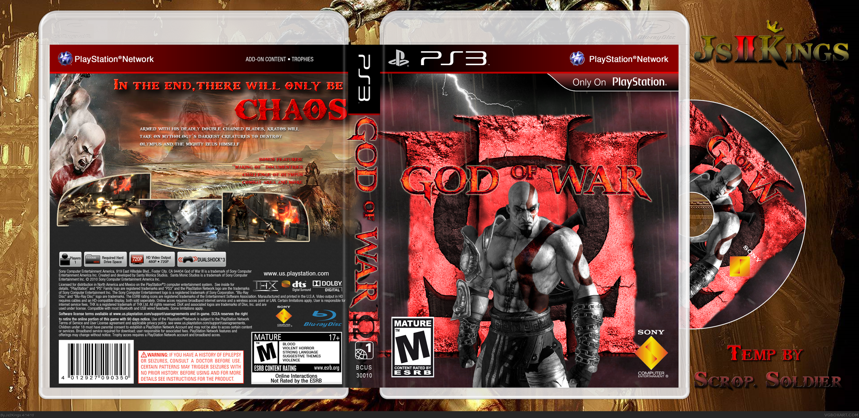
The box looks nice. I love the borders you've used for the photos, and the front is a nice deviation from what I've seen before. A minor gripe; the tagline on the back seems a little close to the edge, does it not? Despite that though, it looks very nice!
The back looks very nice and well put together. Kudos to you for that. Making appealing backs can be pretty hard. However, your front seems to simple and your saturations are clashing. Kratos is almost gray and it doesn't look very well with him being over a bright red logo. Also the red in the logo doesn't look very appealing to me. I would have kept it the original color.
I think the Kratos' that are on the disc and front cover should be switched.. I don't know why but it's just the front cover Kratos just clashes completely with the changed logo.

 God of War III Box Cover Comments
This box was sitting on my computer for a while so I fixed it up a little and posted it. Credit in the bottom right.
[ Reply ]
The box looks nice. I love the borders you've used for the photos, and the front is a nice deviation from what I've seen before. A minor gripe; the tagline on the back seems a little close to the edge, does it not? Despite that though, it looks very nice!
[ Reply ]
#2, Yeah I just took a notice to that, I'll update it later.
[ Reply ]
The back looks very nice and well put together. Kudos to you for that. Making appealing backs can be pretty hard. However, your front seems to simple and your saturations are clashing. Kratos is almost gray and it doesn't look very well with him being over a bright red logo. Also the red in the logo doesn't look very appealing to me. I would have kept it the original color.
[ Reply ]
#4, Thanks for the complement, I decided to make a huge edit to the front, sorry if you all don't like it how it is now but I do.
[ Reply ]
#5, It looks more creative but it's a bit off center and I would have gone with the original orange hue. But it's still better.
[ Reply ]
I tried to change the palette to something original. I'll be sure to fix the front up.
[ Reply ]
I think the Kratos' that are on the disc and front cover should be switched.. I don't know why but it's just the front cover Kratos just clashes completely with the changed logo.
[ Reply ]
not too fond of the front,love the back though
[ Reply ]
I hate the III of the logo being cut out.
But why haven't i seen this before. It's really really good. the lighting on kratos on the front is kinda fitting.
[ Reply ]