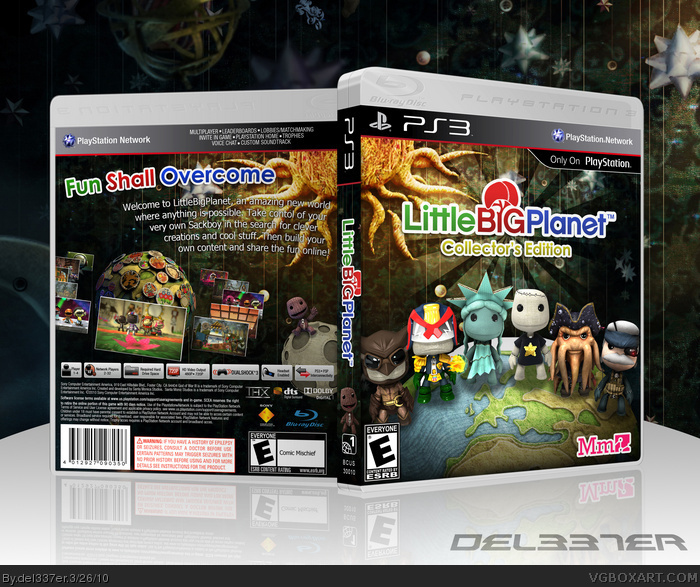
Ok, so this is a box i made during my banning. I didn't really feel great about this one, but the people in the Abandon-O-Rama thread seem to think it has potential. :)
Aww, no offence, but I am with you on this one del. I dont know what everyone is seeing in it. You know as well as I do that I looooove your work but this is a bit of a letdown.
#21, thats my problem with all the LBP boxes, no one EVER includes the regular sackboy, plus another thing is this should be a CE becase if i was in the store and saw this i'd be like, whoa i get all those costumes? but once i opened it - aww i have to buy them :(
so if you dont want to put reg sackboy on, at least squeeze the title collecters edition on there
 LittleBigPlanet Box Cover Comments
Ok, so this is a box i made during my banning. I didn't really feel great about this one, but the people in the Abandon-O-Rama thread seem to think it has potential. :)
Edited at 1 decade ago
[ Reply ]
I am going to guess and say that this will be your third hall.
[ Reply ]
Good stuff!
[ Reply ]
Thanks, I didn't think this would turn out that well. If this makes Hall I will be genuinely surprised.
[ Reply ]
I spy with my little eye my render.
Very nice job!
[ Reply ]
#5 Actually i rendered everything by myself...Everything else was found on google. But thanks :)
[ Reply ]
Nice, not a big fan of the tagline though.
[ Reply ]
#7 Hmm you mean how i made it, or the actual words, because i can always edit...
[ Reply ]
Probably the tagline; it is pretty strange on this box. Try the omnes font.
[ Reply ]
Is that better?
[ Reply ]
This better get the Hall, very nice job!
[ Reply ]
Thanks, and i hope so :)
[ Reply ]
This is great, this should be in the hall, deserves it.
Fav and Fav Author.
Great work mate.
[ Reply ]
#13 Thanks a lot.
[ Reply ]
That's pretty sweet.
[ Reply ]
Did I just get a fav from ADFD...? :o
EDIT: Woah, I count over 100 points already
Edited at 1 decade ago
[ Reply ]
Not bad. but the logo is sort of blending in with the background. Make it stand out a bit more.
[ Reply ]
Yea i was trying to think of a way to make it stand out more...
[ Reply ]
Good job, like what you did with the screenshots.
[ Reply ]
yore forgrtting some certain sackboys
link
and
link
Edited at 1 decade ago
[ Reply ]
Thanks SD, and lol spypilot, the first one is on the spine :P
[ Reply ]
Wow, nice job Del.
[ Reply ]
#22 Thank you
[ Reply ]
Great idea with the screenshots, but make logo stand out more somehow. You might wanna use different LBP logo (the blue one).
+FAV
[ Reply ]
Aww, no offence, but I am with you on this one del. I dont know what everyone is seeing in it. You know as well as I do that I looooove your work but this is a bit of a letdown.
[ Reply ]
Amazing, however the background has some blurry issues, and so does the sun. But other then that awesome work.
[ Reply ]
#21, thats my problem with all the LBP boxes, no one EVER includes the regular sackboy, plus another thing is this should be a CE becase if i was in the store and saw this i'd be like, whoa i get all those costumes? but once i opened it - aww i have to buy them :(
so if you dont want to put reg sackboy on, at least squeeze the title collecters edition on there
[ Reply ]
#27 Ah ok, good idea.
[ Reply ]
Ok guys, I fixed the logo. I think it looks a lot better.
[ Reply ]
This is even better in full view :P favd
[ Reply ]
Thanks man :)
Last count, i got 187 points...so close :o
Edited at 1 decade ago
[ Reply ]
I find it funny that you have the same number of faves and comments, well now one more comment thanks to my comment here.
[ Reply ]
Haha yea that happens a lot :P I didn't think this box would get far at all, but now it is a few favs away from Hall. I'm pretty surprised.
[ Reply ]
#33, This is my favorite from you, and I think it is because of the screen shots.
[ Reply ]
#34 Well thanks man. Yea the screenshots were inspired by KoopaDasher, I think it works really well with this game/box.
[ Reply ]
The logo looks great right now, but I think it should say "Collector's Edition".
[ Reply ]
Well Congrats on your third Hall.
[ Reply ]
It made Hall! :D Second in a row, woot woot.
Edited at 1 decade ago
[ Reply ]
New update looks great. I have to Author Fav you dude.
[ Reply ]
#39 Woah an Author Fav, thanks so much!
[ Reply ]
you spelt collector's wrong
[ Reply ]
#41 Oh -.-
EDIT: Fixed
Edited at 1 decade ago
[ Reply ]
#42, nope it isnt, read the comment harder
collectOr's
Edited at 1 decade ago
[ Reply ]
#43 Oh my god... o-o
Edited at 1 decade ago
[ Reply ]
Told ya.
[ Reply ]
#45 ...?
[ Reply ]
When I saw this in the forum, I knew it would be a big hit.
Congrats!
Edited at 1 decade ago
[ Reply ]
#47 Ah ok, well thanks for your support :)
[ Reply ]
This is damn good work. I envy you!
[ Reply ]
Very impressive box work. It's neat, shaped up well, and realistic. Also a good idea. 5/5. It deserved hall.
[ Reply ]
I loved making my LBP box. This one looks awesome and is very creative. Nice work.
[ Reply ]
Even beter the original :)
[ Reply ]