It looks good. i like it. the only thing that's wrong
is that the effect is covering it, nintendo on ... microsoft?? and that the bg is boring and looks real life.
Look, I'm not trying to be a craphead, but this is not a good box - of course, no one's early boxes are good.
Next time don't put effects on renders that make them hard to see, or that don't match.
Secondly, NEVER put cartoon images on real-life backgrounds. Not only does it not look good, but people around here will get very angry when you do it. Apparently not this time, though.
Finally, try harder on boxes and take some time on them. Keep up the good work and I'm looking forward to see more work from you.
#5, while that is mostly the case (and nothing against you) I would like to point out that Qwerty334's first boxes were awesome and his fourth one is a HOF.
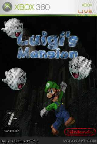
 Luigi's Mansion XBOX 360 Box Cover Comments
I hope you like it.....!
[ Reply ]
It looks good. i like it. the only thing that's wrong
is that the effect is covering it, nintendo on ... microsoft?? and that the bg is boring and looks real life.
Edited at 1 decade ago
[ Reply ]
#2, Whatever if it is nintendo logo on a Microsoft, it's just for fun!
[ Reply ]
Nice box..., The background is a little too real.
[ Reply ]
Look, I'm not trying to be a craphead, but this is not a good box - of course, no one's early boxes are good.
Next time don't put effects on renders that make them hard to see, or that don't match.
Secondly, NEVER put cartoon images on real-life backgrounds. Not only does it not look good, but people around here will get very angry when you do it. Apparently not this time, though.
Finally, try harder on boxes and take some time on them. Keep up the good work and I'm looking forward to see more work from you.
[ Reply ]
#5, while that is mostly the case (and nothing against you) I would like to point out that Qwerty334's first boxes were awesome and his fourth one is a HOF.
[ Reply ]