[ Box updated on February 28th, 2010 ] [ original ]
 Metal Gear Solid 3: Snake Eater - Special Edition Box Cover Comments
Comment on jmariamellinas's Metal Gear Solid 3: Snake Eater - Special Edition Box Art / Cover.
Whoa! It´s been a while! :)
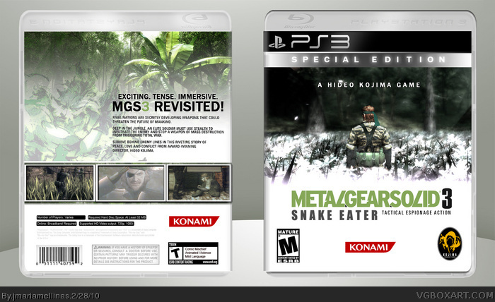
Hello again. I´m back with a box for a MGS3 PS3 remake directed by the same Kojima. Lots of job, but fun!
Enjoy it!^^
[ Reply ]
Front artwork is too low resolution, the Peace Walker Snake render stands out on the screenshot on the back...overall, pretty good front, not so great back.
[ Reply ]
I might try something like this. It's a good idea.
[ Reply ]
If that template was up to date and didn't suck so much ass, this would be really nice.
[ Reply ]
#4, Heh, whoops =P
Anyway, fantastic stuff.
[ Reply ]
The entire concept is well done, and I think the front is excellent. Two things, the gradient the logo is using makes it hard to read, and the screenshots on the back could use some type of border.
[ Reply ]
I actually really like this box. There's only one thing that bothers me - the text on the front is slightly hard to see. It needs to stand out against the white more.
[ Reply ]
Epic. Box is Epic. I was going to do something just like this, but I see there is no use. This is just too much awesome to compete with. Great job, dude!
[ Reply ]
Box updated! Logo and borders for the pics fixed and added.
[ Reply ]
Much better sir.
[ Reply ]
It's a fantastic concept but it needs some work. To start, none of the pics looks to be particularly high res. Secondly, I don't think putting gray text on a white background works, personally I feel it should be black. The info on the back is so light that if I had a lower res computer screen that was dimmer I most likely wouldn't be able to see it. Overall though, I still think you put in a good effort worthy of a fav.
[ Reply ]