my latest, i spent 5 hours in 3 dyas working on this, and im very pleased with the result, i feel it is one of my best. thanks to the slyder for helping me out. cred:
Logo: Makjack
Esrb stuff: EG and qwerty.
Templates: Scorpion soldier and Sens
Username logo: TMRD
Borders: Qwerty
and last but not least..
Vega, Ibuki & Akuma renders: SGJin (thanks a bunch!)
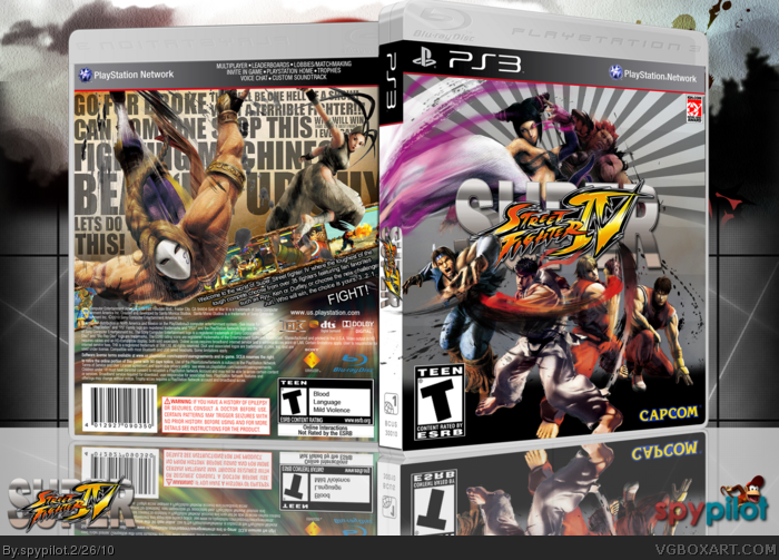
anyways, i wanted to do something unique for this one, and something thats better than the official, on the back i put a bunch of qotes on paper, covered by the ink from the renders and the renders themselves, on the bak its supposed to appear like ibuki has just dodged an attack from vega, but why them? well it would be cool because Geki supposively trained Vega and is supposively Ibuki's father, on the front, its supposed to feel like the intro of Street fighter 4 (Just no gay theme music, LOL) with the smoke & such. Also, i wanted everything to interact with everything, Juris leg on the spine and ibuki ove and under the screens, with vega flying over them, i chose the reck border, because the kinda look like crumpled paper.
Enjoy, fav and comment! im hoping for the hall on this!
The light rays on the front are really distracting, try and decrease the number. Also, the back's text has a really boring font that kills an otherwise great back. The opacity on the reflection is also a bit too much, and i'd like to see you do a bit more with the spine. The ESRB on the front is a bit too big too.
Fix those things, and you'll have a nice box here.
Looks too cool.
But, i think you should lower the opacity of the rays. And that motion blur thingy on the bottom of the back looks too colourful. Maybe change its colour to match the upper part.
I like the back a lot, especially with the text, the front I'm not feeling quite as much. The first thing I notice is the silver background clashes with the brown / tan you have on the back, or vice versa. If the background was the same color for the front and backs of the design, I think the entire piece would have a tighter unity, and flow better with the eye.
I like the idea of the kick swoosh from the top character coming from the spine, but for some reason it's not working, and I think it's making things a bit unbalanced within the composition on the front.
Again though, the back is really cool, and even if you were to update with matching background colors, I can see myself faving this.
It's alright, but just alright. I don't like how it flows and the colors are all muted and dull. It doesn't really do a good job of grabbing my eye, then making me take a second look. The effects make the pictures look pixelated and the screen shots are very hard to make out. I don't like how you put text everywhere, then covered it with pictures. Like I said, it's ok, but not great.
#23, Instead of constantly defending yourself how about working on fixing the problems people have suggested?
It's a flashy box, nice at first sight but if you look at it closer there are a few too many problems.
First of all the front looks great. There are a few minor problems such as the IGN logo looking out of the place and the woman carrying onto the spine and then covering the spine logo. Other than that, nice job.
The back, again, is great BUT the text is unreadable. I realize you designed it in that way for style but if you are a consumer you want to know what the game is about (that is of course, if you have been living under a rock for the past 20 years :P) and need more readable text. The screenshots are very small and your actual synopsis is very in the corner and out of the way. It should have more prominence.
Overall, I like it, and I know from the novel above it sounds like I hate it but really, it's a great box. It just has a few problems that keep me from faving.
You've come a long way since I joined, well done man ;)
 Super Street Fighter IV Box Cover Comments
my latest, i spent 5 hours in 3 dyas working on this, and im very pleased with the result, i feel it is one of my best. thanks to the slyder for helping me out. cred:
Logo: Makjack
Esrb stuff: EG and qwerty.
Templates: Scorpion soldier and Sens
Username logo: TMRD
Borders: Qwerty
and last but not least..
Vega, Ibuki & Akuma renders: SGJin (thanks a bunch!)
anyways, i wanted to do something unique for this one, and something thats better than the official, on the back i put a bunch of qotes on paper, covered by the ink from the renders and the renders themselves, on the bak its supposed to appear like ibuki has just dodged an attack from vega, but why them? well it would be cool because Geki supposively trained Vega and is supposively Ibuki's father, on the front, its supposed to feel like the intro of Street fighter 4 (Just no gay theme music, LOL) with the smoke & such. Also, i wanted everything to interact with everything, Juris leg on the spine and ibuki ove and under the screens, with vega flying over them, i chose the reck border, because the kinda look like crumpled paper.
Enjoy, fav and comment! im hoping for the hall on this!
[ Reply ]
That fan fiction tho.
[ Reply ]
Nice!
Only flaw for me is that I can't see much of the text on the back. Other than that, it's really good.
[ Reply ]
The light rays on the front are really distracting, try and decrease the number. Also, the back's text has a really boring font that kills an otherwise great back. The opacity on the reflection is also a bit too much, and i'd like to see you do a bit more with the spine. The ESRB on the front is a bit too big too.
Fix those things, and you'll have a nice box here.
[ Reply ]
no one else? im getting all these favs but no comments :'(
[ Reply ]
nice
[ Reply ]
Looks too cool.
But, i think you should lower the opacity of the rays. And that motion blur thingy on the bottom of the back looks too colourful. Maybe change its colour to match the upper part.
[ Reply ]
#6, lol, its actually a screenshot of blanka
[ Reply ]
#7, Ohhh...
But it isn't easily recognisable. Now that you have told me, it does looks like him.
Edited at 1 decade ago
[ Reply ]
#8, its not supposed to be recognizable lol.
[ Reply ]
Dude, this is awesome.
But that logo isn't. If I'm honest I think that you should try and get one that looks less like the official with WordArt on the back IMO.
Otherwise really fantastic. +fav.
Screw it, +author fav
[ Reply ]
#10, yippie!
[ Reply ]
This is fucking awesome.
[ Reply ]
Nice
[ Reply ]
Ok, this is nice. but I've seen these renders adozen lately. And considering it's a new game, I'd like to see new.
But that back is marvelous, Great job with that.
The spine is kinda plan as well.
but i give it 8.4/10
nice job.
[ Reply ]
Breath-taking!
[ Reply ]
#14, what do you mean, sure the ryu and ken have been used, but i havent ever seen the others used
[ Reply ]
#16, I do a lot of internetz, and I (myself) have seen it, that's all.
[ Reply ]
#17, can you link me to some boxes?
also, thanks to everyone who commented and fav'd, imso happy this box wasnt hated by anyone yet :)
Edited at 1 decade ago
[ Reply ]
#18, Well it's not boxes per-say. But I have seen the pics.
I've been looking into Super Street fighter VI lately, so yeah.
I'm sorry if I came of to be rude, not what I was going for.
[ Reply ]
#19, well of course youve seen the pics :P im not gonna have a pic that doesnt exist.
[ Reply ]
I like the back a lot, especially with the text, the front I'm not feeling quite as much. The first thing I notice is the silver background clashes with the brown / tan you have on the back, or vice versa. If the background was the same color for the front and backs of the design, I think the entire piece would have a tighter unity, and flow better with the eye.
I like the idea of the kick swoosh from the top character coming from the spine, but for some reason it's not working, and I think it's making things a bit unbalanced within the composition on the front.
Again though, the back is really cool, and even if you were to update with matching background colors, I can see myself faving this.
Good work man!
[ Reply ]
It's alright, but just alright. I don't like how it flows and the colors are all muted and dull. It doesn't really do a good job of grabbing my eye, then making me take a second look. The effects make the pictures look pixelated and the screen shots are very hard to make out. I don't like how you put text everywhere, then covered it with pictures. Like I said, it's ok, but not great.
[ Reply ]
Epic, amazing job ! :D
[ Reply ]
#23, Instead of constantly defending yourself how about working on fixing the problems people have suggested?
It's a flashy box, nice at first sight but if you look at it closer there are a few too many problems.
First of all the front looks great. There are a few minor problems such as the IGN logo looking out of the place and the woman carrying onto the spine and then covering the spine logo. Other than that, nice job.
The back, again, is great BUT the text is unreadable. I realize you designed it in that way for style but if you are a consumer you want to know what the game is about (that is of course, if you have been living under a rock for the past 20 years :P) and need more readable text. The screenshots are very small and your actual synopsis is very in the corner and out of the way. It should have more prominence.
Overall, I like it, and I know from the novel above it sounds like I hate it but really, it's a great box. It just has a few problems that keep me from faving.
You've come a long way since I joined, well done man ;)
[ Reply ]
#25, do you mean the stoke?cuz it looked bad without it
[ Reply ]
Printable version get? I really like it.
[ Reply ]
yo you commented on a box of Paper Mario in space with a rosalina in paper here's the link
Edited at 1 decade ago
[ Reply ]
#28, oookay then :/
[ Reply ]
Those screen-borders = needles in my eyes.
[ Reply ]
#30, i didnt make em, and i couldnt find any other good ones :/
[ Reply ]
hey guys, if you decide to fav, try to leave a comment, i do enjoy reading them
[ Reply ]
adding prinntable ver. would be great for that fantastic box
[ Reply ]
#33, i really cant make a printable, the resouution of my box is waaaaaaay too small
[ Reply ]
on full screen it doesn't looks so bad. I'll be very happy if you add or send me any ver. you had, because it's the best box for SSF4 ever created:D
[ Reply ]
#35, send me a printable temp and ill see what i can do.
[ Reply ]
check your inbox:)
[ Reply ]
how works going
[ Reply ]
#38, it looked bad
[ Reply ]
Nice one, i really like the design on the front.
Fav.
[ Reply ]
193 points! almost in!
[ Reply ]
Man I'm loving that back. Nice work.
[ Reply ]
Haha, finally in!
Congrats dude.
[ Reply ]
I really like the back, good job =)+Fav
[ Reply ]
thank you so much guys!
[ Reply ]
great job, man. i can tell you've improved a great lot in the months of my absence. 5/5 and faved!
[ Reply ]
Could I have those renders please........great box dude. FAV
[ Reply ]
Needs to be on master works
[ Reply ]
Excellent box dude, could you perhaps put up some links...
[ Reply ]
This is simply amazing. I knew it was HoF even before I saw the HoF stamp.
[ Reply ]