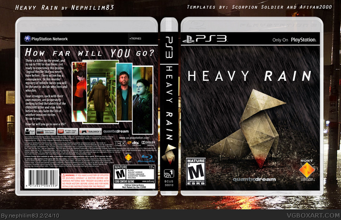
This is for those of you who enjoy the simplicity of the European version. I simply used the US font and added some raindrops so it would match the rest of my pre-existing box. I hope you guys enjoy it.
#4, Yeah, its not JUST the PAL version. I removed the other font and added raindrops. I also brightened it up a bit in key areas for a little extra flare. Anyway, that was my main point. I wanted to offer the PAL version with a little of my own spin.
You are wrong about he logos. EVERYTHING is to scale and the exact ratio you'll find on any box. The only thing that has been stretched is the the spine (which was an accident and has been fixed) and the front title. I stretched the front title to fill some of the void up there.
#5, No. The logos are vertically stretched. I'm holding a copy of the game in my hand right now and here's a nice high resolution scan for you to see: link
It's obvious.
#6, No need, I have a copy myself. Please, pay more attention to what you're looking at. The only thing that's stretched is the title on the front. Its not "obvious" cause its not true. I used a very nice template for this box and maintained a perfect ratio throughout the project. You can even overlay your scan over mine and see that they match. ;)
#7, you're obviously fucking blind.
Here is an image with YOUR logo compared to the ACTUAL logo. link
You can't argue with that.
The front and spine title are both visibly distorted and they make the box look ugly.
Upon closer examination, the back text is fine but your screenshots are too low resolution and you technically should've posted this as an update to your previous Heavy Rain box seeing as you only changed the front.
#8, Dude, I've already said twice that the front title is stretched. By logo I assumed you were talking about the Sony logos or something ssince you mentioned the logos seperately. We are having a misunderstanding is all. :P
Now, that I know what you're talking about.... I stretched the title on the front, because I didn't like the large empty space up there. I will update another version with the regular sized one to see if you like it any better.
I know there are some low res images on the back, but I kind or liked tthe way the two to the right looked like that. Its kind or artsy. And on paper they look just fine.
Lastly, I uploaded this as a second box, because with a cover so drastically different I felt it was a box all its own. I apologize for my lack of concern with your insignificant technicalities.
I love the boxart, it looks professional, and makes the traditional PAL version different enough from the US version. I like that you changed both the front and the back formats. HOWEVER, I think the break in the work "psychological" looks a bit off and unprofessional. I haven't seen many boxarts which do this, but I generally don't like hyphens.
Moreover, you have plenty of space to fit it all on one line. Sure, the right side of your text bubble would look slightly less uniform, but it would be negligible. Only the one line would be slightly shorter, and the "who lives and who dies" would extend further into that last line. The right side doesn't really need to be as tight as the left side anyway.
Lastly, the spine title looks a bit cramped. I would love if you'd upload a tweak on these two points, but I'm just nitpicking. It's still a great cover in all other respects. I especially like the extra rain effects you added to the front, brings more gravity to the whole presentation.
Artistically, my only suggestion (and ONLY if you want it to look more noir) is to add a color filter to the screenshots. Picture grain (i.e. lo-res pics) doesn't matter, as it would look like mugshots/files in a report. But a color filter on the pics on the back would add warmth (reds/browns) or make the cover feel colder (blues/grays). The only problem if you do this, however, is that you run the risk of the pics kind of fading into the rest of the background.
#11, Wow. Thank you so much for the great comment. I agree with the hyphened word psychological. When I first typed that my screenshots were bigger and provided less room for the full word. I just never went back to fix it.
I'm not sure exactly what you mean by the spine being too cramped. Do you mean the font is too small or there is too much on there? I originally had the font there stretched a bit to fill it out a bit. Check the previous versions. I kind of liked it better the other way.
The screenshots of the three men on the back are completely color filtered already. They were desaturated images that I added color to in a way I thought would set a sort of tone for each image while complementing the others. The one of the girl was never desaturated because I thought it was already colored quite beautifully. I simply added a few accents to that one and that was it.
Anyway, I'm glad you like it. If you'll just be more specific about what you'd like me to do to the spine I will gladly fix and update this one for you.
Hello Again. Yeah, I thought the pics of Ethan and Nathan had some tint to them. I especially like how you cooled down the colors for the FBI Agent. As for the spine, I just feel like the bar that separates the "PS3" logo from the "H" in "Heavy Rain" is too close to the "H." Also, the origami on the spine looks a bit stretched, I wouldn't mind if it were smaller, giving more space between it and the title. But that's why I said I was nitpicking, it's not really a big detractor.
Anyway, love the artwork. Just had a thought, does the spine look good if you add the rain effects to it, or does it look too cluttered (which is why it's better to keep the spine background plain black)?
#13, I definitely went plain black on the spine for a reason. I had the rain effects everywhere originally, but changed it to not only unclutter the spine but aslo give the whole box a bit of a break from the rain. lol.
 Heavy Rain Box Cover Comments
This is for those of you who enjoy the simplicity of the European version. I simply used the US font and added some raindrops so it would match the rest of my pre-existing box. I hope you guys enjoy it.
[ Reply ]
Nice work. This looks pretty professional and I like the characters / screenshots on the back.
[ Reply ]
Thanks, Drakxxx. I'm pretty fond of those myself. :P
[ Reply ]
Front is just the PAL official, logos and pretty much all the text are stretched and ugly looking. Origami on the spine is stretched.
[ Reply ]
#4, Yeah, its not JUST the PAL version. I removed the other font and added raindrops. I also brightened it up a bit in key areas for a little extra flare. Anyway, that was my main point. I wanted to offer the PAL version with a little of my own spin.
You are wrong about he logos. EVERYTHING is to scale and the exact ratio you'll find on any box. The only thing that has been stretched is the the spine (which was an accident and has been fixed) and the front title. I stretched the front title to fill some of the void up there.
Edited at 1 decade ago
[ Reply ]
#5, No. The logos are vertically stretched. I'm holding a copy of the game in my hand right now and here's a nice high resolution scan for you to see:
link
It's obvious.
Edited at 1 decade ago
[ Reply ]
#6, No need, I have a copy myself. Please, pay more attention to what you're looking at. The only thing that's stretched is the title on the front. Its not "obvious" cause its not true. I used a very nice template for this box and maintained a perfect ratio throughout the project. You can even overlay your scan over mine and see that they match. ;)
[ Reply ]
#7, you're obviously fucking blind.
Here is an image with YOUR logo compared to the ACTUAL logo.
link
You can't argue with that.
The front and spine title are both visibly distorted and they make the box look ugly.
Upon closer examination, the back text is fine but your screenshots are too low resolution and you technically should've posted this as an update to your previous Heavy Rain box seeing as you only changed the front.
[ Reply ]
#8, Dude, I've already said twice that the front title is stretched. By logo I assumed you were talking about the Sony logos or something ssince you mentioned the logos seperately. We are having a misunderstanding is all. :P
Now, that I know what you're talking about.... I stretched the title on the front, because I didn't like the large empty space up there. I will update another version with the regular sized one to see if you like it any better.
I know there are some low res images on the back, but I kind or liked tthe way the two to the right looked like that. Its kind or artsy. And on paper they look just fine.
Lastly, I uploaded this as a second box, because with a cover so drastically different I felt it was a box all its own. I apologize for my lack of concern with your insignificant technicalities.
Now, is there anything you LIKE about my box? :p
[ Reply ]
#8, I fixed it. I know its right too, cause I used the one in your link. :D
[ Reply ]
I love the boxart, it looks professional, and makes the traditional PAL version different enough from the US version. I like that you changed both the front and the back formats. HOWEVER, I think the break in the work "psychological" looks a bit off and unprofessional. I haven't seen many boxarts which do this, but I generally don't like hyphens.
Moreover, you have plenty of space to fit it all on one line. Sure, the right side of your text bubble would look slightly less uniform, but it would be negligible. Only the one line would be slightly shorter, and the "who lives and who dies" would extend further into that last line. The right side doesn't really need to be as tight as the left side anyway.
Lastly, the spine title looks a bit cramped. I would love if you'd upload a tweak on these two points, but I'm just nitpicking. It's still a great cover in all other respects. I especially like the extra rain effects you added to the front, brings more gravity to the whole presentation.
Artistically, my only suggestion (and ONLY if you want it to look more noir) is to add a color filter to the screenshots. Picture grain (i.e. lo-res pics) doesn't matter, as it would look like mugshots/files in a report. But a color filter on the pics on the back would add warmth (reds/browns) or make the cover feel colder (blues/grays). The only problem if you do this, however, is that you run the risk of the pics kind of fading into the rest of the background.
Edited at 1 decade ago
[ Reply ]
#11, Wow. Thank you so much for the great comment. I agree with the hyphened word psychological. When I first typed that my screenshots were bigger and provided less room for the full word. I just never went back to fix it.
I'm not sure exactly what you mean by the spine being too cramped. Do you mean the font is too small or there is too much on there? I originally had the font there stretched a bit to fill it out a bit. Check the previous versions. I kind of liked it better the other way.
The screenshots of the three men on the back are completely color filtered already. They were desaturated images that I added color to in a way I thought would set a sort of tone for each image while complementing the others. The one of the girl was never desaturated because I thought it was already colored quite beautifully. I simply added a few accents to that one and that was it.
Anyway, I'm glad you like it. If you'll just be more specific about what you'd like me to do to the spine I will gladly fix and update this one for you.
-Neph
[ Reply ]
Hello Again. Yeah, I thought the pics of Ethan and Nathan had some tint to them. I especially like how you cooled down the colors for the FBI Agent. As for the spine, I just feel like the bar that separates the "PS3" logo from the "H" in "Heavy Rain" is too close to the "H." Also, the origami on the spine looks a bit stretched, I wouldn't mind if it were smaller, giving more space between it and the title. But that's why I said I was nitpicking, it's not really a big detractor.
Anyway, love the artwork. Just had a thought, does the spine look good if you add the rain effects to it, or does it look too cluttered (which is why it's better to keep the spine background plain black)?
Edited at 1 decade ago
[ Reply ]
Nice work.
[ Reply ]
#13, I definitely went plain black on the spine for a reason. I had the rain effects everywhere originally, but changed it to not only unclutter the spine but aslo give the whole box a bit of a break from the rain. lol.
[ Reply ]
Wow very nice !! fav.
[ Reply ]