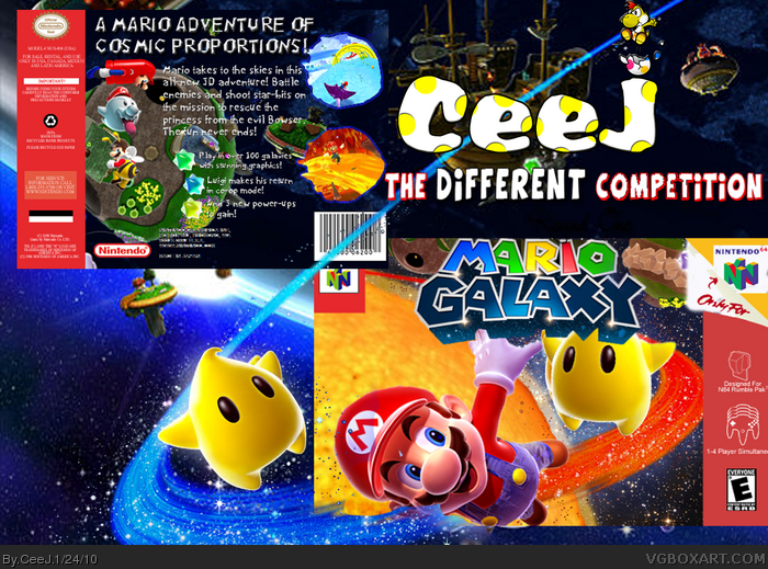
My entry to Enchanter's Different comp. Unfortunately it is not doing well as the box on the other guy's is AMAZING! I think my backis better. Credit; Ayron for the power-ups.
The logo looks as though it's only been placed right at the top of the box because it was the easiest way to hide the "Super". And the back text seems a bit misplaced. But everything else is pretty nice.
The presentation is real horrible I'm sorry. The package is blending right into the background and that's a real no go. It's about the package, so it should stand out!
 Mario Galaxy Box Cover Comments
My entry to Enchanter's Different comp. Unfortunately it is not doing well as the box on the other guy's is AMAZING! I think my backis better. Credit; Ayron for the power-ups.
[ Reply ]
it's nice!
[ Reply ]
I like the box, but the presentation takes away the attention from the box, and it kind of blends in. Try and tone it down a bit :)
[ Reply ]
#3. i agree
[ Reply ]
Ok guys thanks!
[ Reply ]
The logo looks as though it's only been placed right at the top of the box because it was the easiest way to hide the "Super". And the back text seems a bit misplaced. But everything else is pretty nice.
[ Reply ]
Yeah I reallised that too but all too late. I did actually render it out and play with it. Misplaced how? What do you mean? Thanks. Is it worth a fav?
[ Reply ]
The presentation is real horrible I'm sorry. The package is blending right into the background and that's a real no go. It's about the package, so it should stand out!
[ Reply ]
I agree with what has already been said. The box blends into the presentation too much, and the logo placement on the front is terrible.
[ Reply ]
make printable
[ Reply ]