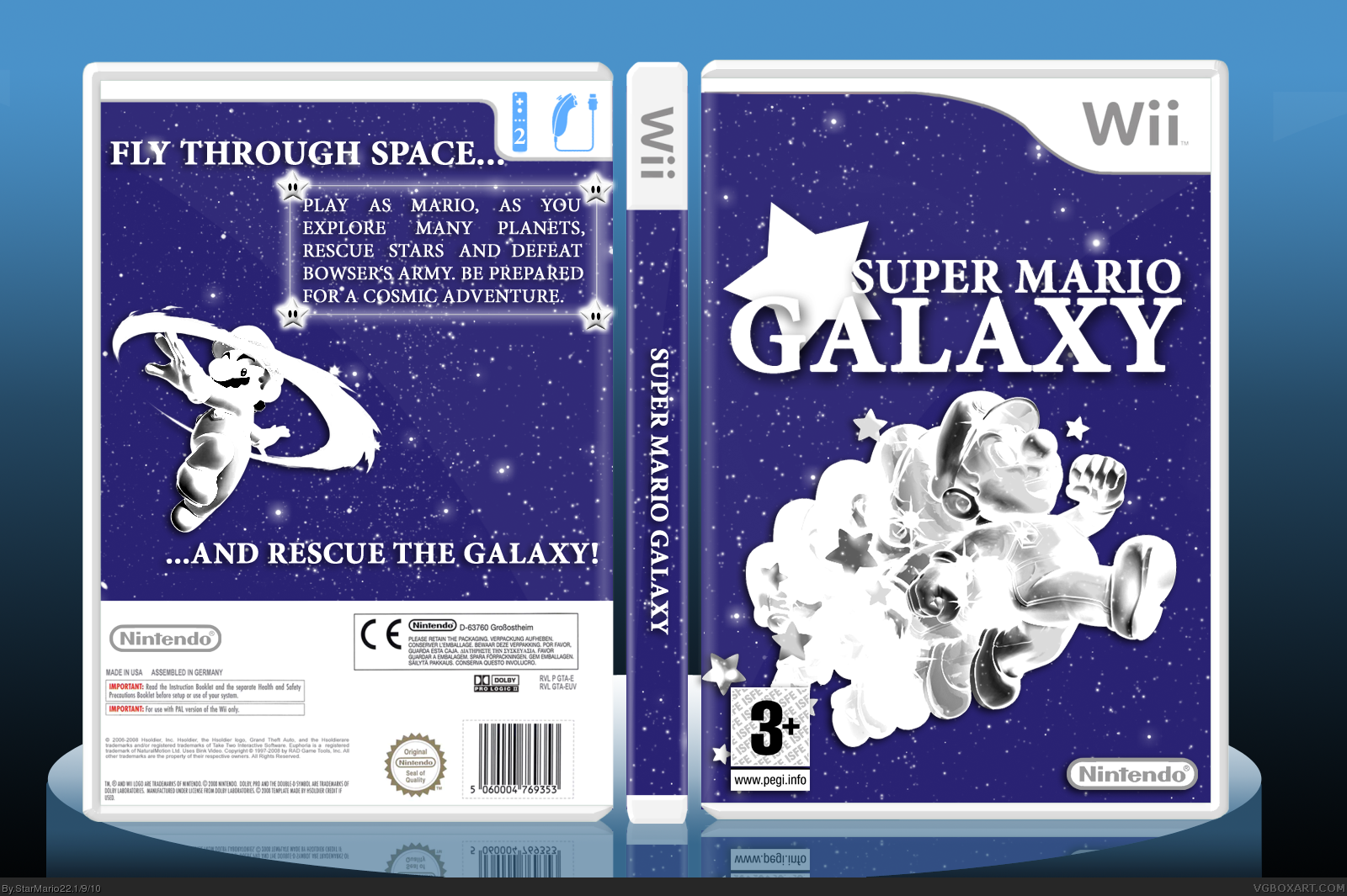
okay... this box is almost utterly perfect...
just 2 bothersome adjenda's
1)screenshots? i don't think it would ruin it
just have to find appropriate ones
2) that star 0.0 lift it a little out of the logo...
#5, man, this is like a Essence box with silouehtes (typo?), There must be no screenshots and I wanted to make much of Empty Space.
And I really like that Star on the Logo.
i'm not saying take it out completely or take i off the logo. just lift it up a little bit...
i really like the box, nd i wanna fave >_> just the star is bothersome
There's so many problems with this design.
I understand the concept,and it's very original, but that won't get you all the way.
The background is bland,since it's exactly the same on every spot.
That's not a problem if you have lots of different elements overlapping it, but you've only put a render on it[counts for both the back and the front].
So, either add some elements to the background[planets,stars etc etc],or change the design to include more renders or other elements.]
The back also feels too empty.
This is because of the small text block, ditto tagline,and the fact that there's ONLY text and one other element.[the render,in this case]
I suggest looking at either official back covers or back covers of some of the more established members of this site for inspiration and ideas for this.
#13, thanks. I said. I wanted MUCH EMPTY SPACE. I like how the background is. So I live it as it is. There aren't many problems, it's about how I like the Design, 'BOUT I LIKE THE DESIGN.
#14, I don't want to insult you, but i believe i have enough experience to say if a design has problems or not.
Your attitude is very disturbing,to say the least.
 Super Mario Galaxy Box Cover Comments
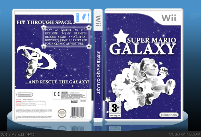
Hi.
I wanted to make a simplicity design, and I've chosen the game Super Mario Galaxy.
Template is by hsoldier.
[ Reply ]
You forgot screenshots
[ Reply ]
#2, I've never seen any simplelistic Covers with screenshots. It would ruin it, too.
[ Reply ]
#3, ok
[ Reply ]
okay... this box is almost utterly perfect...
just 2 bothersome adjenda's
1)screenshots? i don't think it would ruin it
just have to find appropriate ones
2) that star 0.0 lift it a little out of the logo...
[ Reply ]
#5, man, this is like a Essence box with silouehtes (typo?), There must be no screenshots and I wanted to make much of Empty Space.
And I really like that Star on the Logo.
[ Reply ]
i'm not saying take it out completely or take i off the logo. just lift it up a little bit...
i really like the box, nd i wanna fave >_> just the star is bothersome
[ Reply ]
#7, Ok, I'm also making it smaller.
[ Reply ]
okay.
don't take it out, i like how its there, just the effect it has oh the G
[ Reply ]
UPDATE
Edited at 1 decade ago
[ Reply ]
It could be better, but it's also great how it is. Fav.
[ Reply ]
thats really nice, i'll fave now :)
[ Reply ]
There's so many problems with this design.
I understand the concept,and it's very original, but that won't get you all the way.
The background is bland,since it's exactly the same on every spot.
That's not a problem if you have lots of different elements overlapping it, but you've only put a render on it[counts for both the back and the front].
So, either add some elements to the background[planets,stars etc etc],or change the design to include more renders or other elements.]
The back also feels too empty.
This is because of the small text block, ditto tagline,and the fact that there's ONLY text and one other element.[the render,in this case]
I suggest looking at either official back covers or back covers of some of the more established members of this site for inspiration and ideas for this.
Good luck.
[ Reply ]
#13, thanks. I said. I wanted MUCH EMPTY SPACE. I like how the background is. So I live it as it is. There aren't many problems, it's about how I like the Design, 'BOUT I LIKE THE DESIGN.
(Sorry, I'm pissed off for some reasons)
Edited at 1 decade ago
[ Reply ]
The front looks pretty nice, but IMO, the back is...umm...erm...well...empty (PLEASE DON'T HURT ME :P).
Edited at 1 decade ago
[ Reply ]
It's well made, you did a great job!
But unfortunetaly, by default it's not an appealing box because it's monochrome, and the two colors are white and an unpleasant hue of blue.
[ Reply ]
#14, I don't want to insult you, but i believe i have enough experience to say if a design has problems or not.
Your attitude is very disturbing,to say the least.
[ Reply ]
#17, yeah sorry about that, but I like it so I leave it as it is.
[ Reply ]