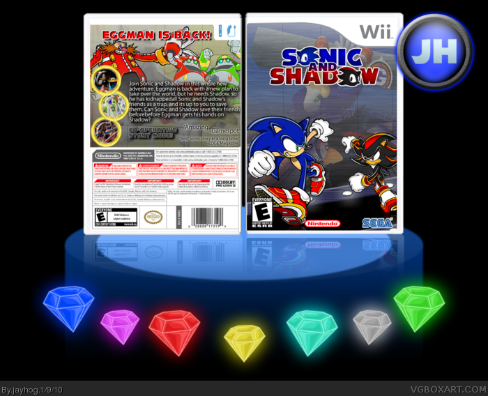
This box has taken me all day to complete, and I mean all day, it's been non-stop working on it since i loaded my computer up this morning. I came up with this idea when I was going to make a Sonic and Knuckles 2 box, but then i found the front 2 renders and thought that it would be perfect for a front. I also decided to go for something a little bit different (I think) by adding screen shots onto the background of the front and back covers. I like to think of it as being like past memories from Sonic and Shadow. Anyways, i posted this up in the WiP forum and it got some replies but only 3 or 4 and I thank the users who did comment on this to help me make this better. But before I came to upload it I felt like something was missing and I still didnt have much from the WiP's so I spoke to Koopadasher and he helped me out on some things I should change so thank you Koopadasher.
Credit to:
Jevangod - Temp
Sonic art archive - Renders
Google - Screen shots.
Everything else was made by myself.
Very interesting concept, but I think the name is very generic. I dislike the way that the drop shadow is so far away from the actual text, because it is hard to read. The front is a bit plain and I dont like the placement of the tagline.
#2, Thanks for the feedback, ill update soon with the text on the back edited, it seems like the main problem. And I was stuck for a name of the box so I decided to go with the generic one.
Also, the tag line placement seemed like a good idea when i first thought of it :P
Update!
Logo edited, screen borders added credit to Eggboy'13 for those, background on the front is less transparent and review quotes added in the empty space of the back.
Much better! I really like that logo. I also feel that the text that says "co-operative story mode" should be changed colour, it fades into the background. I would like to see the font changed for the synopsis. And that nintendo logo on the front looks like something sat on it, lol.
 Sonic and Shadow Box Cover Comments
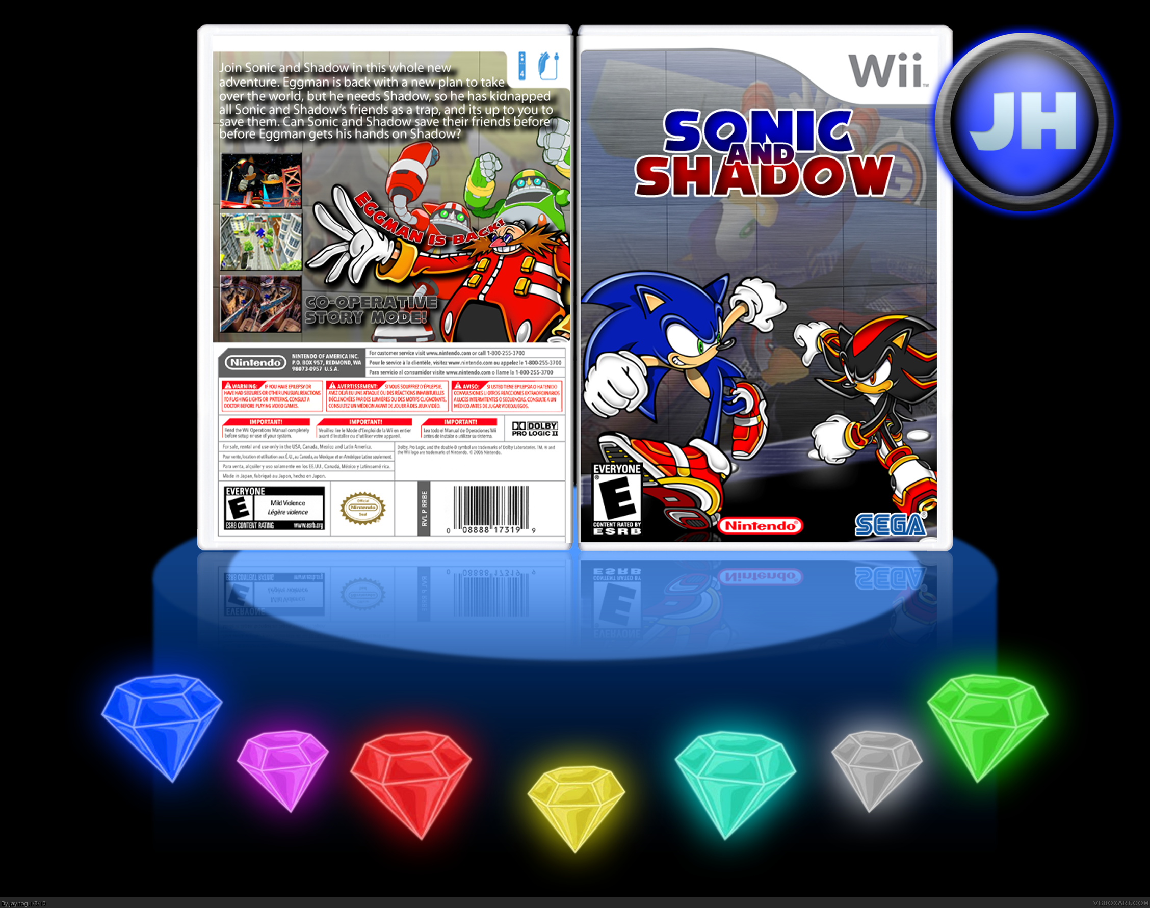
This box has taken me all day to complete, and I mean all day, it's been non-stop working on it since i loaded my computer up this morning. I came up with this idea when I was going to make a Sonic and Knuckles 2 box, but then i found the front 2 renders and thought that it would be perfect for a front. I also decided to go for something a little bit different (I think) by adding screen shots onto the background of the front and back covers. I like to think of it as being like past memories from Sonic and Shadow. Anyways, i posted this up in the WiP forum and it got some replies but only 3 or 4 and I thank the users who did comment on this to help me make this better. But before I came to upload it I felt like something was missing and I still didnt have much from the WiP's so I spoke to Koopadasher and he helped me out on some things I should change so thank you Koopadasher.
Credit to:
Jevangod - Temp
Sonic art archive - Renders
Google - Screen shots.
Everything else was made by myself.
[ Reply ]
Very interesting concept, but I think the name is very generic. I dislike the way that the drop shadow is so far away from the actual text, because it is hard to read. The front is a bit plain and I dont like the placement of the tagline.
[ Reply ]
#2, Thanks for the feedback, ill update soon with the text on the back edited, it seems like the main problem. And I was stuck for a name of the box so I decided to go with the generic one.
Also, the tag line placement seemed like a good idea when i first thought of it :P
[ Reply ]
Update.
Changed the back quite a bit.
[ Reply ]
i like it!
[ Reply ]
Update!
Logo edited, screen borders added credit to Eggboy'13 for those, background on the front is less transparent and review quotes added in the empty space of the back.
[ Reply ]
I really like that logo. If you made it yourself, well done :)
[ Reply ]
#7, Thanks and yeah I made it myself :)
[ Reply ]
Nice the logo looks much better now too
[ Reply ]
#9, Thanks, that logo too quite a bit to make too, so I'm glad people like it :)
[ Reply ]
Much better! I really like that logo. I also feel that the text that says "co-operative story mode" should be changed colour, it fades into the background. I would like to see the font changed for the synopsis. And that nintendo logo on the front looks like something sat on it, lol.
[ Reply ]
Love it! Nothing wrong i can point out.
[ Reply ]
#11 This, and also change the screenshot border colors to
Blue
Red
Blue
[ Reply ]
#13, theyree meant to be rings
[ Reply ]
wow this looks realy good best of yours since your previous sonic ones 9/10
fav
Edited at 1 decade ago
[ Reply ]
#14 Ah, nvm then
[ Reply ]
#15, Thanks man :)
[ Reply ]