[ Box updated on December 22nd, 2009 ] [ original ]
 Ratchet and Clank Future: A Crack In Time Box Cover Comments
Comment on Gorgoroth's Ratchet and Clank Future: A Crack In Time Box Art / Cover.
This is a well-due box I feel, you just don't get much better than Ratchet and Clank, and it's time more people recognise that.
[ Reply ]
Dude, the dimensions for this box look a bit perfect, the front is great, the back is great, I'm liking the logo and screenshot placements.
[ Reply ]
#2, Thanks dude.
[ Reply ]
ratings are different for back and front
[ Reply ]
#4, nice one for spottin, ty.
[ Reply ]
its good, but why have you put it in the 360 section?
[ Reply ]
Very nice. Good colours.
P.S. I like your username. Tolkien is always a good thing :)
[ Reply ]
Thanks Roza, I just noticed, ty. Unfortunately I don't know how to change.
Edited at 1 decade ago
[ Reply ]
I'm contemplating making the Dr's head dome translucent, I dunno Why I didn't in the first place.
[ Reply ]
I wanna know how long it'll be before you get into the hall of fame. You certainly have the talent...I'm jealous.
But yeah, i've never played a Ratchet and Clank game but from what i've seen from the covers, this looks very official.
[ Reply ]
Thanks man. I think it's cos of my rank. If I improve, more people will check my boxes (fingers crossed)
[ Reply ]
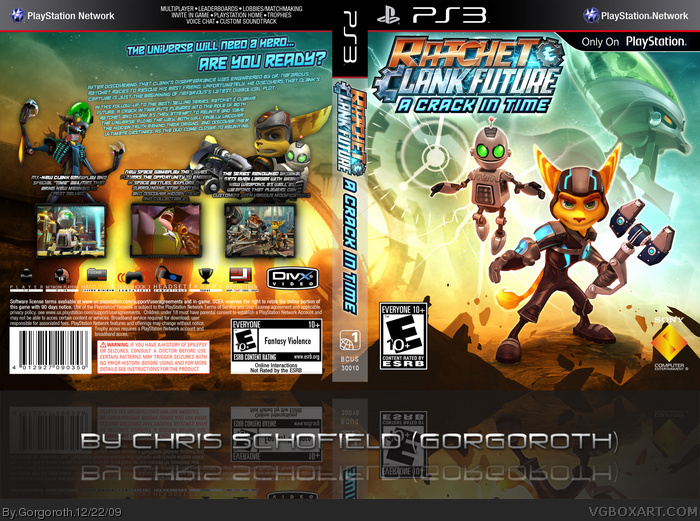
The front of this case doesn't look too bad but, could be re-sized a little better. And the back truly needs more work. Why is the wording angled on the top portion of the back in that way? And again, what's with the DiVX logo? There is much room for improvement, though. Doctor Nefarious could be re-sized bigger on one side and Ratchet on the other. Perhaps on opposite corners?
[ Reply ]
Dude, piss off. You clearly don't have a scoob, so don't tell me what to do. Attain rank one before you tell folk what to do, FFS.
[ Reply ]
#13, You should try and be a little less egotistical about people giving you critiques, even ones such as #12. I think the attitude of your comments on boxes is what turns people off about your boxes, and as such, they don't pay attention to you.
I like your work, this box is actually pretty nice, but you have got to calm down. I've seen users who get mad at people like you are now, they don't usually get much attention because they don't want to deal with the attitude.
[ Reply ]
OK, tleeart, man, I do pay attention to peoples comments, seriously - just take a look at the average number of updates on my boxes :L, I know I'm not the best, but that particular guy has seiously not stopped his incessant shit. Y'know?
Edited at 1 decade ago
[ Reply ]
#15, Yeah, I get it. I just read his comment on your God of War III box. So I'm seeing the trend you're talking about. Sorry you got some idiot screwing with you every time you post a box.
[ Reply ]
lol, it happens to the best of us. Besides, look at his art - I'm not taking crap from him. :P
[ Reply ]
Nice box, looks extremely official. Just there is this bald spot on the left hand top corner for the back. But well done, another great box by you and if you produce another hi-quality box I'll give you an author fav!
[ Reply ]
#18, I am working on a new one. :)
[ Reply ]
It looks good, but all it is is a wallpaper with the back stuff added on.http://selectstartgames.files.wordpress.com/2009/10/ratchet-and-clank-future-a-crack-in-time-11.jpg
[ Reply ]
#20, that explains why its so good X)
[ Reply ]
It's insanely high quality but it lacks unity. It's not really organized enough. Still kudos on the dimensions and quality they're both spot on.
[ Reply ]
#20, Yeah, I did try to find more assets but there weren't many. I had to use this wallpaper.
[ Reply ]
#23, Thought Its very nice, ill fav!
[ Reply ]
ty :)
[ Reply ]
Looks very official, nice job
[ Reply ]