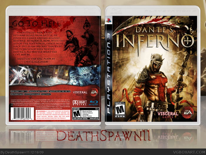
Wow. If you two have eyes he actually did alot more than that. He added blood to his sword like thing. Added a blast in the background making the cover more focused on him (which I loved). Changed it up to a better color tone. The logo looks better now actually.
I know ze back isn't the greatest -____-
I might revamp it if need be.
#12, I have the same background and render.
I edited the background a bunch, as you can see, there is not mass of undead at the bottom, nor are there as many buildings, and there is quite a lot of lighting going on, plus the black smoke down there.
Just because it has elements of the original doesn't mean it practically IS the original.
On a separate note, there isn't a lot of art for this game, if there was a different render of Dante which would've fit well, I would have used it.
Great work. Im not sure about a tweaked version but whatever you did surely brought out Dante on the cover. Newbie could I request for a printable copy pls. Would love to use this for my game. Much thanks
 Dantes Inferno Box Cover Comments
Put the lotion in the basket.
Credit to Sens for the template.
[ Reply ]
Incredible job DeathSpawn, looks awesome!
[ Reply ]
Nice front, but the back is... eh.
[ Reply ]
Yea the front I cant see you did alot of editting. The back is just meh.
[ Reply ]
Yes, the front looks incredible, but the back is pretty bland. I do like the idea with the screenshots though.
[ Reply ]
pretty slick-fav
[ Reply ]
NO U
Back sucks like always.
[ Reply ]
#7, I know.
I was honestly about to text you asking you to comment my box saying how much the back sucks hahaha. BD
[ Reply ]
You guys do know the front is the official box just tweaked alittle.
[ Reply ]
#9, Wow it is pretty much the same idea with a few edits. Pretty uncreative.
[ Reply ]
Wow. If you two have eyes he actually did alot more than that. He added blood to his sword like thing. Added a blast in the background making the cover more focused on him (which I loved). Changed it up to a better color tone. The logo looks better now actually.
[ Reply ]
I don't like how you just tweaked the official front.
link
Well tweaked, yes, but tweaked nonetheless.
And the back is meh.
[ Reply ]
nice. :)
[ Reply ]
I really dislike the back.
[ Reply ]
I know ze back isn't the greatest -____-
I might revamp it if need be.
#12, I have the same background and render.
I edited the background a bunch, as you can see, there is not mass of undead at the bottom, nor are there as many buildings, and there is quite a lot of lighting going on, plus the black smoke down there.
Just because it has elements of the original doesn't mean it practically IS the original.
On a separate note, there isn't a lot of art for this game, if there was a different render of Dante which would've fit well, I would have used it.
[ Reply ]
#12, There is VERY limited art for this game, and DeathSpawn did an incredible job with the art available.
[ Reply ]
Great work. Im not sure about a tweaked version but whatever you did surely brought out Dante on the cover. Newbie could I request for a printable copy pls. Would love to use this for my game. Much thanks
[ Reply ]