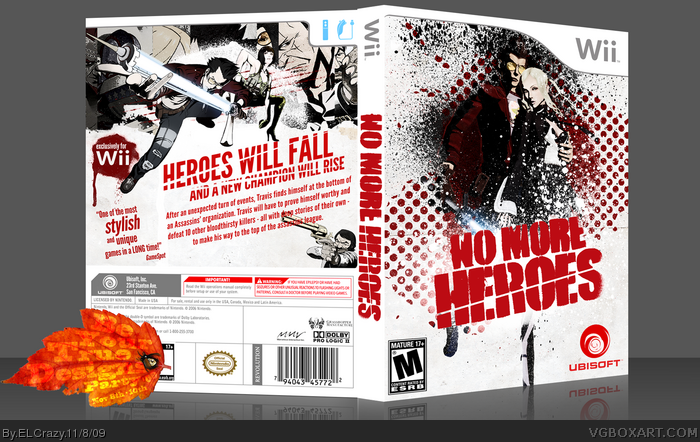
I was looking at my progress over the years, and I realised I've improved dramatically. I revisited my NMH box I did in January 08, and realised I can actually remake it, which is what I might do to other boxes too. THIS is what I originally intended to do, and therefore, I'm really proud of this one. Enjoy! :)
I love the half tone pattern on the front. I think the back should have a little of that on the image that Travis is jumping out of to tie it together.
 No More Heroes Box Cover Comments
This is my BYTD Fall Party box.
I was looking at my progress over the years, and I realised I've improved dramatically. I revisited my NMH box I did in January 08, and realised I can actually remake it, which is what I might do to other boxes too. THIS is what I originally intended to do, and therefore, I'm really proud of this one. Enjoy! :)
[ Reply ]
Duuuuude.
[ Reply ]
Not bad.
The polkadots make me very uneasy, which is probably what you intended.
[ Reply ]
Holy Cupcakes.
[ Reply ]
Superb, I think you went a little crazy with the brushing on the front though (although I shouldn't be talking :P)
[ Reply ]
I liked your first one.
I LOVE THIS ONE! It's truly superb, as Karma said.
[ Reply ]
Front looks great and I like how I am able to focus my eyes on one point.
[ Reply ]
Not a fan of the middle section on the back.. but everything else is great :)
[ Reply ]
I love the front.
[ Reply ]
very nice! :D
[ Reply ]
Great stuff as usual Dan. I love the lines through the texts on the back.
[ Reply ]
To be honest, it seems generic and ugly (especially the back). That may seem harsh, but you've done much better boxes in a similar style.
I don't want to give you candy floss comments, because I know you are capable of something far more creative.
Edited at 1 decade ago
[ Reply ]
I love the half tone pattern on the front. I think the back should have a little of that on the image that Travis is jumping out of to tie it together.
[ Reply ]