#3, I agree about Alan, and he could be feathered into the background abit. But I like the red template.
Also on the back of the box don't put multiple full stops, if anything only put 3, on your top paragrph it has gone a bit too far with the full stops. But good box overall :)
#5, Thanks.
#4, I will be sure to unstretch him, make him feather into the background as you said and stop using full stops, i will use 3 as you said.
#3, I will take out the "A Phsycological Action Game".
All, Thanks for viewing and helping me correct the mistakes, be sure to check back when i update it.
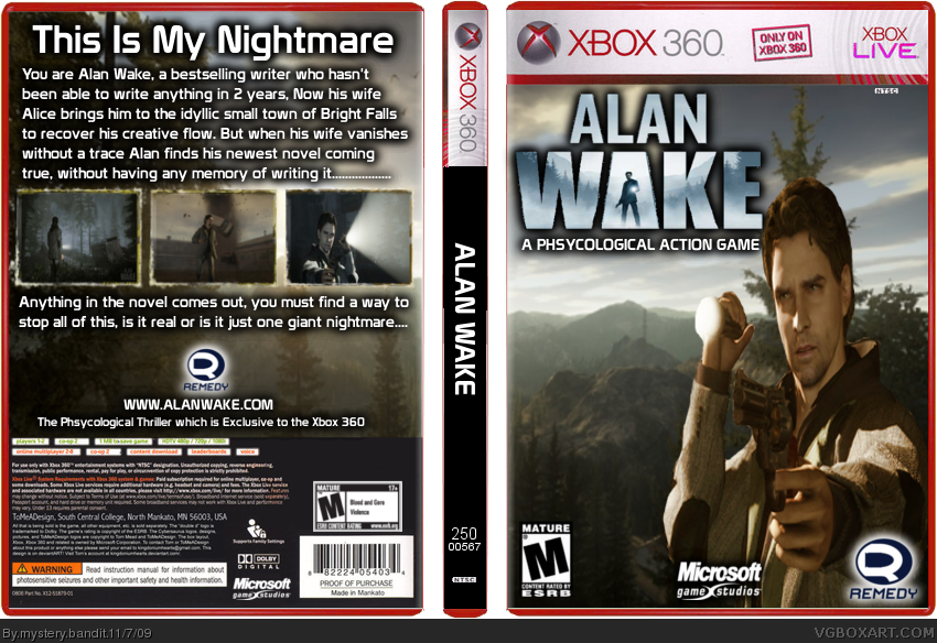
Okay, so i have updated it, with a few differences.
#5, Roarshark, said i should use the real 360 template, so i changed it from red to green.
#4, jayhog, I took out the thousand ....'s and replaced them with 3 and i dropped a shadow twice to make him ease into the BG.
#3, Sir Tobii, i took the advice and made Alan smaller, making him look just the right size and i also took out the subtitle from underneath the Alan Wake logo.
I think it looks alot better then before, now i look at both versions i can see that Alan did look a bit stretched, so thanks for the help guys and i hope this looks better.:)
 Alan Wake Box Cover Comments
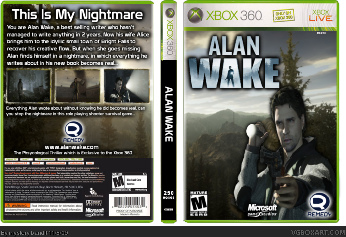
Hey all, this is my second box, there is alot of hype going into this game and i like the idea, kinda reminds me of the silent hill games and movie.
I rendered the main character Alan and the Alan Wake logo myself.
Credit to LEGOslayer for the fantastic screenborders.
Oh and the xbox360 case is just made a different color, i thought Red would be a good one.
Edited at 1 decade ago
[ Reply ]
The reason Alan has a torch in his hand is because he is facing a dark allyway.
sorry for the double post, i've got to stop now anyway, going out with a bunch of mates from college.
Edited at 1 decade ago
[ Reply ]
Alan is very strechted, and I don't think it's "A Psychological Action Game" It's "A Psychological Thriller"
The Red case dosen't look that good either, the purple on LIVE ruins it.
[ Reply ]
#3, I agree about Alan, and he could be feathered into the background abit. But I like the red template.
Also on the back of the box don't put multiple full stops, if anything only put 3, on your top paragrph it has gone a bit too far with the full stops. But good box overall :)
[ Reply ]
You should use the real template, and the render needs some work, but over all not bad for a second box.
[ Reply ]
#5, Thanks.
#4, I will be sure to unstretch him, make him feather into the background as you said and stop using full stops, i will use 3 as you said.
#3, I will take out the "A Phsycological Action Game".
All, Thanks for viewing and helping me correct the mistakes, be sure to check back when i update it.
[ Reply ]
Okay, so i have updated it, with a few differences.
#5, Roarshark, said i should use the real 360 template, so i changed it from red to green.
#4, jayhog, I took out the thousand ....'s and replaced them with 3 and i dropped a shadow twice to make him ease into the BG.
#3, Sir Tobii, i took the advice and made Alan smaller, making him look just the right size and i also took out the subtitle from underneath the Alan Wake logo.
I think it looks alot better then before, now i look at both versions i can see that Alan did look a bit stretched, so thanks for the help guys and i hope this looks better.:)
[ Reply ]
The only thing I don't like is that Alan seems to be stretched, but otherwise is very good for a second!
+Fav
[ Reply ]
#8, Thanks, I'll figure it out eventually, still getting the hang of the program, the tutorial videos helped alot.
Maybe my next will be better, it's resident evil 4 on the PS3.
[ Reply ]
For your second this is very good. You have defiantly improved. Fav
[ Reply ]
#10, Thanks.
My next box is Gears Of War 3, i will upload it tomorrow at 11am when the 24 hours have passed.
[ Reply ]