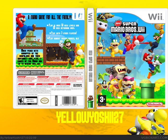
Ok, what I mainly put into this one was showing the 3-d artworks of the koopalings WOOT WOOT! I think it turned out Ok in the end.
Credit; jevangod for the template.
#2 Thanks, but if i made Mario bigger he'd be bigger than luigi which doesnt look good. I tried to put more focus on the koopalings.
Has anybody seen the intro for this? It rocks!! Its like, the koopaling legendary BIRTHDAY CAKE PLAN. Wickedly funny!
The front feels crowded with all those renders on it though, 2 of which are floating in mid air. Also try putting Bowser all the way in the background. Right now you can see him overlapping the bricks, clouds, and mountains.
#5 I tried not to make them floating more jumping actually and i'll edit with the bowser thing.
#6 Yeah, i know, ihad to make it crowded because the koopaling artwork had bits of certain kooplings missing so i had to hide them behind the others. Thansk for your comments anyway.
#7 Ok ill change that in an update, Thanx for the fav though.
Oh my, I think I like the 1st version best. There's just too much going on on the front. Maybe do good guys on the front bad guys on the back or something, but as is, it's just too way way way over crowded.
Freaking awesome. All it needs is Ludwig on there and it would be perfect. Also, what are the chances of having a red version of it so it matches the original case?
 New Super Mario Bros. Wii Box Cover Comments
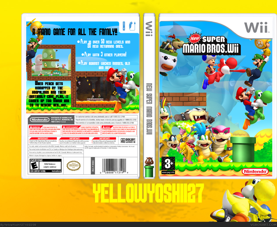
Ok, what I mainly put into this one was showing the 3-d artworks of the koopalings WOOT WOOT! I think it turned out Ok in the end.
Credit; jevangod for the template.
[ Reply ]
Really great but you might want to make Mario bigger ,so he really stand out.
P.S.:fav'd it
[ Reply ]
#2 Thanks, but if i made Mario bigger he'd be bigger than luigi which doesnt look good. I tried to put more focus on the koopalings.
Has anybody seen the intro for this? It rocks!! Its like, the koopaling legendary BIRTHDAY CAKE PLAN. Wickedly funny!
[ Reply ]
#3, Yeah the intro's funny
[ Reply ]
The front feels crowded with all those renders on it though, 2 of which are floating in mid air. Also try putting Bowser all the way in the background. Right now you can see him overlapping the bricks, clouds, and mountains.
[ Reply ]
A bit crowded.
[ Reply ]
I like it, but I did not like you've used the same render on front and back...
[ Reply ]
#5 I tried not to make them floating more jumping actually and i'll edit with the bowser thing.
#6 Yeah, i know, ihad to make it crowded because the koopaling artwork had bits of certain kooplings missing so i had to hide them behind the others. Thansk for your comments anyway.
#7 Ok ill change that in an update, Thanx for the fav though.
Edited at 1 decade ago
[ Reply ]
You forgot to add Ludwig Von Koopa, the genius with the cool blue hair!!
[ Reply ]
Oh my, I think I like the 1st version best. There's just too much going on on the front. Maybe do good guys on the front bad guys on the back or something, but as is, it's just too way way way over crowded.
[ Reply ]
#9 Oops, right time for another update
#10 I quess it I's still a bit crowded.... Maybe koopalins on back?
[ Reply ]
I've looked at other NSMBwii boxes and some are really crowded. More than this one.
[ Reply ]
Freaking awesome. All it needs is Ludwig on there and it would be perfect. Also, what are the chances of having a red version of it so it matches the original case?
[ Reply ]
#13, Thanx man, your comment made me feel i should update this. :) Thanx dude.
[ Reply ]
Ratings are different, ESRB or Pegi choose one.
[ Reply ]