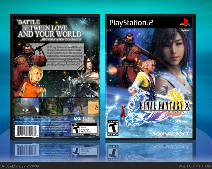
I like it...but its a little to full on the front...you added a BG, an image faded on the BG, a girl faded,that dude with the sword...and thatdude behind the logo...but the box itself is ok...I'll fav.
I don't like Auron on the front. Tagline is confusing to me. The game didn't have an outer-spacey atmosphere. Uh, I guess that's it.
And on the front you have Squaresoft and on the back you have Square Enix.
SM22, out of curiosity, have you played this game? On the back, the right screenshot is for FFXII and the one next to it is for FFX-2. You might want to adjust the brightness so the separate images go together better.
 Final Fantasy X Box Cover Comments
Hi people!
My newest box is here! :] It's my first Final Fantasy and PS2 Box. I really like the box adn you?
Credits:
Renders: Planet Renders/Jevangod
Logo: rendered out myself
Backgrounds: Google
Template: qwerty334
[ Reply ]
The main front image is used alot but i really like this. + Fav
[ Reply ]
I like it...but its a little to full on the front...you added a BG, an image faded on the BG, a girl faded,that dude with the sword...and thatdude behind the logo...but the box itself is ok...I'll fav.
Edited at 1 decade ago
[ Reply ]
#3 I added effects and stuff on it too!
Edited at 1 decade ago
[ Reply ]
I don't like Auron on the front. Tagline is confusing to me. The game didn't have an outer-spacey atmosphere. Uh, I guess that's it.
And on the front you have Squaresoft and on the back you have Square Enix.
Edited at 1 decade ago
[ Reply ]
SM22, out of curiosity, have you played this game? On the back, the right screenshot is for FFXII and the one next to it is for FFX-2. You might want to adjust the brightness so the separate images go together better.
[ Reply ]
#7, Only saw it from a friend. :p Never played it.
[ Reply ]
Besides the flaws mentioned above, this is a very nice composition.
Well done!
[ Reply ]
I love it!
[ Reply ]
If Square used a box art like this, then they would have gotten it right.
[ Reply ]