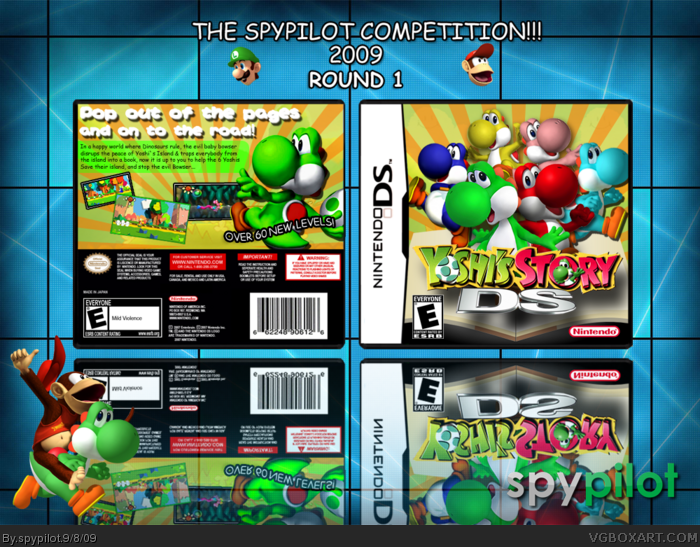
my newest box, made for an example for the spypilot competition. credit:
numerobetically - template
tmrd - username logo
JDevil - yoshi's story logo.
---------------------------------------------------------------------
this box took me 4 hours to get right, i took my time and to my opinion, it is one of my best so far. (my others being wario bros, luigi vs donkey kong and bowsers inside story [the solo project]) so c&c as always and if you havent see my mario and luigi box i recomend you do: link
(also, if you decide to fav, i would appreaciate a comment, thnx)
The back does a good front bad. The tagline is good, but the screenshot placement looks like you're trying to fill space, and the blue opaque box holding the description text is clashing with the bright yellow.
#2, as ive said before, my parents dont let me download fonts so i cant really get cool ones, but thanks man!
#3, it was either that or the thick stroke that you despise.
EDIT, back slightly changed, but not drastically.
I really like it! But I wish the drop shadow on the logo on the front was either lowered A LOT or removed completely ... or maybe kept the same, just change the direction so its not so far apart?
Its really good, but there's only one other problem. The brightness / contrast on some Yoshis are different from others (the Brawl render on the front and the SM64 DS one on the back). My suggestion is to play with the brightness / contrast until they all look similar.
I love the front, but the lower left corner on the back gives the box a feeling of emptiness, but in overall is very good! +Fav
I wanna ask you a question... why you put the refection so far from the box?
 Yoshi's Story DS Box Cover Comments
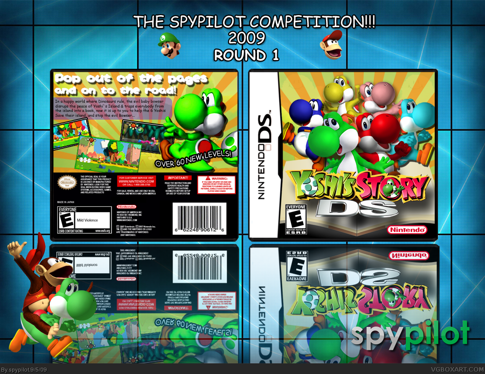
my newest box, made for an example for the spypilot competition. credit:
numerobetically - template
tmrd - username logo
JDevil - yoshi's story logo.
---------------------------------------------------------------------
this box took me 4 hours to get right, i took my time and to my opinion, it is one of my best so far. (my others being wario bros, luigi vs donkey kong and bowsers inside story [the solo project]) so c&c as always and if you havent see my mario and luigi box i recomend you do: link
(also, if you decide to fav, i would appreaciate a comment, thnx)
[ Reply ]
Nicely done. I really can't find any complaints except for the use of Comic Sans font.
It's very clean, it's well composed, the colors work together well, I like the presentation.
Overall pretty nice job.
[ Reply ]
The back does a good front bad. The tagline is good, but the screenshot placement looks like you're trying to fill space, and the blue opaque box holding the description text is clashing with the bright yellow.
[ Reply ]
#2, as ive said before, my parents dont let me download fonts so i cant really get cool ones, but thanks man!
#3, it was either that or the thick stroke that you despise.
EDIT, back slightly changed, but not drastically.
Edited at 1 decade ago
[ Reply ]
The back looks pretty good to me, and everything flows nicely. It's a darn good job.
[ Reply ]
Not a fan of the back cover title, but nicely done nonetheless. :)
[ Reply ]
I really like it!! Just one question....
Why are you entering your own comp?
[ Reply ]
#7, im not, its just an example for what the boxes in round 1 should look like.
[ Reply ]
#8, Oh! I get it! I feel stupid...
[ Reply ]
I really like it! But I wish the drop shadow on the logo on the front was either lowered A LOT or removed completely ... or maybe kept the same, just change the direction so its not so far apart?
Its really good, but there's only one other problem. The brightness / contrast on some Yoshis are different from others (the Brawl render on the front and the SM64 DS one on the back). My suggestion is to play with the brightness / contrast until they all look similar.
[ Reply ]
Not bad of an example.
[ Reply ]
Nice!
You should make the D green and S red, if you want.
[ Reply ]
All looking good, though I don't like the tagline and the brightness/contrast issue that YS brang up.
Fix these, and I'll happily favourite =)
[ Reply ]
I love the front, but the lower left corner on the back gives the box a feeling of emptiness, but in overall is very good! +Fav
I wanna ask you a question... why you put the refection so far from the box?
[ Reply ]
#14, because i like to, it looks good, right?
[ Reply ]
That is MUCH better, the green on the back fits the scheme nicely, and the screens look proer now.
[ Reply ]
#16, but still no fav?
[ Reply ]
Looks good, I'll fav.
[ Reply ]
Great job man! :)
Edited at 1 decade ago
[ Reply ]
I would looooove for this to become a reality
[ Reply ]
UPDATED!
-saturation issues fixed.
[ Reply ]
I like it. The way you got all the Yoshi's to fit on the front without making it look to crowded. +fav
[ Reply ]
nice i followed through wip im glad its done
[ Reply ]