I thought the game was the pits, but this box for it is very cool. I can see a good amount of editing went into the aesthetics, and I like the orange / red colors throughout. Good job!
#5, thanks for both favs! =)
#6, I heard this game is not the greatest. I just liked its artwork.
#7, you are one of those rare people on this site who look at the box itself and not who made it. Thank you for that.
#9, I know how it is, I did a Assassin's Creed II box with about 300 views, and only 5 favs. And I was really happy with it.
Peoples at VGB is really lazy nowadays...
its not bad, but i got ze good, ze bad, and ze ugly
ze good:
tons of effort
nice colour scheme
well placed and orginized
ze bad:
big empty space on the back
a little cluttered
ze ugly:
unlegible logo, all i see is 25
Nice, i like your work here man. Full view is great, nice and crisp and clean and it all flow really well. I would have perhaps chosen a more straight styled font for the blurb as it is a little hard to read in full view (not overly hard, but you have to look that little biut closer). I like you screen shot montage on the back, IMO BETTER than standard screens.
Great work! Its time for an author fav. Thanks for the reminder too!!
And #14, sounds like this boxart is exceeding your PC's colour palette. Try updating your monitor drivers and it might fix it.
#14, I agree about the logo, but that's the official logo. It doesn't help either that I wasn't able to find hi-res logo.
#15, appreciate your honest feedback! =)
 25 to Life Box Cover Comments
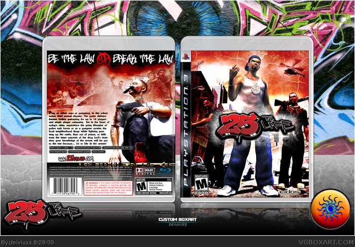
Here's my box for "25 to Life" video game.
Did a lot of editing for image, both front and back (if anyone cares).
Comments & favs appreciated.
Thanks!
[ Reply ]
Honestly... You are awesome.
My favorite artist on the site. Love the style of your boxes!
[ Reply ]
Very nice work.
[ Reply ]
#2, thanks and you are one of my most favorite fans! =)
#3, you always say that, but never fav. =/
I guess this will get ignored again...
Edited at 1 decade ago
[ Reply ]
I think it's about time for an author fav. Great work here.
[ Reply ]
I've been interested in this game since its debut, but apparently the servers are now offline. *sad face* Anyways, I like it sir.
[ Reply ]
I thought the game was the pits, but this box for it is very cool. I can see a good amount of editing went into the aesthetics, and I like the orange / red colors throughout. Good job!
[ Reply ]
#5, thanks for both favs! =)
#6, I heard this game is not the greatest. I just liked its artwork.
#7, you are one of those rare people on this site who look at the box itself and not who made it. Thank you for that.
[ Reply ]
Can someone please tell me what's wrong with this box?
Only 152 views and 7 favs...
[ Reply ]
#9, I know how it is, I did a Assassin's Creed II box with about 300 views, and only 5 favs. And I was really happy with it.
Peoples at VGB is really lazy nowadays...
[ Reply ]
The front is great, but the back seems to be a bit too empty...
[ Reply ]
the front looks good the back does to but it feels like its missing something maybe try and add screen shots.
[ Reply ]
Have you guys looked at this box in FULL SIZE? If yes, then you would see that the back has everything it needs to have.
[ Reply ]
its not bad, but i got ze good, ze bad, and ze ugly
ze good:
tons of effort
nice colour scheme
well placed and orginized
ze bad:
big empty space on the back
a little cluttered
ze ugly:
unlegible logo, all i see is 25
[ Reply ]
Nice, i like your work here man. Full view is great, nice and crisp and clean and it all flow really well. I would have perhaps chosen a more straight styled font for the blurb as it is a little hard to read in full view (not overly hard, but you have to look that little biut closer). I like you screen shot montage on the back, IMO BETTER than standard screens.
Great work! Its time for an author fav. Thanks for the reminder too!!
And #14, sounds like this boxart is exceeding your PC's colour palette. Try updating your monitor drivers and it might fix it.
Edited at 1 decade ago
[ Reply ]
edit-
nevermind...lol
Edited at 1 decade ago
[ Reply ]
#14, I agree about the logo, but that's the official logo. It doesn't help either that I wasn't able to find hi-res logo.
#15, appreciate your honest feedback! =)
[ Reply ]