resi [ Buy Resident Evil 4 at Amazon ] By super-mega-hyper-sonic 41 on August 28th, 2009 No Printable Available Resident Evil 4 Box Cover Comments Comment on super-mega-hyper-sonic's Resident Evil 4 Box Art / Cover. Cancel Reply super-mega-hyper-sonic 41 [ 1 decade ago ] Hi peeps. You say the front is a wall and you die.It has been heavily edited. Cred PR and IGN. [ Reply ] XCore 42 [ 1 decade ago ] All these filters killed the quality of your box. I don't see how the front is heavily edited, you just used the blending tools. It looks like a big piece of "blur". Whats the font on your presentation though? May come in handy for my next box. [ Reply ] super-mega-hyper-sonic 41 [ 1 decade ago ] #2, I didn't realize the quality was that bad.You must have high standards.The font is called "Anything you Want".It is on Da Font. [ Reply ] billyman31 40 [ 1 decade ago ] have to agree with Xcore. it looks very blurry. [ Reply ] super-mega-hyper-sonic 41 [ 1 decade ago ] #4, .... Am I the only one whom thinks the quality is alright? [ Reply ] Spiner_ 42 [ 1 decade ago ] I'm sorry but all your backs looks the same with that "report". Pretty tired of it. [ Reply ] sacredgabz 27 [ 1 decade ago ] #5, Agree with all. Its blurry and I also agree with #6, all of your backs look the same. sorry, no fave from me. [ Reply ] spypilot 43 [ 1 decade ago ] too dark, it needs brightness [ Reply ]
 Resident Evil 4 Box Cover Comments
Hi peeps.
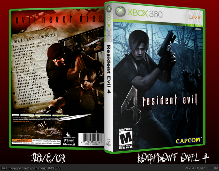
You say the front is a wall and you die.It has been heavily edited.
Cred PR and IGN.
[ Reply ]
All these filters killed the quality of your box. I don't see how the front is heavily edited, you just used the blending tools. It looks like a big piece of "blur".
Whats the font on your presentation though? May come in handy for my next box.
[ Reply ]
#2, I didn't realize the quality was that bad.You must have high standards.The font is called "Anything you Want".It is on Da Font.
[ Reply ]
have to agree with Xcore. it looks very blurry.
[ Reply ]
#4, ....
Am I the only one whom thinks the quality is alright?
[ Reply ]
I'm sorry but all your backs looks the same with that "report".
Pretty tired of it.
[ Reply ]
#5, Agree with all. Its blurry and I also agree with #6, all of your backs look the same. sorry, no fave from me.
[ Reply ]
too dark, it needs brightness
[ Reply ]