![]() »
»
[ Box updated on October 12th, 2014 ] [ original ]
 Metal Gear Solid 4: Guns of the Patriots Box Cover Comments
Comment on XCore's Metal Gear Solid 4: Guns of the Patriots Box Art / Cover.
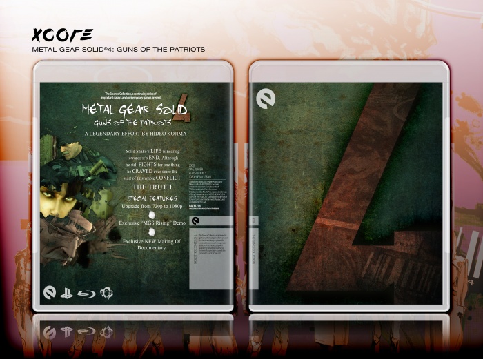
FULL VIEW PLEASE
CREDIT TO:
Sens.
My attempt at the Essence Collection.
Enjoy.
I made the inlay template by myself (300dpi, full vector). If you want it, PM me.
Edited at 1 decade ago
[ Reply ]
I was making something so similar to this, but I stopped because I felt it didn't really "capture the essence" of the game. I somewhat think this doesn't either
[ Reply ]
It fits in with the jungle like level of act 2 in the game. I like it!
[ Reply ]
As i said on MSN epic dude, epic!
[ Reply ]
Metal Gear? Didn't expect that....
#2, I still think people are missing the point of the Essence Collection. First of all, the word Essence is being taken way too literally. Making a box for this collection does not mean it has to encapsulate the essence of the game, it's simply an artistic take on the game that breaks away from standard box art conventions. That's it. You usually won't see the standard promotional materials on a box of this sort, most of the time even the logo will be different.
Probably pointless trying to explain this because if you are still having trouble getting the point of the Essence box, you probably never will.
As for this box, I get what you are trying to do, but I still think the front needs more. It's a bit too empty.
[ Reply ]
#5, Minimalism was the key for the front. Adding anything else would ruin the concept. The Four itself was the concept that justified it from my other projects, and I think it works very well on itself. I although tried adding in some more material, such as some artwork, although it just wouldn't fit.
Thanks for the deep explanation to Apollo though x_x
Edited at 1 decade ago
[ Reply ]
Added a 300dpi printable, and updated the bleak presentation.
[ Reply ]
Only nag.. i have is the fonts clash on the back... Thats all :)
[ Reply ]
There was another like this with almost the same concept over at the NeoGaf thread.
[ Reply ]
It looks awesome, and as far as the idea of Essence is concerned, what Xcore did with the front works. Considering how popular and well regarded the Metal Gear Solid series is, and how we all knew well in advance that part 4 would be the final chapter, I feel a gritty "4" as the focus point on the front certainly captures a very strong essence of the contained product.
Edited at 1 decade ago
[ Reply ]
Really nice design you have here man, real slick.
[ Reply ]
I thought MGS4 did run at 1080p native resolution? It does on my PS3, even the XMB is 1080p when I press the PS button, and my TV automatically displays in 1080p when I load the game.
I'm not sure actually, I originally thought it was 720p, but because of the above reasons I googled it about a month ago, and people said it was 1080p, but screenshots are all in 720.
Edited at 1 decade ago
[ Reply ]
#12 it runs in native 720p, although it's scaled to 1080p.
[ Reply ]
really something else isn't it love the natural look. +fav
[ Reply ]
congrats on HoF.
[ Reply ]
#13, actually im pretty sure its resolution is 1024 x 576, anyways great box. quite unique.
[ Reply ]
#16, He's talking about the game resolution, not the image size.
[ Reply ]
#16, nope. It's native 1280x720.
Edited at 1 decade ago
[ Reply ]
#18, What the hell? I didn't know they measured resoultion like that as well.
[ Reply ]
Good box, I would have liked it more for you to have replaced the screenshots with art. It would have flowed more in my view.
[ Reply ]
I Wouldn't say EFFORT it's like he tried but failed lol and try to make the pictures fully on the back other than that it's good
[ Reply ]
#21, who are you?
And do you even understand the concept of Essence? No, so be quiet.
[ Reply ]
Maybe I wasn't clear I meant on the back of the Box I wouldn't Say A LEGENDARY EFFORT BY KOJIMA
[ Reply ]
You spelled essence with 1 "S" on the gray wrap.
Edited at 1 decade ago
[ Reply ]
Spectacular.
[ Reply ]
Unique!
[ Reply ]
This is so going to the Masterworks area. Great job :)
[ Reply ]
Very, very, nice. I love the design overall.
[ Reply ]
Finally!
[ Reply ]
How is this the latest HoF entry? o_O It achieved a HoF aaages ago.
Edited at 1 decade ago
[ Reply ]
#30, Now it's MasterWorks...yeah, the title is a bit misleading.
[ Reply ]
#31, I never realised that happened - it should probably be fixed. I remember that 'random masterworks' used to be 'latest mastworks'.
Anyway, congratulations on your first MasterWorks XCore!
Edited at 1 decade ago
[ Reply ]
there is no rating title or publisher logo on the front and theres no publisher logo or rating on the back and theres just a big 4 on the front
[ Reply ]
This is the worst peice of crap ever it should be removed. Metal gear solid is already out why are you making this you fag. Metal Gear Solid 4 sucks so much donkey balls it is disgusting. you shoul d have made a better more creative box like mine LINK link
[ Reply ]
#34, UMAD?
[ Reply ]
#34, little kid
[ Reply ]
I don't think this is a cover for a game...
[ Reply ]