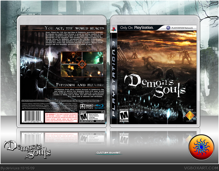
Hi,
Don't know why, but I decided to make a box for this game, which I don't know much, but it just looked cool, so I decided to give it a show.
I also, wanted to break the "Essence" chain and bring "regular" box back.
Let me know what you think by leaving a comment below!
Thanks...
The shadow shouldn't be going out in 2 different directions, 1 from the front and 1 from the back like it is. It's too bad you can't find a bigger logo, that would make the front killer. The back is already great. Good presentation too, classy, yet not boring. Thumbs up!
#14, believe me, I am sick of Essence boxes too and I won't be making one anytime soon (maybe never).
#15, what do you mean "not something i would do for a box"? I am working on an update and I might make borders silver.
Thanks for you favs, I have just crossed 200 favs!
thats actually different than i pictured it... but it looks alot cooler! you should have that same gradiant change in the gold underlines too. 4.5/5
keep going man! i smell greatness in this box!
#20, I tried changing them to silver, but it didn't look good to me. They don't stand out as much as when they are orange.
I don't think this will get HoF..not enough favorites and I don't think many people will see this box.
If you don't get 20+ favs in the day you posted the box, then you can basically forget about HoF...
Since the game came out last week, I decided to upload a printable. Surprisingly, it has received very good reviews (link.
Also, a small update to the box (added "Only on PlayStation" bar).
Awesome box! The layout of the back is really nice and it has this sort of feel to it. My only problem is that you forgot to put: "So hard you will s*** bricks" in the description. :)
 Demon's Souls Box Cover Comments
Hi,
Don't know why, but I decided to make a box for this game, which I don't know much, but it just looked cool, so I decided to give it a show.
I also, wanted to break the "Essence" chain and bring "regular" box back.
Let me know what you think by leaving a comment below!
Thanks...
Edited at 1 decade ago
[ Reply ]
Really great composition, both front and back.
Faved. :)
[ Reply ]
Yeah, I like it. :)
[ Reply ]
Glad you guys liked it and thanks for taking time and leaving a comment. Really appreciate!
[ Reply ]
Not enough attention for a truly awesome box.
Great job, though I think the logo could be a little bigger.
[ Reply ]
looks good
[ Reply ]
#5, that the size I found the logo and I didn't want to scale it up, 'cause then it would loose quality.
#6, Thanks!
[ Reply ]
I think it's your best one yet. Great job!
[ Reply ]
#8, Really..the best one? Well thank you. =)
UPDATE:
Also, I got bored with my "boring" presentation background and decided to make a new presentation. Let me know what you think!
[ Reply ]
Great box. Just I don't like the shadow and the reflection, but otherwise is very well. Fav
[ Reply ]
#10, I was kinda not sure about the shadow, I think I'll remove for my future boxes, but I'll keep the reflection.
[ Reply ]
The shadow shouldn't be going out in 2 different directions, 1 from the front and 1 from the back like it is. It's too bad you can't find a bigger logo, that would make the front killer. The back is already great. Good presentation too, classy, yet not boring. Thumbs up!
[ Reply ]
#12, I might try and look for a bigger logo. If I find one, should I keep it where it is or does it need to be moved somewhere else?
[ Reply ]
Thankyou SO MUCH for not making an essence box! I'm so sick of them I'll fav just for that ;)
I really like the composition of the box itself. I like the back more than the front :)
[ Reply ]
not something i would do for a box... but this is really nice! 4.3/5 +fav
i just think the screenshot borders could have been silver
[ Reply ]
#14, believe me, I am sick of Essence boxes too and I won't be making one anytime soon (maybe never).
#15, what do you mean "not something i would do for a box"? I am working on an update and I might make borders silver.
Thanks for you favs, I have just crossed 200 favs!
Edited at 1 decade ago
[ Reply ]
UPDATE:
- removed shadow
- made logo larger
- changed screenshot borders to light blue/silver color
Thanks for you feedback guys! =)
Edited at 1 decade ago
[ Reply ]
thats actually different than i pictured it... but it looks alot cooler! you should have that same gradiant change in the gold underlines too. 4.5/5
keep going man! i smell greatness in this box!
[ Reply ]
#18, you mean that the gold lines just above and below screenshots should be silver too?
also..what kind of greatness are you smelling..? =)
[ Reply ]
#19, no, i meant the text underlines. i smell a HOF in this box
[ Reply ]
#20, I tried changing them to silver, but it didn't look good to me. They don't stand out as much as when they are orange.
I don't think this will get HoF..not enough favorites and I don't think many people will see this box.
If you don't get 20+ favs in the day you posted the box, then you can basically forget about HoF...
[ Reply ]
This is pretty sweet, sorry I only just caught it. Version 3 is pretty darn amazing!
[ Reply ]
#22, better now then never..thanks! =)
[ Reply ]
Man, I can't believe I missed two updates to this box!
Great updates, v3 looks alot better.
[ Reply ]
#24, as I said before, I update my boxes very frequently and I advice to keep an eye on my updates. =)
[ Reply ]
Since the game came out last week, I decided to upload a printable. Surprisingly, it has received very good reviews (link.
Also, a small update to the box (added "Only on PlayStation" bar).
[ Reply ]
My major complaint is that the front is devoid of a strong focus.
Otherwise, this is fantastic. Keep up the great work.
[ Reply ]
#27, Thanks, LK but what do you mean by "front is devoid of a strong focus"? There's too much focus or there is not enough focus on the front?
Edited at 1 decade ago
[ Reply ]
Great use of the games artwork!
Very impressive case, after looking at this, it makes the official one look a tad boring!
[ Reply ]
HoF. Now.
[ Reply ]
#30, Haha..thanks for the support man! :)
[ Reply ]
Awesome box! The layout of the back is really nice and it has this sort of feel to it. My only problem is that you forgot to put: "So hard you will s*** bricks" in the description. :)
[ Reply ]
Nice Box and congrats on HOF
[ Reply ]
#32, haha..yeah, I heard that the game is very hard.
#33, thanks but the box isn't in the Hall..lol
[ Reply ]
#34, Oh yes it isss lol congrats
[ Reply ]
The box looks really good, but your printable version has a crease in it on the back.
[ Reply ]
Damn, I went to play Skyrim for few hours, came back and found this in the Hall (to bad it didn't stay on the front page long enough).
Once again, thanks for the support and feedback. I never though this would go as far as the Hall.
[ Reply ]
On a roll...Congrats again ;)
[ Reply ]