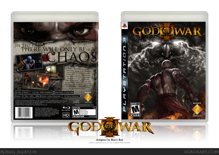
before i say anything, i have to give credit to Abraão Lucas for his amazing artwork that i edited to create the front!
Really like how it turned out!
#8, I think you should remove a bit of the color saturation at kratos on the front as well, if you wanna make it fit the back. or give him (his face) a bit more saturation on the back.
I don't think you should have listened to the comments. I think Version 1 is definitely the best. As it is now, Kratos doesn't stand out at all on the front. In fact he gets lost because he and the background are too similar in color. But I still like it a lot.
This is awesome, dude. You should have ignored Jevangod, though. Your first version looks much better. The colors on the front actually reminded me of hour the colors look in the game itself. And since when do the front and back have to match? Most official cases don't match back and front at all; Fallout 3, Heavy Rain, MGS4...
 God of War III Box Cover Comments
before i say anything, i have to give credit to Abraão Lucas for his amazing artwork that i edited to create the front!
Really like how it turned out!
[ Reply ]
Awsome.
faved
[ Reply ]
I dont know about this one. The color tone seems pretty weird on front. But the back is great.
[ Reply ]
I'm really loving this.
[ Reply ]
#3, weird in what way?
[ Reply ]
back and front look too diffrent to fit each other, but both look very well done.
[ Reply ]
#5, I dont know just blue, red and gold logo just seems a bit weird.
#6, agree
Edited at 1 decade ago
[ Reply ]
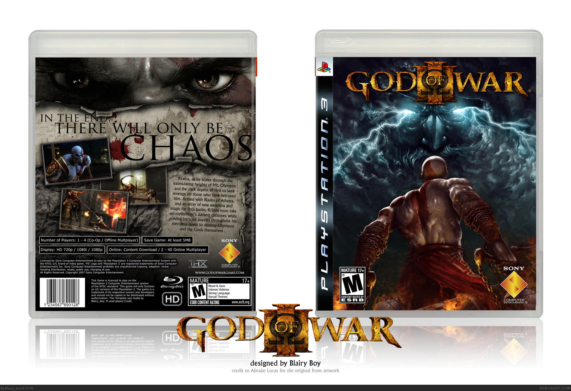
UPDATED! Tried to make the front and back match abit more and also tried to alter the colours on the front to help the colour tone!
[ Reply ]
#8, I think you should remove a bit of the color saturation at kratos on the front as well, if you wanna make it fit the back. or give him (his face) a bit more saturation on the back.
[ Reply ]
I dig it. I agree that the cover looks a lot better with less chroma.
[ Reply ]
Extremely well designed.
[ Reply ]
I don't think you should have listened to the comments. I think Version 1 is definitely the best. As it is now, Kratos doesn't stand out at all on the front. In fact he gets lost because he and the background are too similar in color. But I still like it a lot.
Edited at 1 decade ago
[ Reply ]
awesome box dude...but i have to be honest i do like your version 1 better but oh well you still get a fav and an author fav!
[ Reply ]
Wow, this is really nice. Both front and the back. Good job!
+FAV
[ Reply ]
Wow, this is really shitty. Both front and back suck my nuts. Awful fucking job!
+FUCKYOU
[ Reply ]
I'd rather have this than the retail art. Great job man keep it up!!
By the way, can you make printable versions of this?
Edited at 1 decade ago
[ Reply ]
looks better then the retail art great work best GOW 3 box art i seen
[ Reply ]
#17, Agreed.
[ Reply ]
This is awesome, dude. You should have ignored Jevangod, though. Your first version looks much better. The colors on the front actually reminded me of hour the colors look in the game itself. And since when do the front and back have to match? Most official cases don't match back and front at all; Fallout 3, Heavy Rain, MGS4...
Anyway, man, its brilliant! +fav
[ Reply ]
Faved. That back is ace.
[ Reply ]
Dark and moody. I like.
[ Reply ]