![]() »
»
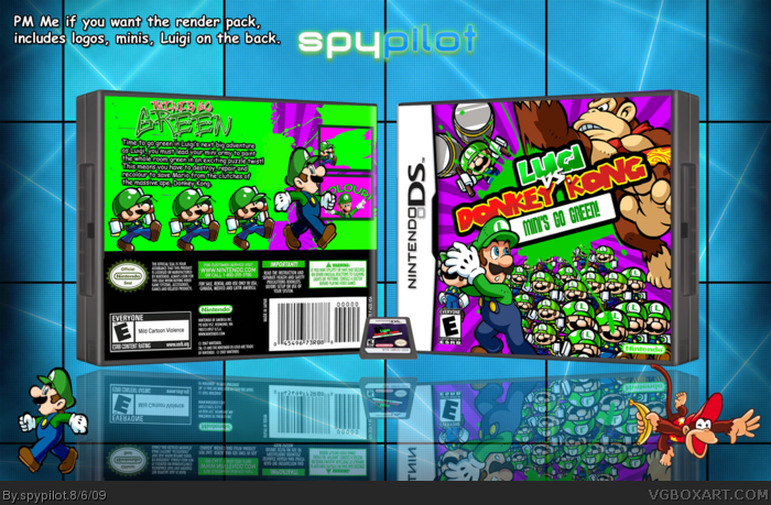
[ Box updated on August 7th, 2009 ] [ original ]
 Luigi vs. Donkey Kong: Minis Go Green! Box Cover Comments
Comment on spypilot's Luigi vs. Donkey Kong: Minis Go Green! Box Art / Cover.
I still think that you need to do something to the green splatter thing on the back. Front = epic. back = almost.
Edited at 1 decade ago
[ Reply ]
After 7 resolution lowerings, this finally uploaded.
I had to make almost everinthing on this box, the minis, the luigi on the back...
credit:
Ninty: template
Jevangod: DS card template
vegeta1035: logos
afifan000: tagline
this took me about a week to get the design right, and somehow, i STILL dont feel like it's at it's greatest, but i do not know how to make it better, I hope you guys like this, i poured all my boxart skills into making this picture.
#1, like...
Edited at 1 decade ago
[ Reply ]
Nice!
[ Reply ]
The front is good, but the back seems so unfinished, the back is very green and the render choice is small, and a tad overused. I'd size those mini Luigis down and try and get some more DK renders in.
Also, the reflection is backwards?
[ Reply ]
Gold, simply gold. Looks great. The only thing i would suggest is to get a more defined splatter on the background, you could try a brush from brusheezy.com, but you'll need PS. But thats me being really picky.
Either way, i think this is great!
Edited at 1 decade ago
[ Reply ]
#5, Actually PS brushes and image work on GIMP (and .psd can be saved on gimp) although I'm not sure of paint.net about the box the front is great but the back needs work i can't say exactly what it is but it seems to be missing something. still fav
Edited at 1 decade ago
[ Reply ]
YES!!! I loved MvDK2! And I love this more! nice editing work man! You win an Authorfav!
[ Reply ]
this is brill mate, a lot of effort has defenintaly payed off. love all the minis on the front cover. LOOKS PERFECT, well done .
[ Reply ]
Nice! Oh and it's not 1035 it's 1056.
[ Reply ]
It's alright. back looks rushed though. Also reflection is pretty bad.
Edited at 1 decade ago
[ Reply ]
Ill fix everything you told me to, it will probably be updated later in the day.
#12, i know. ill try a slightly different approach to the back, (thats what kills it, right?)
Edited at 1 decade ago
[ Reply ]
#10, I agree. It's nice, but I don't see how everyone thinks its good enough to fav, no offense. It needs some work =/
[ Reply ]
Wow, awesome! I'll fav ;)
[ Reply ]
The front is epic but the back needs some work. Great job.
[ Reply ]
coolest one yet from you ill fav and fav author! Keep it up!
[ Reply ]
#14, no fav? :(
[ Reply ]
Very nice, you might have another hof on your hands!
[ Reply ]
The front's just awesome, but the back could use some work. It seems kind of plain compared to the front.
[ Reply ]
your best yet
[ Reply ]
This is your best box by far, I really like the front.
[ Reply ]
man why didn't i think of that, your good!
[ Reply ]
I just thought of something. The title says "Minis Go Green". Is this game good for the environment? XD!
[ Reply ]
Your boxart abilities are getting better and better for certain. The front is great in my opinion, but something is a bit off with the back design as a few others have mentioned. How you have it set up is good, but the splatter looks a little to hard, if that makes sense.
You could easily soften up the edges with the smudge tool if you use Photoshop (there might be one in GIMP, not sure). Also, dropping a shadow behind Luigi and the mini whatevers will definitely help them pop more, and give more depth to your composition.
Great job so far though.
[ Reply ]
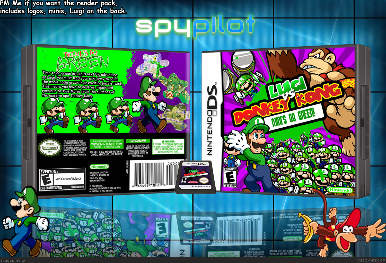
updated box
-paint looks more like paint
-drop shadow behind tagline
-reflection is fixed
-background is changed on the back (barley noticable but still)
-changed screenshot
#22, yeah, its kind of a lame pun, thats how i actually came up with the title lol
#25, thats what i was kinda going for, i like how it turned out, especially v2. Thanks for the fav btw!
Edited at 1 decade ago
[ Reply ]
Backs pretty plain, other than that, not that bad.
[ Reply ]
um.. reflection is not fixed. The reflection should be evenly touching the cover.
[ Reply ]
Not bad.
[ Reply ]
To me i think the backs is worse i like the old screenshots. you could try to make a level on the back like the NSMB back link also for the reflection add the reflection first then add the 3D then add the Cart at it's angle as it is then reflect.
Edited at 1 decade ago
[ Reply ]
#28, no thanks, i prefer my back, but thanks for the advice! and the old screenshots were just editd MvsDK ones with a crappy frame, i think this looks better.
[ Reply ]
Ah Sure sorry I'm not the best at advice.
[ Reply ]
Very nice. However, I think that the green background on the back does not look good.
[ Reply ]
148 points! woohoo! i feel special!
[ Reply ]
I'm still not in love with the back, but I certainly think the changes make it worth a fav.
[ Reply ]
Back looks worse... It looks really messy and rushed. There's also no design to the back, it looks like you used paint, colored it green and pasted the renders on. Come on, look at the screen shots, they are half-assed.
As for the front, it looks solid, but it doesnt appeal to me, just looks like you pasted the renders on the front multiple times. The splat behind the logo looks messy.
The reflection is really off, as Lenny said. Overall the box is very messy, and looks rushed in general. Nice try though.
Front:3/5
Back:1/5
Total:4/10
Edited at 1 decade ago
[ Reply ]
#34, Okay then, try to duplicate it on paint genius, the back is actually numerous shapes from photoshop.
[ Reply ]
do you use gimp, photoshop, or paint.net?
btw box is awesome!
Edited at 1 decade ago
[ Reply ]
#36, i use photoshop elements 6
btw, Who removed a fav?
[ Reply ]
o ok
[ Reply ]
woh, this is too awesome! killer update man! i wish I could fav again! this needs Hall people!
[ Reply ]
great !!! box
[ Reply ]
#39, thank you man! that means a lot from you!
[ Reply ]
All I have to say is that the box is very well done. :)
[ Reply ]
219 points and no hall? okay, somethins up here, was it bumped to 250?
[ Reply ]
Why not Luigi vs. Diddy Kong? :P JOKE
great box!
[ Reply ]
#44, lol, i actually was thiking of doing that, but luigi vs donkey kong sat better with me. diddys too cool to be a bad guy.
[ Reply ]
HAHA I LOVE THE FRONT
[ Reply ]
Sweet dude
[ Reply ]
Pretty good job, man. If I had to complain it would be about the Mario recolor not being elongated enough, still good, though.
[ Reply ]
#48, but no fav? :(
EDIT: thank you all so very much! you all get a new pet cat!
Edited at 1 decade ago
[ Reply ]
Let me be the first to say congrats for HoF!
[ Reply ]
Congrats on your second HoF
[ Reply ]
im not sure if I like the green/purple theme you have for this box but the design and layout is awesome so ill fav lol.
[ Reply ]
Congrats on the hall!
[ Reply ]
Well done man
[ Reply ]
thanks guys!
[ Reply ]
Congrats on your 2nd Hall of Fame box!
[ Reply ]
#35, lol? Learn to take criticism. The back looks like a gaint green pile of shit. I'm pretty sure I could make that BG in paint. Numerous shapes? Yeah, right. I like how you only commented on one part of my post.
And IMO, this didn't deserve hall.
Edited at 1 decade ago
[ Reply ]
#57, i can take criticism, just that when someone says my work looks like it was done in paint makes me mad because i tried real hard to make that back, also i cant make screenshots very good, and i attempted to skew the reflection to fit, it didnt work.
[ Reply ]
#58, I kinda agree, I don't see what all the hype of this box was. All together I don't think it's really hof worthy. Also you don't know how to reflect obviously :P.
Edited at 1 decade ago
[ Reply ]
#59, well for most boxes i just flip it vertically and change the oppacity to around 65-70 percent. you wanna know why there was a hype? because I MADE a hype :P
[ Reply ]
#60, well this is what I mean by the reflection.http://www.vgboxart.com/view/27162/oiligarchy/?replies=16 All sides of the box are touching the reflection.
[ Reply ]
#61, i know what you mean, i just couldnt pull it off.
[ Reply ]
congrats on the hall, man! front 5/5 back 3/5, for a rating. i think the back could use some work, but the front is awesome. otherwise, really nice job!
Edited at 1 decade ago
[ Reply ]