#6 I can tell from looking at a lot of Pan's work that he was definitely not going for the rusty look with this design, for the simple fact that pretty much all the BioShock boxes we see around here approached with the grungy rust aesthetic. If Pan designs a box for a popular game or film, you can be certain he's going to try and put his own spin on it.
Anyways, the green looks great, and I love the scattered look of the back, especially with the scraps of paper and what not. I also really like how the tagline text is worked into the ornate border at the top.
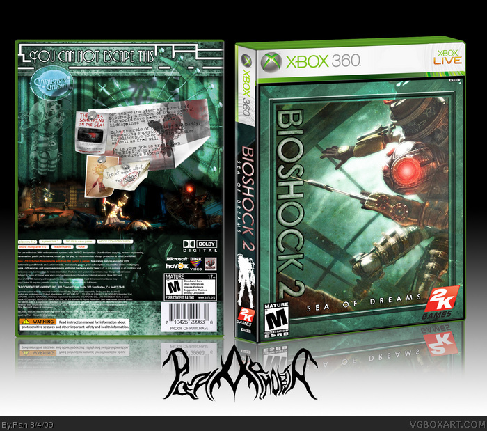
 Bioshock 2: Sea of Dreams Box Cover Comments
My contest box, I made this about a week ago but wasn't allowed to post it.
Edited at 1 decade ago
[ Reply ]
Too much green. It doesn't fit the style of the box.
[ Reply ]
#2, The style of the box is supposed to look green, so how can I not match my own style I intended?
[ Reply ]
#3, Ownt. + Fave.
[ Reply ]
#2, do you perhaps mean the style of the game?
Also, you forgot to tag it.
Edited at 1 decade ago
[ Reply ]
#3, No, it's just that it looks like you were going for more of a rusty look. Maybe make it more dirty?
[ Reply ]
#6, lolwut?
Fav'd
[ Reply ]
#6, yesh, I kinda agree.
faved anyway
[ Reply ]
Tagged
#6 I wasn't going for a rusty look at all. The border on the top and bottom of the back was made using rust texture, but that's about it.
[ Reply ]
Stupidly good.
[ Reply ]
Quite nice. Some perspective issues with the template I think, but the design is awesome!
[ Reply ]
#6 I can tell from looking at a lot of Pan's work that he was definitely not going for the rusty look with this design, for the simple fact that pretty much all the BioShock boxes we see around here approached with the grungy rust aesthetic. If Pan designs a box for a popular game or film, you can be certain he's going to try and put his own spin on it.
Anyways, the green looks great, and I love the scattered look of the back, especially with the scraps of paper and what not. I also really like how the tagline text is worked into the ornate border at the top.
Excellent and unique as always.
Edited at 1 decade ago
[ Reply ]
Very unique, though the front is a lot more organized, or uniformed, than the back, however the two clash nicely.
I'm not sure the sideways logo is in order though.
[ Reply ]
#11, Everyone always says my perspective is off on the template, I've tried to fix it but I can't seem to do it.
Thanks for the comments everyone.
#12, Thanks, the back was a little inspired by MARKERs backs, with a lot of little details.
Edited at 1 decade ago
[ Reply ]
This really should've gotten into the Hall.
[ Reply ]
#15, Glad you think that, but if this box gets me to the next round then it did it's job.
[ Reply ]
I likes.
Cannot is one word, though.
[ Reply ]
#17, I'll change it when the game is released and I change the other info.
[ Reply ]
I really like the look of it. Definatly think they should've used the big sister on the cover of the retail box. Anyways, very nice work!
[ Reply ]