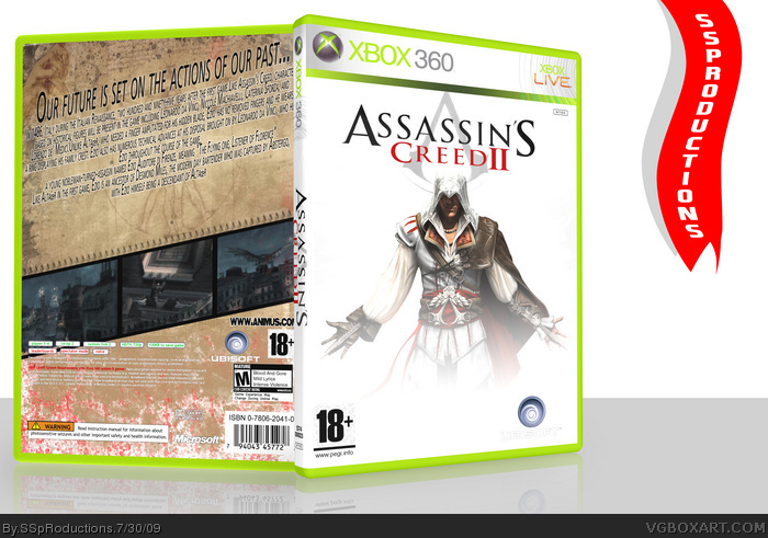
I think the main problem is the back, it doesn't suit the front or the Assassin's Creed theme. I mean, the papyrus look with the Da Vinci drawings does, but the italic 'movie' font and screenshots just don't blend well. The front is far too bland aswell.
 Assassin's Creed II Box Cover Comments
Thought I'd make this I really can't wait til this game comes out.
I know the front is just white, I did have a design until I made it 3D, the red stuff on the back is suppose to be blood.
Please comment on how to improve, and your likes and dislikes
Edited at 1 decade ago
[ Reply ]
Arrrg. That ONE render on the cover again. Sorry, dude, but no points for originality here. That same look has been done to death on this site.
[ Reply ]
I think the main problem is the back, it doesn't suit the front or the Assassin's Creed theme. I mean, the papyrus look with the Da Vinci drawings does, but the italic 'movie' font and screenshots just don't blend well. The front is far too bland aswell.
[ Reply ]