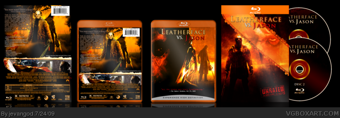
Jason on the back is not that well cut - I still see white stuff at his... errr... hair? (lower left between mask and shoulder) The center justification of the text went horribly wrong. You got a lot of free space between some words.
And again I would to suggest to work with the real template (the blue one). Sure, the modified one works well and it looks harmonic with all those yellow and orange tones, but the whole impression would be diffrent with the blue (original) one forcing you (maybe) to change some designs you made here.
It is not bad, but to me another one that's more basic and even a bit side-tracked from the real boxart. You should make a design that's working with the real templates, not change the template to work with your design. The exception proves the rule. I think it would be better to have the slipcase the way it is now and the actual box blue.
#5, The templates to me are fine cause for certain movies tey seem to change up the case cover like The incredible Hulk the temp was green and it looks pretty cool to me.
#6, I may be wrong, but as far as I know that's just the slipcase. The actual package inside is blue again.
(Edit) yeah... wrong... it's both (get proud of that >.<). However, it's not all about "to me it's cool". Besides there's still that white stuff near Jasons head (dunno what that is supposed to be...) and the horrible text.
Good box, but a few things. THe "experience high def" bar doesn't need to be on every blu-ray box, and I think this one would look better without it. The quote "you want scary..." I can still see some of the black outline from where you vut it from another box, and the screen shot of the girl next to the one with the police officers is half way down from the rest of them, making it making it look pretty weird.
Besides those flaws it's not bad, you may want to work on your back discriptions a little more though, lot of periods.
Oh yea, forgot to tell you all about the color tone choice. Had didnt have many types of color choices and it was really hard to choose one. So I basically went with the Texas Chainsaw Massacre look. Now that I think of it, Jason's blue color tone with rain would work. But I guess people seem to like it the way it is.
#5, I couldn't agree more. I'm not as good as any of the long-time members of this forum(clearly!), but I do have to say that this could definitely be better. I liked all of the stuff in the box, but the back text was a little to choppy for my taste. I would keep the gist of the back text, but definitely reword it. Other than that, very good box art.
Might I suggest something for the back text? Something along the lines of ' On a run from the law, Leatherface's murderous family finds themselves in a matchup with one of the most feared men in history: Jason Vorhees. Angered by the new company at Camp Crystal Lake, Jason starts picking off his invaders one-by-one, until leatherface steps it up. This time, the gloves are off- and someone won't go home.'
That's nice dude. The only thing that bothers me is the small paragraph of text on the back isn't very readable. What makes it hard to read is that it's all caps and the leading is too small making the text all meld together.
 Leatherface vs. Jason Box Cover Comments
Man I workd my ass off on this one. I think the crossover worked out very well.
[ Reply ]
Awesome, it looks like a real movie, you've really outdone yourself jevangod, awesome box!
+Fav +Author Fav
[ Reply ]
looks amazing as usual. lol
[ Reply ]
this is awesome!!!!
Edited at 1 decade ago
[ Reply ]
Jason on the back is not that well cut - I still see white stuff at his... errr... hair? (lower left between mask and shoulder) The center justification of the text went horribly wrong. You got a lot of free space between some words.
And again I would to suggest to work with the real template (the blue one). Sure, the modified one works well and it looks harmonic with all those yellow and orange tones, but the whole impression would be diffrent with the blue (original) one forcing you (maybe) to change some designs you made here.
It is not bad, but to me another one that's more basic and even a bit side-tracked from the real boxart. You should make a design that's working with the real templates, not change the template to work with your design. The exception proves the rule. I think it would be better to have the slipcase the way it is now and the actual box blue.
And that's NO ATTACK!
However, kudos on making your own logo.
Edited at 1 decade ago
[ Reply ]
#5, The templates to me are fine cause for certain movies tey seem to change up the case cover like The incredible Hulk the temp was green and it looks pretty cool to me.
[ Reply ]
#6, I may be wrong, but as far as I know that's just the slipcase. The actual package inside is blue again.
(Edit) yeah... wrong... it's both (get proud of that >.<). However, it's not all about "to me it's cool". Besides there's still that white stuff near Jasons head (dunno what that is supposed to be...) and the horrible text.
Edited at 1 decade ago
[ Reply ]
#7, Heard you the first time about Jason and the text. (not attacking)
Edited at 1 decade ago
[ Reply ]
Too awesome for words
[ Reply ]
Nice colors, very offical looking just the way I like it! Good job Jevangod...
Edited at 1 decade ago
[ Reply ]
Leatherface to Hockeyface? Great box, dude!
[ Reply ]
#11, Like I said I hate writing plots. They suck ass.
[ Reply ]
wow I thought this was a real movie at first , great job!
Edited at 1 decade ago
[ Reply ]
#12, it made me laugh. Right on!
[ Reply ]
Good box, but a few things. THe "experience high def" bar doesn't need to be on every blu-ray box, and I think this one would look better without it. The quote "you want scary..." I can still see some of the black outline from where you vut it from another box, and the screen shot of the girl next to the one with the police officers is half way down from the rest of them, making it making it look pretty weird.
Besides those flaws it's not bad, you may want to work on your back discriptions a little more though, lot of periods.
[ Reply ]
Awesome!
[ Reply ]
#15, I know it doesnt. I havent put the experience high def on all my boxes. I think only about 3 boxes. Yea the black box thing I saw it too.
[ Reply ]
Looks great man. Nice work, and really official looking.
[ Reply ]
too awesome man, too awesome. This crossover would probably make a bad movie though. (almost all slashers suck.)
[ Reply ]
#19, True true. I was thinking the same thing. It would be a silent film basically. But I would like to see the matchup.
[ Reply ]
#20, Jason would win easily, Leatherface is just a human Jason is something else.
[ Reply ]
#21, Yea I know it would just be interesting to see though.
[ Reply ]
Great stuff.
[ Reply ]
I like this a lot.
[ Reply ]
Oh yea, forgot to tell you all about the color tone choice. Had didnt have many types of color choices and it was really hard to choose one. So I basically went with the Texas Chainsaw Massacre look. Now that I think of it, Jason's blue color tone with rain would work. But I guess people seem to like it the way it is.
[ Reply ]
I think it would sound better as "Jason vs Leatherface".
[ Reply ]
#26, Yea probably. Just like when Freddy vs. Jason came out people always said Jason vs. Freddy.
[ Reply ]
I guess I put this in the HoF (finally). Congrats!
[ Reply ]
#28, LOL thank you.
Thank you everyone for your favs and comments.
[ Reply ]
Very professional!
[ Reply ]
FINALLY!
[ Reply ]
This discs are useless and the second back isn't needed because it's the same as the first.
Love the idea, so.... Mega Fav!
[ Reply ]
#5, I couldn't agree more. I'm not as good as any of the long-time members of this forum(clearly!), but I do have to say that this could definitely be better. I liked all of the stuff in the box, but the back text was a little to choppy for my taste. I would keep the gist of the back text, but definitely reword it. Other than that, very good box art.
Might I suggest something for the back text? Something along the lines of ' On a run from the law, Leatherface's murderous family finds themselves in a matchup with one of the most feared men in history: Jason Vorhees. Angered by the new company at Camp Crystal Lake, Jason starts picking off his invaders one-by-one, until leatherface steps it up. This time, the gloves are off- and someone won't go home.'
How about something like that?
Edited at 1 decade ago
[ Reply ]
That's nice dude. The only thing that bothers me is the small paragraph of text on the back isn't very readable. What makes it hard to read is that it's all caps and the leading is too small making the text all meld together.
[ Reply ]
#33, Thats awesome.
[ Reply ]
#33, Well not changing anything now.
[ Reply ]
Great box, except you chose to use Jason from Freddy Vs. Jason which sucked
[ Reply ]
#37, Yea for two images. Not for the front though.
[ Reply ]
Sick box dude, definitely one of the best i have seen.
[ Reply ]