[ Box updated on July 15th, 2009 ] [ original ]
 Metroid Prime: The Other Hunters Box Cover Comments
Comment on Js2Kings's Metroid Prime: The Other Hunters Box Art / Cover.
[ Box updated on July 15th, 2009 ] [ original ]
Comment on Js2Kings's Metroid Prime: The Other Hunters Box Art / Cover.
Full View Please
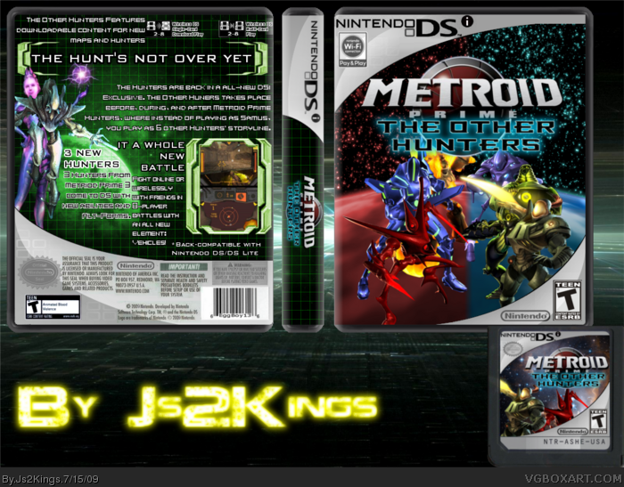
I wondered on what my next box should be and the saw EggboyÂ’s temp and thought on how DSiWare mainly consists of portions or a spin-off of games(this isnÂ’t DSiWare though). This is supposed to be a prequel/sequel to the first game (Metroid Prime Hunters) (look at the back to get it) I would say this is one of my best box yet (although my 2nd or 3rd quickest).
Template: Eggboy13 (was slightly edited by me)
Cartridge: Me (Idea by and made using EggboyÂ’s template)
Screen and text border: Eggboy13 (again edited by me)
Logo: Me
[ Reply ]
It looks ok. 3.5/5.
[ Reply ]
I love it! MASSIVE FAV!
[ Reply ]
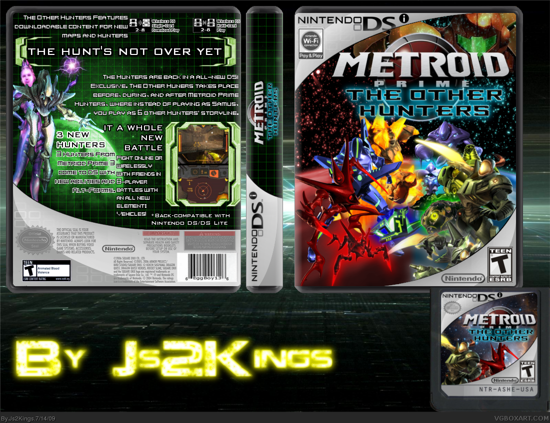
Wow, this is actually pretty good. I can't say I'm a big fan of your template but I appreciate the effort and an attempt at uniquity (is that a word?) which I think you've achieved. I suggest rotating the "Nintendo DS" part of the spine so it's at the top, it looks odd down there and I can't help but feel that spine would be awkward to read like that. (in fact - just rotate the entire spine around, that would be a lot easier.)
Besides that, it's generally very good, I just feel it's quite crowded on the front. The hunter's alternate forms seem a little unnecessary. I would remove those, move the hunters closer together (but not so they're squashed - basically rearrange them so they have space, but they aren't taking up so much space. i.e. move Trace (the red one) down so Sylux (the one above him) can be shifted to the left or something.
After that, I'd remove Samus. She doesn't seem to have a big part in this story of yours and she's only taking up space and making things seem claustrophobic. I was going to suggest moving the logo down so she could breathe a little more (irony, eh?) but that would only make the hunters feel cramped and leave the top space empty, so just remove her completely.
So far so good, 4/5.
[ Reply ]
I flipped the logo and #4 i put samus in becuase it also takes place in MPH story line and in that game each hunter battles samus
[ Reply ]
Ok Vengeance i made said changes
[ Reply ]
dude, for a n00b, you make not to shabby work! keep it up man rank 4 isnt that far away for you!
[ Reply ]
Um... Thanks spypilot.
Edited at 1 decade ago
[ Reply ]
#8, by n00b i mean you just joined, and are already showing fast improvement.
[ Reply ]
noob is a newbie. N00b is a useless spamming user.
[ Reply ]
oh i wasn't sure which one you where talking about so yeah thanks
Edited at 1 decade ago
[ Reply ]
#10, sorry, didnt know the difference :P
i meant noob.
Edited at 1 decade ago
[ Reply ]
It's alrite.
[ Reply ]
Logo (metroid) should be centered.. looks weird that way ´cau ethe text of it is centered. but the logo not. the "s" of the dsi-logo on the template is cut *ouch* gray text on the back is hard to read ´cause it is on a gray backgrond (especially the parts with inverted text like the seal of quality) *ouch2*
[ Reply ]
I didn't make the template but i could try to edit it.
[ Reply ]
That's much better. Nice work.
[ Reply ]
Thanks Ven
Edited at 1 decade ago
[ Reply ]
Ok I updated the template and logo
[ Reply ]