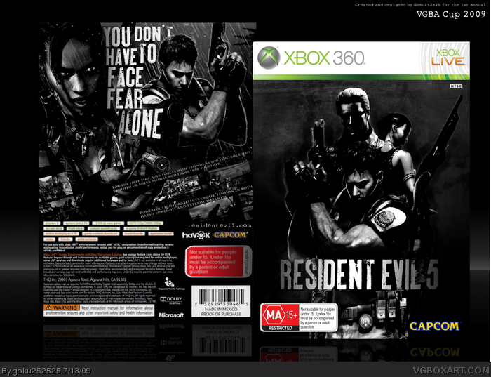
Okay, so here is my box for the VGBA Cup:) To stop it from looking to dull i decided to keep the ratings, dev logo and temp in colour which in my opinion works really well. I hate the official logo and it also wouldnt look very good in b&w so i made my own trying to keep it similiar to the logos of the older resident evil games.
I am very happy and proud of how this turned out, especially the tagline and logo. Anyways hope you enjoy:D
#3, i was going for a dark blackish look as most boxes submitted for this comp seem to be very light with alot of white and light greys so i wanted to be a bit different:)
#4, I'd rather keep it as it is. And I agree with Cerium. Btw, "You don't have to face fear alone" is something Capcom didn't quite understand in this game. When I buy a horror game, I want it to be atmospheric, haunting and fucking scary. I never liked the co-op aspect of the game. RE4 was much better.
Very well done box, bright red rating aside.
#8, thanks, yeah i kinda forgot about that. I could change it if you want but i dont think it would make much difference but i will definately do that with my next OFLC box:D
 Resident Evil 5 Box Cover Comments
Okay, so here is my box for the VGBA Cup:) To stop it from looking to dull i decided to keep the ratings, dev logo and temp in colour which in my opinion works really well. I hate the official logo and it also wouldnt look very good in b&w so i made my own trying to keep it similiar to the logos of the older resident evil games.
I am very happy and proud of how this turned out, especially the tagline and logo. Anyways hope you enjoy:D
[ Reply ]
Its pretty good!! Although the bright red rating on the front somewhat spoils the effect.
[ Reply ]
nice but a little too dark IMO good luck man!
[ Reply ]
#2, would you prefer it desaturated?
#3, i was going for a dark blackish look as most boxes submitted for this comp seem to be very light with alot of white and light greys so i wanted to be a bit different:)
Edited at 1 decade ago
[ Reply ]
#4, whatever floats your boat I guess, but it's a bit too dark for me.
[ Reply ]
#4, I'd rather keep it as it is. And I agree with Cerium. Btw, "You don't have to face fear alone" is something Capcom didn't quite understand in this game. When I buy a horror game, I want it to be atmospheric, haunting and fucking scary. I never liked the co-op aspect of the game. RE4 was much better.
Very well done box, bright red rating aside.
[ Reply ]
The red rating is unfortunatly what we have to look at when we buy games in Australia, it just varies in colour and rating. Thanks OFLC.
Anyway, quite a stylish manner there Goku, love the text arrangement on the back!! Along with the image compesition.
Overall, a very, very cool boxart! fav and long time comming author fav!
[ Reply ]
It's unfortunate you're still using the OFLC wrong D:
the black writing on the front differs for each game, and you can check what their rated for at the oflc website
link!OpenDocument
"Strong Violence"
[ Reply ]
I liek this a lot.
[ Reply ]
#8, thanks, yeah i kinda forgot about that. I could change it if you want but i dont think it would make much difference but i will definately do that with my next OFLC box:D
#9, Thanks, that means alot:)
[ Reply ]
I was hoping you'd change it on here, but if you do plan to do it from now on, a fave you shall get
[ Reply ]
#11, I am doing it right now for my new box at this moment:D
[ Reply ]
Nice. :)
Edited at 1 decade ago
[ Reply ]