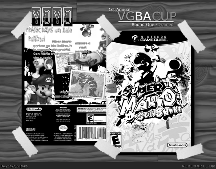
Hooray! Here's my entry for the first round of the VGBA Cup! I worked very hard on it! I tried to make the front look like graffiti. As always, comment, criticize, and enjoy!
Sorry, but this is exactly what some members were saying.
Super mario sunshine is maybe one of the games that should be forbidden for this competition.
You've just made a colorful box[ as in the composition etc.] and desaturated it.
And sorry my friend,but this is an awful choice for a greyscale box.
The box would be pretty nice in color, i think.
Sorry you don't like it. :(
I made this because of the tagline "DARK DAYS".
BTW credit to qwerty234 for the template.
Also, I'll upload the box in color tomorrow.
Updated with more text!
Well, the design is good, but the overall box is kind of low quality. Sorry, but it's not one of my favored pieces. I think it's the black and white that I'm having disputes over.
 Super Mario Sunshine Box Cover Comments
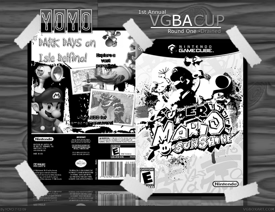
Hooray! Here's my entry for the first round of the VGBA Cup! I worked very hard on it! I tried to make the front look like graffiti. As always, comment, criticize, and enjoy!
[ Reply ]
awesome everything love the way you placed tape on the edges il looks great
Edited at 1 decade ago
[ Reply ]
Sorry, but this is exactly what some members were saying.
Super mario sunshine is maybe one of the games that should be forbidden for this competition.
You've just made a colorful box[ as in the composition etc.] and desaturated it.
And sorry my friend,but this is an awful choice for a greyscale box.
The box would be pretty nice in color, i think.
[ Reply ]
Everybody's boxes but mine are great. I probably won't make it into the next round though. Anyway good luck.
[ Reply ]
I have to agree with Ayron. Also, not enough text on the back.
[ Reply ]
One of the most colorful games have been ruined...great box though XD
[ Reply ]
Sorry you don't like it. :(
I made this because of the tagline "DARK DAYS".
BTW credit to qwerty234 for the template.
Also, I'll upload the box in color tomorrow.
Updated with more text!
Edited at 1 decade ago
[ Reply ]
#7, The text isn't very legible ether. I like what you did with the paint splatters, only you have to make that fit with the back too.
[ Reply ]
Updated once again!
[ Reply ]
Well, the design is good, but the overall box is kind of low quality. Sorry, but it's not one of my favored pieces. I think it's the black and white that I'm having disputes over.
[ Reply ]
#10, well, as I said before, I'm uploading the full color version tomorrow.
[ Reply ]
Way to contrasted on the front and the font on the back does not seem to work for me.
[ Reply ]
This looks nice. The design on the front is really great. 3.5/5 +Fav
[ Reply ]
nice, good luck BTW
Edited at 1 decade ago
[ Reply ]
#14, thank you, Roza!
[ Reply ]
#3, I agree.
it hurts the eyes.
at least mines
Good luck anywy tho
[ Reply ]
Okay, everyone! Here's the link to the color version!
By the way, updated!
Edited at 1 decade ago
[ Reply ]
Thanks to StarMario22 for faving!
[ Reply ]
Why is it Black And White? 3/5
[ Reply ]
#19, it had to be black and white for a competition.
[ Reply ]