Looks pretty good, but drop the DVD logo and the WB logo from the cover and remove the critic quote from the back. Those elements are very "un-Criterion".
Also, while it's not unheard of, listing the MPAA rating is rare for Criterion. They're very supportive of film as art, which the MPAA is not and they tend to exclude those ratings, I think, out of respect to the directors.
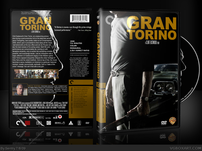
 Gran Torino Box Cover Comments
Heres my Gran Torino criterion cover. Full View please. Printable added as well. :)
[ Reply ]
Very clean...shiny. I like it
[ Reply ]
Nice.
[ Reply ]
Shibby. Like a modern day Dirty Harry cover.
[ Reply ]
Great design, great film!
[ Reply ]
Thanks guys! =D I'm really looking forward to making more criterion covers.
[ Reply ]
I was thinking of doing this film as another Criterion box. Great stuff! :D
[ Reply ]
Great design Sentry. I can't help but think that non-Criterion boxes get less attention lately.
[ Reply ]
Looks pretty good, but drop the DVD logo and the WB logo from the cover and remove the critic quote from the back. Those elements are very "un-Criterion".
Also, while it's not unheard of, listing the MPAA rating is rare for Criterion. They're very supportive of film as art, which the MPAA is not and they tend to exclude those ratings, I think, out of respect to the directors.
Edited at 1 decade ago
[ Reply ]
Beautiful. Need more attention.
[ Reply ]