[ Box updated on June 20th, 2009 ] [ original ]
 Dragon Ball Z: Budokai Tenkaichi 2 Box Cover Comments
Comment on tleeart's Dragon Ball Z: Budokai Tenkaichi 2 Box Art / Cover.
[ Box updated on June 20th, 2009 ] [ original ]
Comment on tleeart's Dragon Ball Z: Budokai Tenkaichi 2 Box Art / Cover.
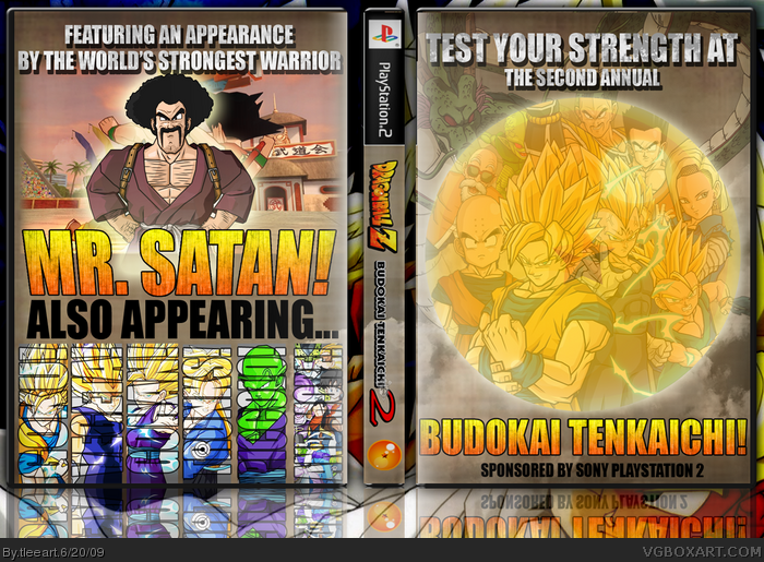
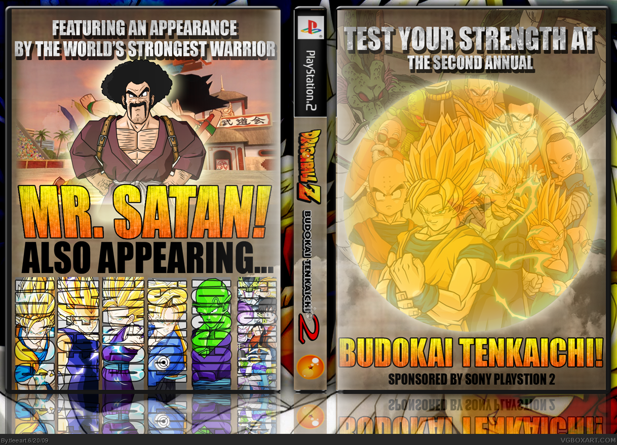
Okay, so this is supposed to be one of those "out of the box" ideas...sort of.
I own the game, felt like making something a little more Martial Arts/MMA/Wrestling competition poster-based for the game. I wanted to add the standard looking spine because if I print this out, I want it to look normal with the rest of my collection.
Most of the resources came from sites such as IGN and GameSpot. The temp was based off my extremely simple DVD template. Oddly, the images that were toughest to come up with were the one of Hercule/Mr. Satan and the tournament background in behind him. For Hercule, I finally found the one I used on deviantart, which the face was bastardized to look like the Joker. I had to recolor it, lol.
Eventually, I found the World Tournament background in a DBZ Budokai Tenkaichi 3 screenshot. I could have edited the characters out (young Goku and Tien) but I felt it unnecessary.
Anyway, I'm not sure if this will get a warm welcome or not, let me know what you think!
[ Reply ]
great stuff, Tim.
EDIT: just noticed a typo: it says "Playstion" on the front.
Edited at 1 decade ago
[ Reply ]
I'm on the edge with this, it looks like a lot of effort was made to look like someone with poor photoshop skills made it.
Maybe that's just me though. It looks like a TON of work was done though.
[ Reply ]
#2, I die. Seriously, I don't know how I could have missed that.
EDIT: Fixed.
Edited at 1 decade ago
[ Reply ]
This is awesome fav
____________________________________
My page new banner
Edited at 1 decade ago
[ Reply ]
#3, I can see what you mean, LEGOslayer. It's not up on par with the polish of my usual stuff, but at the same time, it fits the style that I'm going for.
Like I mentioned in my first post, I wasn't sure what kind of reaction I would get from it. Your opinion is valid and I understand where you're coming from. You can call this an experiment.
[ Reply ]
I can't see where to fix it. Just killer.
[ Reply ]
That's awesome. Great work!
[ Reply ]
*tear rolls down face* It's beautiful. I like the feel of an actiony poster advertising an awesome fight.
[ Reply ]
It's a very different approach, I can't say I'm too favorable of it, but for what it's intended to be, I think it's pretty good actually.
[ Reply ]
#9, man thats how i feel o_q
[ Reply ]
mmm, I feel quite inspired to do a dbz boxart too!
Fav+ you pulled it off very well ;)
[ Reply ]
shouldn't there be a focus on the front? Everybody is faded and it doesn't look good like that IMO.
On the flip side, the back is expertly crafted.
[ Reply ]
It's ok but if someones was to see this at the store with no prior knowledge of the game ,I doubt they would buy it because it tells you absolutely nothing about the game, and the title isn't on the front.
Edited at 1 decade ago
[ Reply ]
#3, I get what you mean, sorry Tlee, im not feeling it this time round.
[ Reply ]
I like this a lot, I can tell there was a lot of work put into it.
[ Reply ]
Alright! Plenty to talk about here.
#13, Do you think It would be better if I didn't fade the characters on the front? Didn't want to hide the dragonball, but I could do something else, like a decorative border instead...in fact, that sounds good, I'll try some stuff out and see how that pans out.
#14, It's not meant to be found on a store shelf. This was more for the art, and for a personal cover for my copy of the game. Thanks for your comment, though, it is relevant and I appreciate that.
#15, It's all good. I knew this was going to be hit or miss going into it, so you're not hurting my feelings.
Thank you so much for everybody's critiques, comments and favs! I'll see what I can do in the near future to improve this.
[ Reply ]
I really like the vertical text with the characters image on the back. The whole fight card concept is really cool as well. Quite innovative sir.
[ Reply ]
#17, yea I know it's not meant to be found at a store I'm just saying that to me it kinda looks more like a promotional poster than actual boxart, But as a form of art its fantastic.
[ Reply ]
hey tleeart i used new tutorials and check my newst box please its humor but it isnt horrible and now i know how to use GIMP thanks for the tutorials
[ Reply ]
Is there a printable somewhere/somehow? It's too good a boxart to not print it off.
[ Reply ]