It's not half bad, if you don't mind, I'm just gonna point out a few things that are easy to fix.
1. The "E" logo is just a bit big.
2. The Ultimate logo in the corner, if the white space were cut out, would look a lot better.
3. "Ultimate" in Ultimate 09 is a bit low compared to the 09.
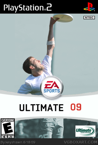
 Ultimate Frisbee 09 Box Cover Comments
It's been a couple years since my last box art attempt. This one is relatively simple, featuring one of my favorite activities, ultimate frisbee.
The WIP thread is link
[ Reply ]
It's not half bad, if you don't mind, I'm just gonna point out a few things that are easy to fix.
1. The "E" logo is just a bit big.
2. The Ultimate logo in the corner, if the white space were cut out, would look a lot better.
3. "Ultimate" in Ultimate 09 is a bit low compared to the 09.
Other than that, not half bad. 3/5
[ Reply ]