This is finely made and you're quickly becoming a memorable uploader. I don't like it when people do exclusive franchises on inappropriate systems, I understand that's up to you though.
Roza, yeah, I thought about it, I wanted to make something with a parchment, but I didn't do it... :[
E G, thank you ! Yeah, I haven't wanted to make this on Wii, I've thought it would be better on PS2 ^ ^ By the way, do you know how I could make a " edge " to the box ? I tried, but it's not really good...
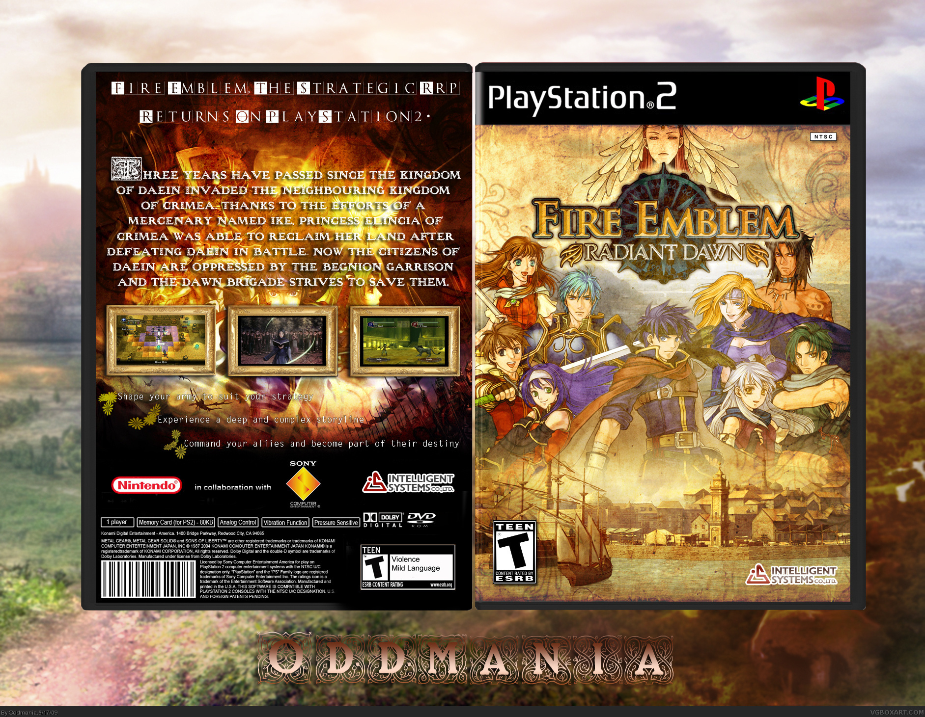
I really enjoy the arrangement you did with the characters on the front, most of people would do that transparent effect behing the game's logo, but you did well with just the character renders, make it look natural, implying that feeling of deepness.
The back has one flaw: that background, or whatever that is, is partially blocked by that description. I also think you should have used the three screenshots over the text description instead of the opposite. The tagline is ok, nothing extraordinary buy it's cool. Those three "things" under the screenshots are barely visible too.
Overall, it's a great box. Maybe you have should maintain the level of light and shadow on both front and back covers, because to me, it seems the front is brighter than the back.
Thanks! Yes, you're right about the background. The back is just terrible, the frames are just too thick and look very clusmy... That's a very old cover, one of the first times I had a whack at making a back. Thanks for your great feedback!

 Fire Emblem : Radiant Dawn Box Cover Comments
Fire Emblem : Radiant Dawn PS2 version ^ ^ I hope you'll like, it's not perfect, I know :[
As usual, I like the front but I just hate the back.
Edited at 1 decade ago
[ Reply ]
Love the front but the backs not you best :(
[ Reply ]
#2, Yeah I know :[
[ Reply ]
its pretty awesome! just change the backs background to parchment (maybe the village you used on the front) ansd it will be full of WIN
[ Reply ]
This is finely made and you're quickly becoming a memorable uploader. I don't like it when people do exclusive franchises on inappropriate systems, I understand that's up to you though.
Edited at 1 decade ago
[ Reply ]
Roza, yeah, I thought about it, I wanted to make something with a parchment, but I didn't do it... :[
E G, thank you ! Yeah, I haven't wanted to make this on Wii, I've thought it would be better on PS2 ^ ^ By the way, do you know how I could make a " edge " to the box ? I tried, but it's not really good...
Edited at 1 decade ago
[ Reply ]
Love the front, not really feelin' the back though. Putting a backdrop on the first letter of each word on the top was a little unnecessary.
[ Reply ]
I really enjoy the arrangement you did with the characters on the front, most of people would do that transparent effect behing the game's logo, but you did well with just the character renders, make it look natural, implying that feeling of deepness.
The back has one flaw: that background, or whatever that is, is partially blocked by that description. I also think you should have used the three screenshots over the text description instead of the opposite. The tagline is ok, nothing extraordinary buy it's cool. Those three "things" under the screenshots are barely visible too.
Overall, it's a great box. Maybe you have should maintain the level of light and shadow on both front and back covers, because to me, it seems the front is brighter than the back.
[ Reply ]
Thanks! Yes, you're right about the background. The back is just terrible, the frames are just too thick and look very clusmy... That's a very old cover, one of the first times I had a whack at making a back. Thanks for your great feedback!
[ Reply ]
Wo0o0o0ow Front Really Nice Like It Bro . . .
[ Reply ]