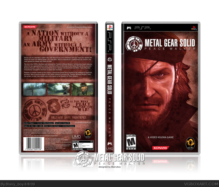
New box! woooooo!
the picture on the front may have been used afew times before but i think ive used it in a slightly more original way than the others!
One thing I dont like about it. Is that you took the picture on the front off the website and just added a color overlay over it. Which sort of shows lazynss.
Anyway he knows what he did too. Its just I usually see more work put into the front than this. Cause I saw the website and I was like that picture looks familiar than I came back here and saw that he just sorta did an overlay to it. I mean it looks very nice but he doesnt usually do that.
#7, Yea but I thought we werent suppose to do the same thing as the official boxes especially if their bad.
Both are lazy, you and jevangod.But this ones design is more appealing to me. You also did put some efford into the whole military-look of it (font, logos), so it does not look as basic as jevangods. However, it`s to much red for me. Would prefer the color of the jevangod version.
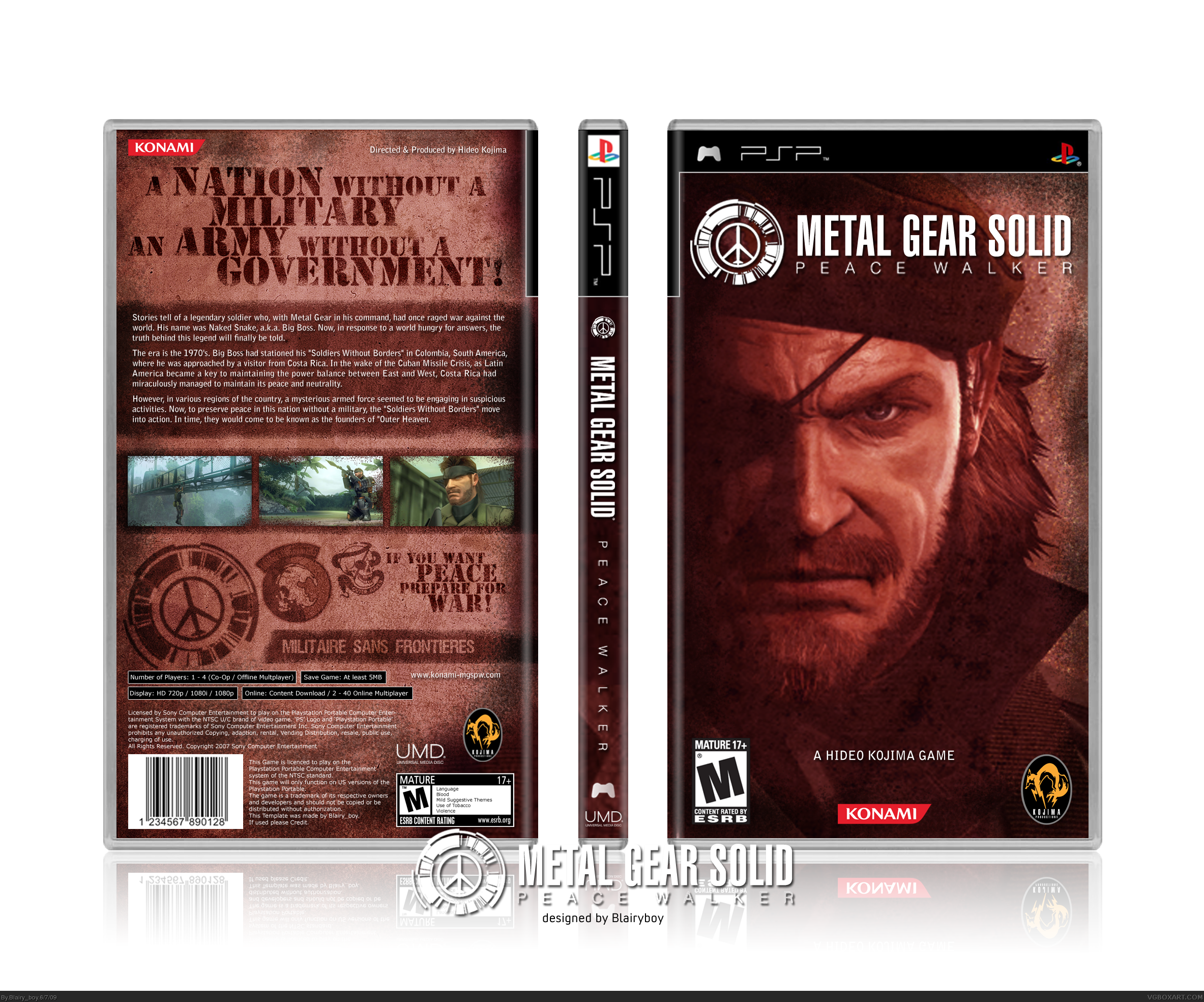
yeh, i agree that i was lazy, but i liked how it looked so i used it! i have tried to put more effort into it since by adding a higher res render and made the background the same texture as the back! i know it doesnt look hugely different and you have to look fairly close to see it. I was abit dissapointed with myself, so i felt like i should put more effort into it!
#15, Its cool man the box still looks great. But I agree with Wasi-bi we were both a bit lazy. But he was right about the color tone thing, I think mine sort of fit with the game and your arrangement on the back was better than mine.
 Metal Gear Solid: Peace Walker Box Cover Comments
New box! woooooo!
the picture on the front may have been used afew times before but i think ive used it in a slightly more original way than the others!
[ Reply ]
Wow, right after mine. Anyway looks great.
[ Reply ]
Great textures and colors!
Faved.
[ Reply ]
#2, woops, sorry mate didnt see your box!
[ Reply ]
just realised ive moved up to rank 9! finally haha!
[ Reply ]
That's epic. And congrats.
Edited at 1 decade ago
[ Reply ]
One thing I dont like about it. Is that you took the picture on the front off the website and just added a color overlay over it. Which sort of shows lazynss.
[ Reply ]
yes!
[ Reply ]
Hope there'll be a new hi-res art soon for you to make a
new version on the front cover, but over all "A Great Job"
[ Reply ]
updated with a higher res front with a background that matches the background on the back cover!
[ Reply ]
#7, have you seen the cover for MGS4? lol
Edited at 1 decade ago
[ Reply ]
#7, I can't believe YOU'RE calling him lazy hahaha.
[ Reply ]
#12, yep me either.
Anyway he knows what he did too. Its just I usually see more work put into the front than this. Cause I saw the website and I was like that picture looks familiar than I came back here and saw that he just sorta did an overlay to it. I mean it looks very nice but he doesnt usually do that.
#7, Yea but I thought we werent suppose to do the same thing as the official boxes especially if their bad.
[ Reply ]
Both are lazy, you and jevangod.But this ones design is more appealing to me. You also did put some efford into the whole military-look of it (font, logos), so it does not look as basic as jevangods. However, it`s to much red for me. Would prefer the color of the jevangod version.
[ Reply ]
yeh, i agree that i was lazy, but i liked how it looked so i used it! i have tried to put more effort into it since by adding a higher res render and made the background the same texture as the back! i know it doesnt look hugely different and you have to look fairly close to see it. I was abit dissapointed with myself, so i felt like i should put more effort into it!
[ Reply ]
#15, Its cool man the box still looks great. But I agree with Wasi-bi we were both a bit lazy. But he was right about the color tone thing, I think mine sort of fit with the game and your arrangement on the back was better than mine.
[ Reply ]