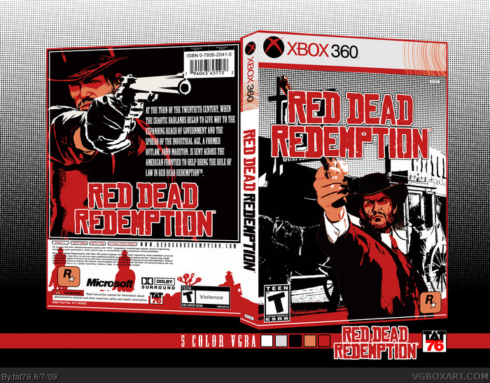
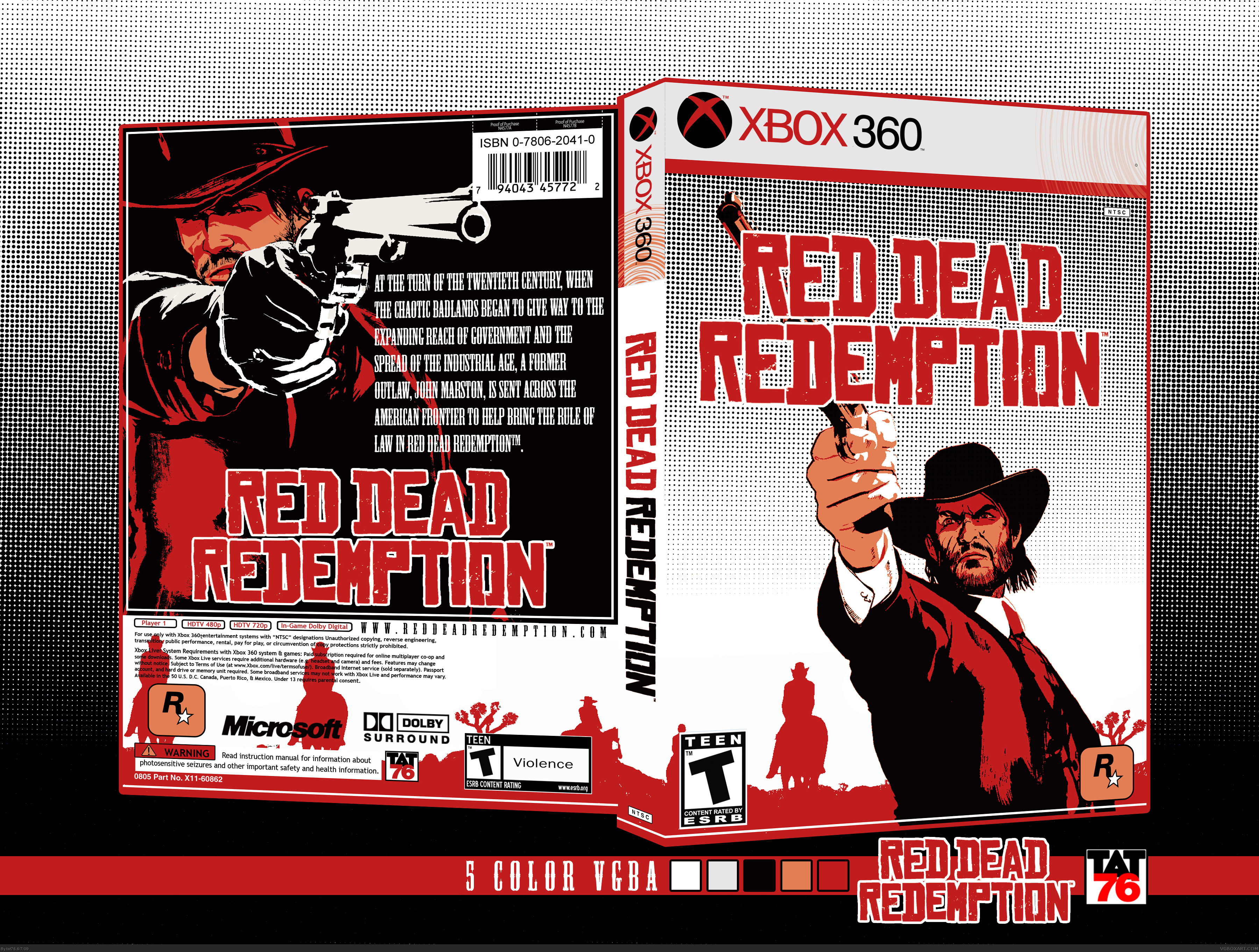
Made for the 5 color VGBA Compatition. Wanted to find something different than others. Also created te entire Recolored Box. I wanted to do the box not just poster like covers like others.... Hope you like it...
Wow this is fucking phenomenal. Even if I didn't absolutely love the game, I'd totaly love this. That is talent right there. Everyone needs to see this. Totaly posting this link on Facebook.
 Red Dead Redemption Box Cover Comments
Made for the 5 color VGBA Compatition. Wanted to find something different than others. Also created te entire Recolored Box. I wanted to do the box not just poster like covers like others.... Hope you like it...
Edited at 1 decade ago
[ Reply ]
dude you need to make a printable version of this, its so damn good
[ Reply ]
i like it, nice job.
[ Reply ]
#1, I agree. I felt like the competition description implied that it should be a full box and not just the cover art. This is excellent work!
[ Reply ]
Woah...
[ Reply ]
#3, Thank you. Most of them look like a game advertising poster. Don't take me wrong....
[ Reply ]
brilliant work. This competition is awesome.
[ Reply ]
#6, Thank you.
[ Reply ]
Looks good, but why do you have 2 same colors in the color boxes?
Also, the dots that fade on the front are different color (they become gray).
[ Reply ]
#8, You're right. The dots just checked... Fixin,Fixin... The color boxes are different colors one is white the other one is very light gray....
[ Reply ]
Just Added version 3. getting there...
[ Reply ]
still looks great, but version 2 is cooler. IMO.
[ Reply ]
you ruined it, version 2 was way cooler!
[ Reply ]
#12, I had to. After i corrected the dots. The halftoned looked bad. Was not looked like a gradient so I added an image to the background.
[ Reply ]
I think it looks better with the background image.
[ Reply ]
Thank you Pan.... Think so too.
[ Reply ]
I love what you did and I hope this gets more attention
[ Reply ]
Wow this is fucking phenomenal. Even if I didn't absolutely love the game, I'd totaly love this. That is talent right there. Everyone needs to see this. Totaly posting this link on Facebook.
[ Reply ]