Dan, you amazing dude you... I was going to scan in my insert from the dvd for you to use elements from, but it was silly of me to think you'd need it. The colors are fantastic, and you put a lot of emphasis on the eyes throughout the design, which is exactly what it's all about.
You deciding on doing these Criterion cases is truly epic dude.
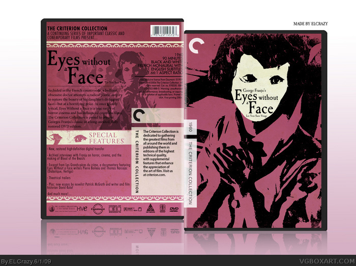
 Eyes Without a Face Box Cover Comments
My newest Criterion box, Eyes Without a Face. I was challenged by Drakxxx to do this, and I'm really happy with the end result.
I wanted to follow the color scheme and design technique of the original box, while doing my own interpretation of it.
Enjoy! :D
[ Reply ]
This is very nice ElCrazy ;]
I love the cartoony style to it. I cannot see any flaws so far, keep it up =]
Edited at 1 decade ago
[ Reply ]
If you slightly change it a bit, you could enter it for the 5 Colour competition :D
[ Reply ]
<3
[ Reply ]
#3, I think you should.
[ Reply ]
I have no idea what it is... but it's still awesome!
[ Reply ]
Stop that.
[ Reply ]
Great job, nice to see some classical stuff like this.
[ Reply ]
Thanks guys!
[ Reply ]
Dan, you amazing dude you... I was going to scan in my insert from the dvd for you to use elements from, but it was silly of me to think you'd need it. The colors are fantastic, and you put a lot of emphasis on the eyes throughout the design, which is exactly what it's all about.
You deciding on doing these Criterion cases is truly epic dude.
[ Reply ]
#10, Haha yeah, I searched for scans on the net.
But thanks dude! And I'm gonna continue doing more until I lose inspiration.
[ Reply ]
As with your other one, the minimalist approach works very well, looks very official and creative. 5/5
[ Reply ]
Excellent, although I wished you went for a curvy typeface for the title logo, like the original cover.
[ Reply ]