So great.
Ok I have to be more specific.
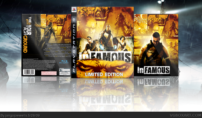
This box is very well done, but there are a few things that are keeping it from being almost perfect.
1. On the two front covers, the screen/artwork you used in the top right corner; You can still see some remnants of the infamous logo. I think you should clone stamp that out if you can.
2. I think the image tearing on the front is beautiful, but you are covering up too much of the infamous logo. I'd say tweak it a little more or bring the tear down so you aren't covering up as much of it.
great box, bot the slogan at the back is too confusing. i dunno if it says "the is your playground" or "city your playground" or "the is city your playground" or.. you know what i mean.
now THIS is what i call box art... congratulations!!
i'd love to mix that with the ps3 bundle i made!
btw, i agree with some of the comments. there are 2 or 3 things that you could improve here.
but that back... man, that's just impressive. sexy box art there...
 inFAMOUS Box Cover Comments
Awesome return
[ Reply ]
I tried to make an infamous box that's slightly different from the others. Hope you guys like it.
[ Reply ]
=D
[ Reply ]
bollocks. there goes my torn paper approach to infamous.
seriously, this is fantastic. everything compliments so well.
[ Reply ]
So great.
Ok I have to be more specific.
This box is very well done, but there are a few things that are keeping it from being almost perfect.
1. On the two front covers, the screen/artwork you used in the top right corner; You can still see some remnants of the infamous logo. I think you should clone stamp that out if you can.
2. I think the image tearing on the front is beautiful, but you are covering up too much of the infamous logo. I'd say tweak it a little more or bring the tear down so you aren't covering up as much of it.
Other than that I think it's awesome :)
Edited at 1 decade ago
[ Reply ]
How it limited edition in small case.
[ Reply ]
#6, jevan back
[ Reply ]
Welcome back.. man, what a great box. It is just done so nicely. Everything is laid out nicely... well done. +Fav
[ Reply ]
Looks pretty good, but i really dont like that you used the same exact images on both the fronts and on the back.
Though i applaud you for making it a somewhat different from the others.
[ Reply ]
great box, bot the slogan at the back is too confusing. i dunno if it says "the is your playground" or "city your playground" or "the is city your playground" or.. you know what i mean.
[ Reply ]
It's very unique... it stands out from all of the others I've seen. For that, and the mix of 3D and comic art, you get a +fav.
[ Reply ]
This is very, very, awesome, my friend. Fav.
[ Reply ]
now THIS is what i call box art... congratulations!!
i'd love to mix that with the ps3 bundle i made!
btw, i agree with some of the comments. there are 2 or 3 things that you could improve here.
but that back... man, that's just impressive. sexy box art there...
[ Reply ]
You really don't you get as much credit as you deserve. This should be in MasterWorks.
[ Reply ]
I like the yellow contrast color.
Good job!
+FAV
[ Reply ]
Slick.
[ Reply ]
Congrats on the Hall
[ Reply ]
Congrats! I knew you'll make it to HOF. =)
[ Reply ]
cool!
[ Reply ]