Erm, i think something bad may have happened in the upload....other than that, looks good mate. Its just very confusing to see whats going where and what. Is it this computer i'm using?
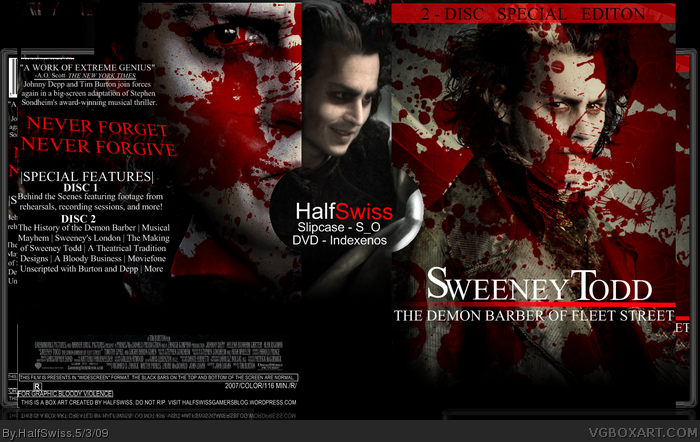
I would remove the blood from his face on the front.
I think the back works brilliantly- very effective.
Just unskew the tagline, and have it saying never forgive never forget- it sounds so much better.
 Sweeney Todd: The Demon Barber of Fleet Street Box Cover Comments
Presentation needs some work, but I threw it together quick, so...
Full view please.
Edited at 1 decade ago
[ Reply ]
Erm, i think something bad may have happened in the upload....other than that, looks good mate. Its just very confusing to see whats going where and what. Is it this computer i'm using?
[ Reply ]
Think you went overboard with the blood
[ Reply ]
i little bloody, oh wait its sweeney todd. Love it man keep up the work
[ Reply ]
#3, My thoughts exactly.
[ Reply ]
You can't tell the box from the Back ground...
You oughta try and fix that.
faved anywho.
[ Reply ]
Yah way too much, looks bad.
[ Reply ]
I would remove the blood from his face on the front.
I think the back works brilliantly- very effective.
Just unskew the tagline, and have it saying never forgive never forget- it sounds so much better.
[ Reply ]
Hi, i do like blood spots either, but really it's a bit too much, otherwise pretty work bye bye
[ Reply ]
Too Much Blood.Sorry that just spoilt it.
[ Reply ]
#3, I tried increasing the transparency, but it always came out looking too bright.
[ Reply ]
Yup, even though it's Sweeney Todd, too much blood. If it looked thicker and a little more sparse, and not in his eyes, it would be more believable.
[ Reply ]