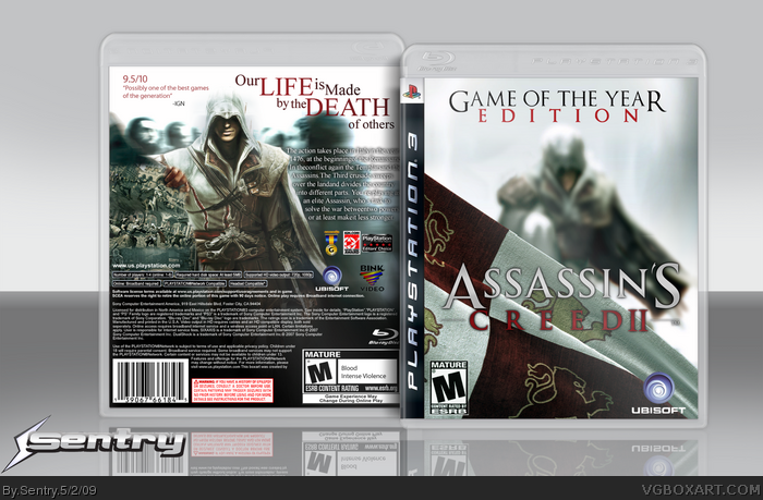
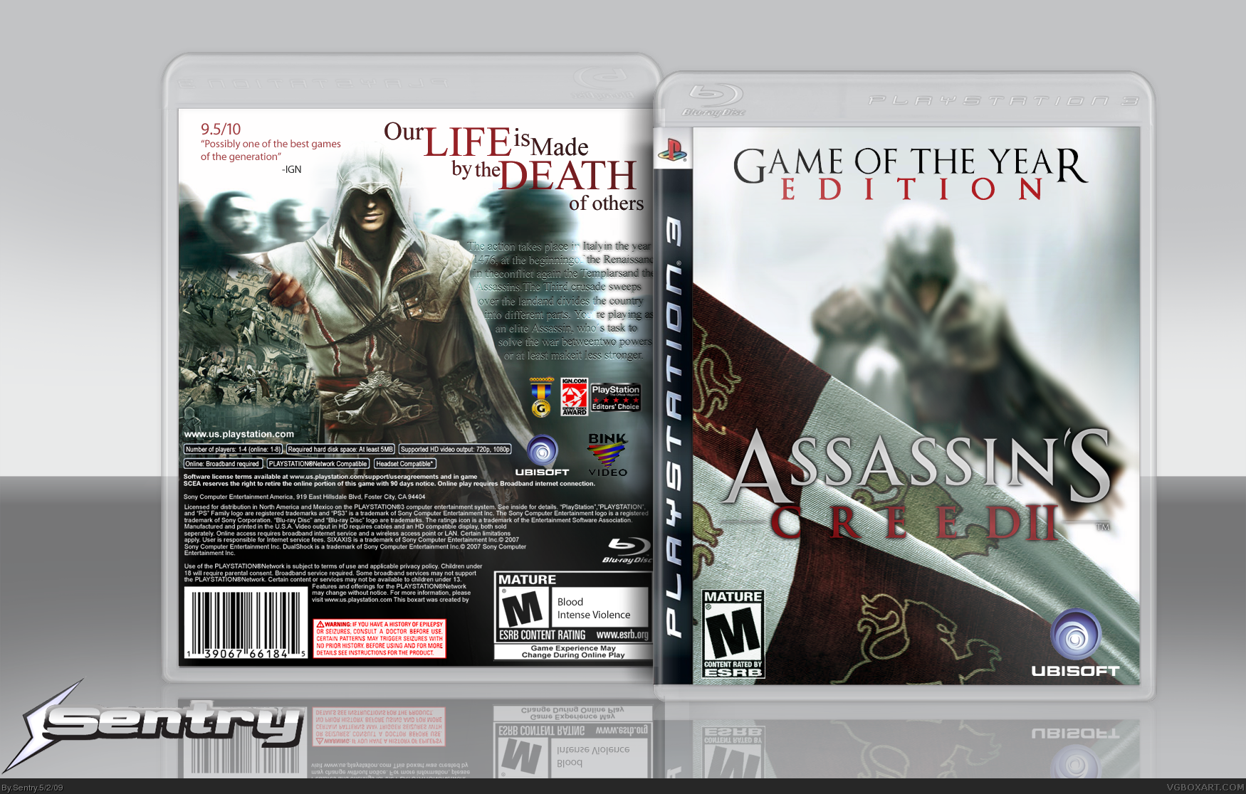
Yea I think the front is a great idea. However I think the "II" needs to be put below the rest of the logo, or spaced out a bit. It looks crammed in there. The description on the back is hard to read. Other than that I like this a lot, especially because it's different.
I definitley love this AC2 box. It's also the best one on the site IMO. Great job with the front and the back is pretty epic. Im not feelin the Game of the year edition title on the front but overall it's really impressive. Great Job Sentry
I liked how you tried to make it different unlike the others (mine) but i think the front needs to be redone with new art (when it comes out) the back is good but try making the background colour the same as the ezio. using orange and browns.
and the game of the year edition needs to be either smaller or beneath the logo.
its nice but i dont like how hes pushing the screen shots out of the way. And this one is just me but the flag on the front is the flag of King Richard the Lionhart from the crusades (like in AC1) but is irrelevant to AC2.
 Assassin's Creed 2 Box Cover Comments
I tried.
Credit to Shady for the temp.
[ Reply ]
Impressive, although I don't like the way the back description is blending into the background.
Edited at 1 decade ago
[ Reply ]
I dont like the front, sorry, the back is great though.
[ Reply ]
I actually love the front, and the back is great too. It's good to see someone not using the same render.
[ Reply ]
Yea I think the front is a great idea. However I think the "II" needs to be put below the rest of the logo, or spaced out a bit. It looks crammed in there. The description on the back is hard to read. Other than that I like this a lot, especially because it's different.
[ Reply ]
link
[ Reply ]
#6, So
Anyway I updated. :)
[ Reply ]
Mesa Like.
[ Reply ]
Am I the only one who thinks this is mediocre at best? Sorry Sentry, but certainly up to par IMO.
[ Reply ]
the render shouldn't be so blurry, but VERY good
[ Reply ]
yeah, I don't like the front at all.
[ Reply ]
'less stronger'?
-_- :P
[ Reply ]
The backs good, but certainly not one of your better fronts.
[ Reply ]
#12, It's Grahamz's description.
[ Reply ]
I think its pretty good, i appreciate that you didn't go whoring that same piece of ACII art too.
If you continue to make PS3 games, i should probably give you my updated temp.
I also like the front, it's different
[ Reply ]
#15, Thanks and the updated temp would be much appreciated.
[ Reply ]
Really great that you created you own Ezio renders, and didn't use the over-used one.
[ Reply ]
Beautiful. Nice work.
[ Reply ]
I definitley love this AC2 box. It's also the best one on the site IMO. Great job with the front and the back is pretty epic. Im not feelin the Game of the year edition title on the front but overall it's really impressive. Great Job Sentry
[ Reply ]
I liked how you tried to make it different unlike the others (mine) but i think the front needs to be redone with new art (when it comes out) the back is good but try making the background colour the same as the ezio. using orange and browns.
and the game of the year edition needs to be either smaller or beneath the logo.
but i like your effort so +fav
[ Reply ]
Not bad, but for the from I think you should have only the logo of the game. It should be in the place of the "game of the year edition."
[ Reply ]
ooooooooo. Jevan faved this, well there are a few things I dont like about it but ill keep his fav up.
[ Reply ]
#22, And yet you faved link
[ Reply ]
#23, Yes, it has nice placement of characters and nice logo placement.
[ Reply ]
its nice but i dont like how hes pushing the screen shots out of the way. And this one is just me but the flag on the front is the flag of King Richard the Lionhart from the crusades (like in AC1) but is irrelevant to AC2.
[ Reply ]