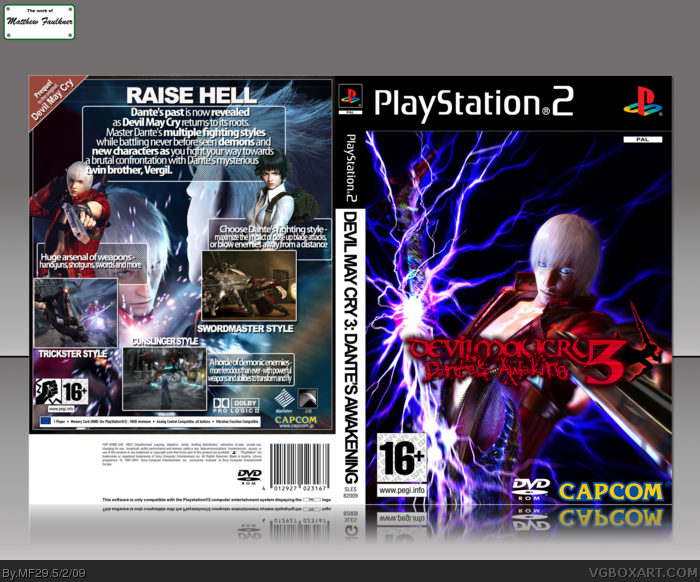
I really like the lightning effects. A few minor gripes though. The game title could stand to be larger and since you have a lot of empty space at the top, it could work better there.
The back looks pretty good. Watch the leading and tracking of your text though as some of it seems squished.
 Devil May Cry 3 Box Cover Comments
This is my submission to the "Developer Competition" Round 1, Vs. Nothing94, I hope I didn't break the rules by posting it early.
Edited at 1 decade ago
[ Reply ]
Ah nice, this looks really good.
[ Reply ]
Really nice, damn! +fav :)
[ Reply ]
I love you.
[ Reply ]
Nope no rules broken but you will need to pm it to me.
As for the box no complaints except the spine seems a little off.
[ Reply ]
I find it funny on how many people fav'd this.
[ Reply ]
I really like the lightning effects. A few minor gripes though. The game title could stand to be larger and since you have a lot of empty space at the top, it could work better there.
The back looks pretty good. Watch the leading and tracking of your text though as some of it seems squished.
Overall, nice job. ^^d
[ Reply ]