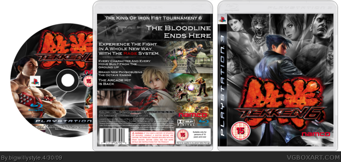
I was looking at all the Tekken 6 box's on this site and I noticed that most of them are the same with the red and black theme so I decided to do one a little different. I kind of went for a glass light effect. Please ignore the over lapping bits on the front I am fixing them as we speak haha. I took m time on this one I thought about it a lot because I wanted make sure it was a good one. I hope you all like it.
The lines overlap the template and the pictures inside them look stretched. You might want to try some presentation and the screenshots on the back are presented badly. Not bad overall but not amazing either.
#3, I just pointed it out that the lines are overlapping.
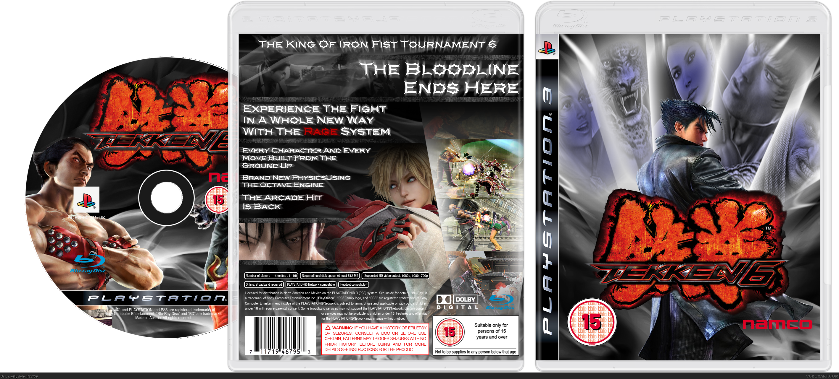
Updated with better front, more visible screens on the back with an added NAMCO logo on the back too because I forgot about that. Got rid of the annoying overlapping bits too.
I love that render of Jin..............He rules although im not a big fan of the Tekken franchise I do like the media that they have released for the game and their renders are sweet.
I love the front and CD, but I'm not too sure on the back. The renders of Jin on the CD and Front could have also been cut out better. I'm still going to fave this.
This is really good. I love the front. Maybe just get rid of the small outline on the "15" logo.
The back however, needs the font changed badly. If you could change that to something more readable I would definitely favorite this box. The font on the back is the only thing holding me back.
Yes definitely.
Well I meant in addition to changing the text. It's fine for the tagline and all, but for the description, not so much
But don't change the box to please me. Do what you feel is best.
 Tekken 6 Box Cover Comments
I was looking at all the Tekken 6 box's on this site and I noticed that most of them are the same with the red and black theme so I decided to do one a little different. I kind of went for a glass light effect. Please ignore the over lapping bits on the front I am fixing them as we speak haha. I took m time on this one I thought about it a lot because I wanted make sure it was a good one. I hope you all like it.
[ Reply ]
The lines overlap the template and the pictures inside them look stretched. You might want to try some presentation and the screenshots on the back are presented badly. Not bad overall but not amazing either.
#3, I just pointed it out that the lines are overlapping.
Edited at 1 decade ago
[ Reply ]
#2, you clearly didn't read what I posted
[ Reply ]
I love it :D!!!
[ Reply ]
#4, thank you very much I am updating it now but its taking ages to update because it says failed to open page ALL THE TIME!!!!!!
[ Reply ]
Updated with better front, more visible screens on the back with an added NAMCO logo on the back too because I forgot about that. Got rid of the annoying overlapping bits too.
I love that render of Jin..............He rules although im not a big fan of the Tekken franchise I do like the media that they have released for the game and their renders are sweet.
[ Reply ]
I love the front and CD, but I'm not too sure on the back. The renders of Jin on the CD and Front could have also been cut out better. I'm still going to fave this.
Edited at 1 decade ago
[ Reply ]
#7, thanks. What do you mean they could have been cut out better?.
Edit...........never mind I didn't realsIe how bad they were haha ill have a look and see if I can sort them out.
Edited at 1 decade ago
[ Reply ]
Update with better render cuts and a few minor tweaks.
[ Reply ]
This is really good. I love the front. Maybe just get rid of the small outline on the "15" logo.
The back however, needs the font changed badly. If you could change that to something more readable I would definitely favorite this box. The font on the back is the only thing holding me back.
[ Reply ]
#10, Would it be ok if I removed the blur on the text?
[ Reply ]
Yes definitely.
Well I meant in addition to changing the text. It's fine for the tagline and all, but for the description, not so much
But don't change the box to please me. Do what you feel is best.
Edited at 1 decade ago
[ Reply ]
#12, Left the blur effect on the text at the top but removed it from everything else because now its a little easier to read
[ Reply ]
the box speaks for itself. nice one
[ Reply ]
hope we could download the box art -___-
[ Reply ]