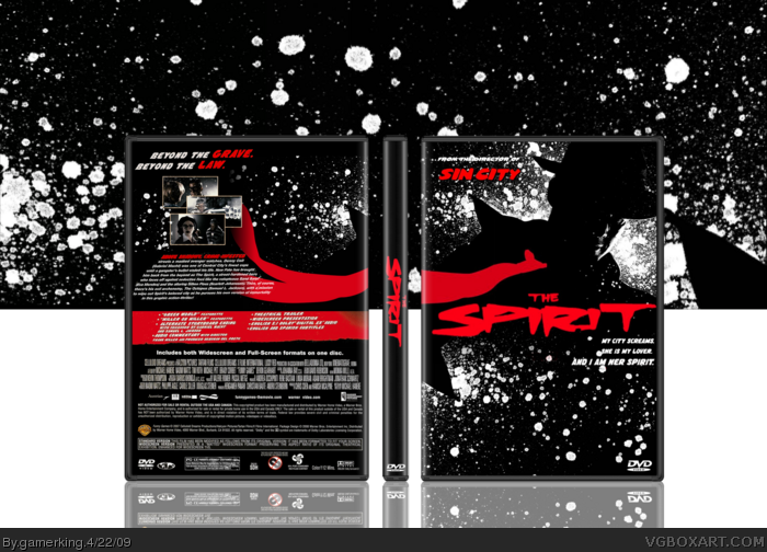
I'm sorry but this box is too generic for my tastes. When you view full size it's extremely blurry. The right side of the back is very plain, I think you should add something more too it. I don't like how the text flows on the back either. Also, the front is just a wallpaper with added splatters. I can tell this is a "filler" box because there really wasn't much effort put into this that I can see. Fix up a few things, then maybe I'll favorite it. Sorry for so many things, but criticism is good.
No, that's okay. I like criticism. :) and you're kinda right on the filler box part. lol i just wanted to get that last 4%. xD I'll try and fix things up after school tomorrow. :)
------------------------------
#7. I'm sorry, but using wallpaper for all your boxes is getting old. I don't want to be the bad guy here, but I'm sure it will be much better if you just adjust some things. :)
#8, yes, I use wallpapers, but for the umpthteenth time, i EDIT them. Not sure how many more times I have to say it. And also with this one, the wallpaper was the top half of the front. and then from using that i was able to compose the rest of the box. and ALSO for the last time, Lenny. My god, Lenny. GET A LIFE. You're only being an ass all the time and it's really annoying. so for the LAST TIME please stop. mmk?
#10, You know gamerking, I don't hate you or anything. But when someone basically uploads a wallpaper on a temp and then makes hof for it, I can't help but comment on it. And by edit do you mean copy and paste the same image around your box? link
#10. Well Lenny isn't trying to be a jerk here, he presents a good point. It seems that the way you edited it is by copy and pasting a section of wallpaper. Again, not trying to be mean, but I think that could be something to fix when you update. :)
Well you must hate me because every single post you ever make basically shows that you do. and no, by edit i mean my past boxes for example. Funny Games, 3:10 to Yuma, Sleepy Hollow and pretty much all the others. and I CAN make boxes regularly such as with my Tropic Thunder and Mutant Chronicles so why does it really matter if i use a wallpaper? It's a hobby site. :/
Oh children calm down. You people get WAY to serious about boxes on here. Especially you Lenny. I mean if you don't like a box don't even comment it. But when you do you always start something.
#13. Well, for me, I respect someone when they take the time to make something really special. You know, not using just all official art. That's why I like some of your other boxes, because they are more personal. I think people respect that more is all I'm saying.
It's a decent design Joe, but it's a little to "safe" if you know what I mean.
I can understand were Red is coming from a bit, as I also really appreciate when you do some creative render work. You have quite the eye for setting up great images for your boxes, especially your Sleepy Hollow design, and you've improved immensely in regards to the technical side of this kind of art, but try hitting your design compositions with some of that creativity I know you have.
If you decide to update this a bit, perhaps you can find some cool shots of the characters, and work with the colors on the images to maintain the Spirit esque with, black and red you have going on already. C'mon Joe! YOU CAN DO IT!
Srsly tough, I wouldn't be disappointed if this were the official. It looks alright to me.
A tad blurry, yeah, but if it were a clearer, it'd make a pretty nice design.
anyways, i'm updating this later but completely and utterly different. I'm gonna draw this time. I'm already done the Spirit himself...just gotta get him colored, so that should be up late tonight or tomorrow. :)
 The Spirit Box Cover Comments
I'm 4% away from rank 9 so I made another box. :P
[ Reply ]
Looks awesome! fav.
[ Reply ]
Looks really good, but I think that I've seen something really similar on here before, but nevertheless, fav!
[ Reply ]
I'm sorry but this box is too generic for my tastes. When you view full size it's extremely blurry. The right side of the back is very plain, I think you should add something more too it. I don't like how the text flows on the back either. Also, the front is just a wallpaper with added splatters. I can tell this is a "filler" box because there really wasn't much effort put into this that I can see. Fix up a few things, then maybe I'll favorite it. Sorry for so many things, but criticism is good.
Edited at 1 decade ago
[ Reply ]
i was waiting for you to do a spirit box. 5/5 +fav
[ Reply ]
I love that wallpaper. +fav
[ Reply ]
No, that's okay. I like criticism. :) and you're kinda right on the filler box part. lol i just wanted to get that last 4%. xD I'll try and fix things up after school tomorrow. :)
------------------------------
come on lenny. it's really getting old now.
Edited at 1 decade ago
[ Reply ]
#7. I'm sorry, but using wallpaper for all your boxes is getting old. I don't want to be the bad guy here, but I'm sure it will be much better if you just adjust some things. :)
[ Reply ]
This isn't your best but it's still great. I think you should find the actual movie info for the back though, but that's not really a big deal.
Edited at 1 decade ago
[ Reply ]
#8, yes, I use wallpapers, but for the umpthteenth time, i EDIT them. Not sure how many more times I have to say it. And also with this one, the wallpaper was the top half of the front. and then from using that i was able to compose the rest of the box. and ALSO for the last time, Lenny. My god, Lenny. GET A LIFE. You're only being an ass all the time and it's really annoying. so for the LAST TIME please stop. mmk?
[ Reply ]
#10, You know gamerking, I don't hate you or anything. But when someone basically uploads a wallpaper on a temp and then makes hof for it, I can't help but comment on it. And by edit do you mean copy and paste the same image around your box? link
[ Reply ]
#10. Well Lenny isn't trying to be a jerk here, he presents a good point. It seems that the way you edited it is by copy and pasting a section of wallpaper. Again, not trying to be mean, but I think that could be something to fix when you update. :)
Edited at 1 decade ago
[ Reply ]
Well you must hate me because every single post you ever make basically shows that you do. and no, by edit i mean my past boxes for example. Funny Games, 3:10 to Yuma, Sleepy Hollow and pretty much all the others. and I CAN make boxes regularly such as with my Tropic Thunder and Mutant Chronicles so why does it really matter if i use a wallpaper? It's a hobby site. :/
[ Reply ]
Oh children calm down. You people get WAY to serious about boxes on here. Especially you Lenny. I mean if you don't like a box don't even comment it. But when you do you always start something.
Edited at 1 decade ago
[ Reply ]
#13. Well, for me, I respect someone when they take the time to make something really special. You know, not using just all official art. That's why I like some of your other boxes, because they are more personal. I think people respect that more is all I'm saying.
Edited at 1 decade ago
[ Reply ]
Good job, hop sink.
[ Reply ]
I know i always rant about your stuff but seriously, you should consider doing this professionally man!
Edited at 1 decade ago
[ Reply ]
#4, This.
#17, Not quite.
Lenny = Win.
[ Reply ]
#4, Agreed
[ Reply ]
It's a decent design Joe, but it's a little to "safe" if you know what I mean.
I can understand were Red is coming from a bit, as I also really appreciate when you do some creative render work. You have quite the eye for setting up great images for your boxes, especially your Sleepy Hollow design, and you've improved immensely in regards to the technical side of this kind of art, but try hitting your design compositions with some of that creativity I know you have.
If you decide to update this a bit, perhaps you can find some cool shots of the characters, and work with the colors on the images to maintain the Spirit esque with, black and red you have going on already. C'mon Joe! YOU CAN DO IT!
Oh, BTW, this movie sucked.
Edited at 1 decade ago
[ Reply ]
Lmao! This shit is Racist!
link
Srsly tough, I wouldn't be disappointed if this were the official. It looks alright to me.
A tad blurry, yeah, but if it were a clearer, it'd make a pretty nice design.
[ Reply ]
Really, really, really generic.
Plus, admitting this is just a box to get you to Rank 9 doesn't really help either.
[ Reply ]
#11, You have WAY too much free time if your going to do that.
[ Reply ]
pretty cool
[ Reply ]
SIMPLY HAVE TO FAV!!!! HOW FUCKING BEATIFUL!!!
[ Reply ]
#25, O.O....whoa. xD
anyways, i'm updating this later but completely and utterly different. I'm gonna draw this time. I'm already done the Spirit himself...just gotta get him colored, so that should be up late tonight or tomorrow. :)
[ Reply ]
#20, This movie was amazing. Go back to Onechanbara.
[ Reply ]
#27 LOL. But dude... Sam Jackson was dressed up as Hitler...
It broke my mind!
[ Reply ]
#28, Wait, what? So are you saying I shouldn't see this movie? I want to...
[ Reply ]
#29, Don't listen to him, it was hilarious.
[ Reply ]
#1, that's the worst reason I've ever heard for making a box, but it's a quite nice box.
[ Reply ]
#31, xD I was out of ideas for a long time and then reed did the updates and i was like "whoa. gotta think of something now! >.O" :P
[ Reply ]
#23, yeah circling images take a lot of work.
[ Reply ]
I'm dead... that box is awesome!
[ Reply ]
#30, I don't think it was supposed to be funny, was it? Either way, so far, it seems like something I want to watch.
[ Reply ]
good luck on getting rank 9 =] currently 1% to go...lol
[ Reply ]
#35, It's not like "wow this movie sucks lawl" funny, it's just... funny. It's intentionally campy, therefore hilarious.
[ Reply ]
Congraulations on rank 9!
[ Reply ]