#1, Well this is an improvement but honestly not HoF material. To me it looks like all you did was add a logo to an image, plus you over used the lighten effect. On the back you should not have used the blur effect on the screenshots, and should have added a border. The background is also very boring but as I said this is an improvement
 Skies of Arcadia: Heroes Box Cover Comments
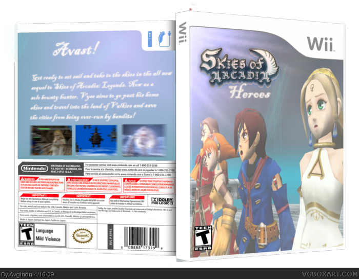
My 3rd box, hopefully it gets HoF'ed becauseI think it's really nice.
Although it could use some improvement with the screen shot creativity
and logo work...
c and c and :D
[ Reply ]
#1, Well this is an improvement but honestly not HoF material. To me it looks like all you did was add a logo to an image, plus you over used the lighten effect. On the back you should not have used the blur effect on the screenshots, and should have added a border. The background is also very boring but as I said this is an improvement
[ Reply ]
2, Thank you for your criticizim.
[ Reply ]
EDIT: ADDED MORE BACKGROUND STUFF
[ Reply ]