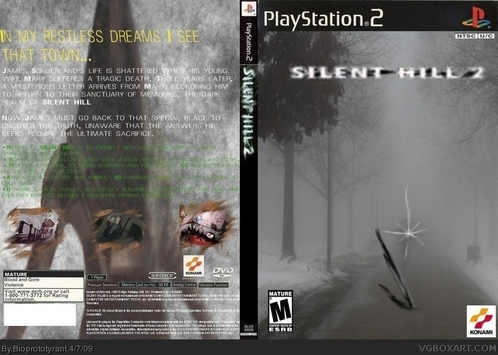
A good question to ask yourself before submitting anything is: "Can people who aren't capable of reading my mind make out the text on this without squinting?" If the answer is "No." then rethink your colors.
You see, white text with a light grey and white background isn't easy to read.
I strongly disapprove of using Pyramid Head on the back. Let alone a badly stretched version.
I appreciate the symbolism with using Angela's knife/the Great Knife for the cover, but I really don't think it's something you should use.
Also, there's more tools than just the text and smudge tool...
 Silent Hill 2 Box Cover Comments
You've improved... I'd like to see more of you man.
Only not yet worth a fav for me.
[ Reply ]
That only boosts me with more confidence thnks.
[ Reply ]
Not half bad, nice avatar, it's LK's old one... yes, LK's indeed. I love the PS2 scan, even though it needs some work. I like it!
Edited at 1 decade ago
[ Reply ]
A good question to ask yourself before submitting anything is: "Can people who aren't capable of reading my mind make out the text on this without squinting?" If the answer is "No." then rethink your colors.
You see, white text with a light grey and white background isn't easy to read.
I strongly disapprove of using Pyramid Head on the back. Let alone a badly stretched version.
I appreciate the symbolism with using Angela's knife/the Great Knife for the cover, but I really don't think it's something you should use.
Also, there's more tools than just the text and smudge tool...
[ Reply ]