The font for "The Derelict Soul" is pretty plain. Most times, they tend to use something with a bit of a script flair to it. Also, consider revising the logo on the spine, it's very hard to read. On the back, "cripples" is spelled incorrectly. The box itself is pretty good. It just needs to be fixed up a little with the formatting errors.
#13, No..... It.... Isn't!!! It is good, but not great. The dark link on the front doesn't actually fit in, he is just, well, there. The logo has a bad texture (default in photoshop i think). the back has the screenshots nicely done except for the one in the middle of the info.
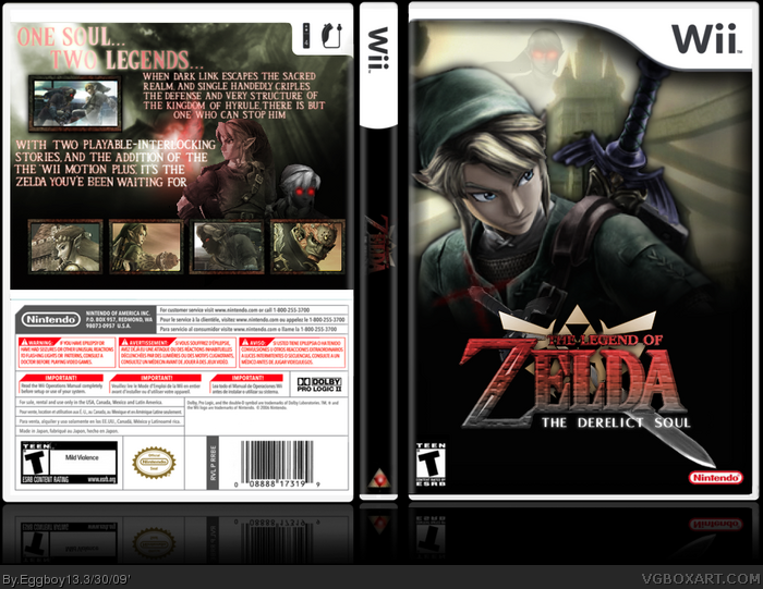
 The Legend Of Zelda: The Derilect Soul Box Cover Comments
This was my first "decent" boxart, anyone who has ever looked into my DA has probably seen this.
Credits:
Technee: temp
SSBB website: screens
Evrything else bt me or found on Google
And the title... yeah, best I could comeup with... :P
Edited at 1 decade ago
[ Reply ]
You are really improving... keep it up.
[ Reply ]
i wish i could see your page
[ Reply ]
I love the back :D faved!!
[ Reply ]
Front is amazing!
The back, i'm not too keen on!
[ Reply ]
#3, link
[ Reply ]
fave+ and author fave+
[ Reply ]
#7, Thanks!
[ Reply ]
Looks pretty sweet. A definite fav~!
[ Reply ]
my...God......My...FAV!....my...lol....my....i love the front!!
[ Reply ]
The font for "The Derelict Soul" is pretty plain. Most times, they tend to use something with a bit of a script flair to it. Also, consider revising the logo on the spine, it's very hard to read. On the back, "cripples" is spelled incorrectly. The box itself is pretty good. It just needs to be fixed up a little with the formatting errors.
[ Reply ]
I like the idea, but not so much the box design.
[ Reply ]
This.....is.....amazing!!!
[ Reply ]
#13, No..... It.... Isn't!!! It is good, but not great. The dark link on the front doesn't actually fit in, he is just, well, there. The logo has a bad texture (default in photoshop i think). the back has the screenshots nicely done except for the one in the middle of the info.
[ Reply ]
#14, Yup Agreed. The spine was very poorly done aswell. Im not liking the info text and the tagline as the outer glow is very annoying.
[ Reply ]