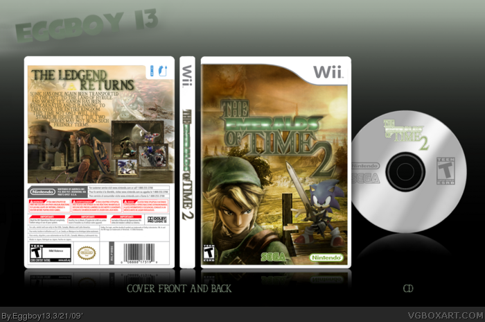
The Emeralds Of Time 2, I felt that ceriums was great as a presentation and idea, but I never like toon link or any of his games, so I figured I'd do this!
Credits:
Technee: Template.
Planet renders: renders of gannon and all on the back.
Me: Link and Sonic render on the front, and logo
backgrounds were built from stuff off of Google images etc. and screens
And most of all, CERIUM, for obvious reasons, link (I tried to contact you to make sure it was alright, but I didn'tknow how to get a hold of you. I hope you like it!)
The Emeralds part of the logo is bad, and your font choice is poor, as well as the front link, and i dislike the faded sonic on the back. This box has SOOO much potential, i strongly suggest you fix it.
Hmmm.... I see what your saying. Ooh, maybe you could find a picture of Sonic facing backwards, and put him on a horse next to Link on the back. Also, change the text and make it more entertaining. Lastly, the "Emeralds" section of the logo is too, like, green and bad quality. I'm gonna have to take my fav back for now. You'll earn it back. I can tell.
I should be angry that you used my idea and title without permission but you did give me sufficient credit so I suppose I can let this one go. I was actually thinking of making a TEOT2 boxart aswell but it will prob be another "cartoony" game on the DS.
 The Emeralds Of Time 2 Box Cover Comments
The Emeralds Of Time 2, I felt that ceriums was great as a presentation and idea, but I never like toon link or any of his games, so I figured I'd do this!
Credits:
Technee: Template.
Planet renders: renders of gannon and all on the back.
Me: Link and Sonic render on the front, and logo
backgrounds were built from stuff off of Google images etc. and screens
And most of all, CERIUM, for obvious reasons, link (I tried to contact you to make sure it was alright, but I didn'tknow how to get a hold of you. I hope you like it!)
Tell me if I forgot anything! thanks!
-- Eggboy
[ Reply ]
The logo, along with other parts of the box, are bad quality. Besides that I like it.
[ Reply ]
#2, The logo only looks that way because of downsizing it along with it's suroundings
See? link
[ Reply ]
Fair enough. I do like the box, you get my fav Eggboy.
[ Reply ]
#4, Thanks!
[ Reply ]
The Emeralds part of the logo is bad, and your font choice is poor, as well as the front link, and i dislike the faded sonic on the back. This box has SOOO much potential, i strongly suggest you fix it.
[ Reply ]
Hmmm.... I see what your saying. Ooh, maybe you could find a picture of Sonic facing backwards, and put him on a horse next to Link on the back. Also, change the text and make it more entertaining. Lastly, the "Emeralds" section of the logo is too, like, green and bad quality. I'm gonna have to take my fav back for now. You'll earn it back. I can tell.
[ Reply ]
I should be angry that you used my idea and title without permission but you did give me sufficient credit so I suppose I can let this one go. I was actually thinking of making a TEOT2 boxart aswell but it will prob be another "cartoony" game on the DS.
[ Reply ]
'Tis a very nice boxart, but you should un-fade the Sonic on the back, front's awesome though!
[ Reply ]
It's a great box, but you need to fix the quality of that logo, it's REALLY bad.
[ Reply ]
Cool box.
[ Reply ]