#2, because KOSMOSinusa only made kingdom hearts - final fantasy - xenosaga boxes, you are a bit similair.
Now to the box. Your fronts are always great. But your back is always the downfall. Compare your boxes to others.
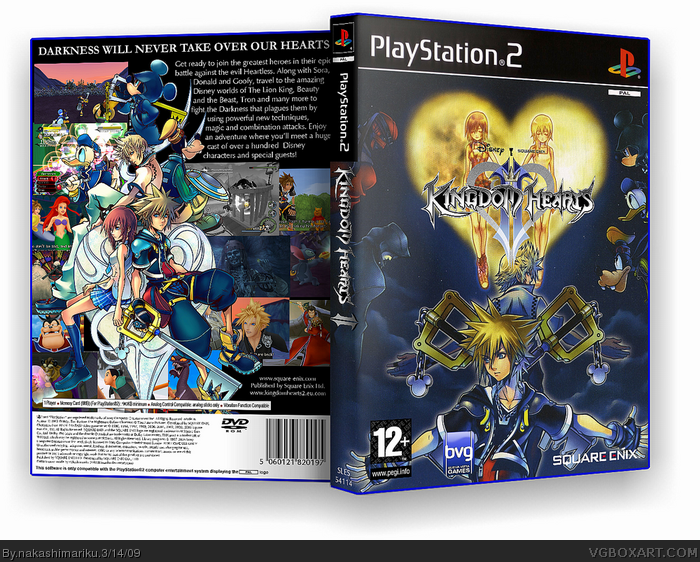
You have to use border for the screenshots, and only use 2-4.The text is boring and the slogan is in a boring font.
Compare your boxes to others, learn how to make good backs, keep your Style (how you make fronts).
But your fronts are always awesome.
#3, thanks!
I've started using borders for the screenshots in my latest boxes, and will probably update my old ones sooner or later. However, I gave this one a lot of screenshots to show just how much there actually is in this game. I've also been experimenting with fonts, but when I use a more fancy one, people have said that they can't read it instead.
#3, Boxes do not need screenshot borders to be good, look at the backs of the official kingdom hearts boxes, no borders and those are some attractive backs.
For the back of this, I dislike the use of screenshots as a background, WAY too many. Use an actual background and maybe go with the style of the official kingdom hearts 2 back. I like the front, don't really like Kairi/Namine behind the logo though.
 Kingdom Hearts 2 Box Cover Comments
Are you KOSMOSinusa?
[ Reply ]
#1, no, why are you asking?
[ Reply ]
#2, because KOSMOSinusa only made kingdom hearts - final fantasy - xenosaga boxes, you are a bit similair.
Now to the box. Your fronts are always great. But your back is always the downfall. Compare your boxes to others.
You have to use border for the screenshots, and only use 2-4.The text is boring and the slogan is in a boring font.
Compare your boxes to others, learn how to make good backs, keep your Style (how you make fronts).
But your fronts are always awesome.
[ Reply ]
#3, thanks!
I've started using borders for the screenshots in my latest boxes, and will probably update my old ones sooner or later. However, I gave this one a lot of screenshots to show just how much there actually is in this game. I've also been experimenting with fonts, but when I use a more fancy one, people have said that they can't read it instead.
[ Reply ]
I like the way the back is arranged.
[ Reply ]
#5, Thanks!
[ Reply ]
Amazing, defenite fave.
[ Reply ]
#3, Boxes do not need screenshot borders to be good, look at the backs of the official kingdom hearts boxes, no borders and those are some attractive backs.
For the back of this, I dislike the use of screenshots as a background, WAY too many. Use an actual background and maybe go with the style of the official kingdom hearts 2 back. I like the front, don't really like Kairi/Namine behind the logo though.
[ Reply ]
i made a box with the same pic but it's not as nearly as good as yours! 10/5!
[ Reply ]